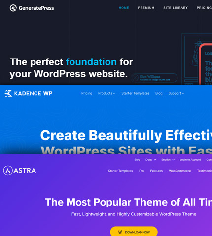
As blogging and publishing content-heavy websites are in their best shape, even with the latest and very frequent Google updates, many WordPress themes have emerged and become very popular in recent years.
Today in this article, I’ve put together a list with some of the best WordPress themes if you want to put up a new content website or if you want to refresh the design of an existing project.
I’m using myself one of these themes and plan to try the others as they have very positive reviews in the online community.
So, here they are:
Read more …
![Bootstrap 4 Carousel: How To Change Arrow Colors? [2 Methods] Bootstrap 4 Carousel: How To Change Arrow Colors? [2 Methods]](https://azmind.com/wp-content/uploads/2020/11/bootstrap-carousel-change-arrow-colors.jpg)
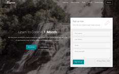
What is “carousel-control-prev-icon” in Bootstrap, you might ask?
Well, if you have worked with Bootstrap carousels you probably know that this, along with “carousel-control-next-icon”, are the classes used for the small arrow icons of the carousel’s controls.
But what do I need them for, you might continue?
Well, you will need them if you want to change the colors of the arrow icons.
Today in this tutorial we will do just that, with 2 different methods.
Let’s see these 2 methods and in the end, you can download the templates as usual.
Read more …

We have already seen how to use fieldsets in forms with the Bootstrap framework.
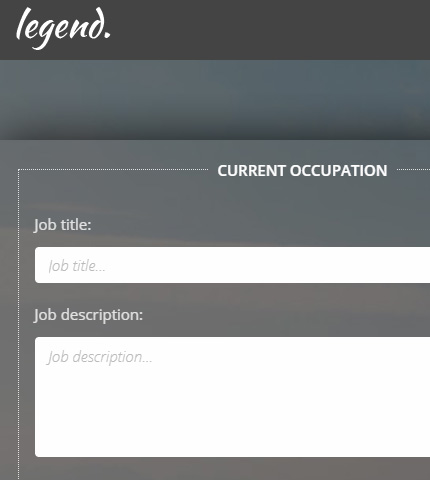
Today we will continue on the same lines and learn how to create fieldsets with legends.
These can come in handy when working with long forms that need to collect a lot of data.
Actually, in the article I mentioned above, we have already used legends, but today we are going to expand on them and see how we can style them a bit differently.
So, let’s see what these fieldset legends are and how to use them!
Template and demo link available at the end.
Read more …

Sometimes you need an image slider for your site or for a landing page you are working on.
Usually, you need it to be on the top part of the page and to occupy the entire width of the browser.
Well, the Bootstrap Carousel component can do that quite easily!
What about an image slider that is not only full-width but also full-height? In other words, an image slider that occupies all the initial viewport when the page loads?
The Bootstrap Carousel can do that too, even though with a few more tweaks.
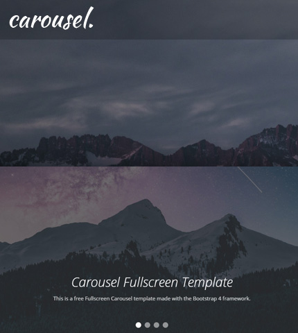
Today, we will see how you can create all the above: a Full-width and a Fullscreen Bootstrap Carousel, by using 3 methods that are slightly different from each other.
In the end, you can download all the templates as usual.
So, let’s begin!
Read more …

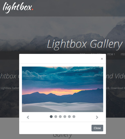
Welcome to another tutorial here on AZMIND! Today we will create a Lightbox Image and Video Gallery using the Bootstrap framework.
The gallery will showcase some images and videos that will open in a lightbox when the user clicks on any of them.
Once opened, the user will have the possibility to interact with the lightbox by scrolling through the images and videos, play / pause the videos, or close the lightbox popup.
This gallery can be used, for example, to create a portfolio page.
In the end, you can download all the files as a handy template.
So, let’s begin!
Read more …

After publishing this Bootstrap carousel template with videos, there were a few users who tried it and asked how to add some additional featured.
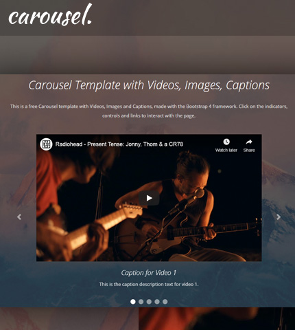
For example, how to use a mix of videos and images in the carousel and how to add captions to a video carousel.
So, I added these features to the carousel and today I’ll show you how you can do the same and, at the end of the tutorial, you can download the template with all the files as usual.
Let’s begin!
Read more …

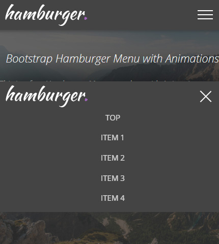
After seeing how to create a Hamburger Menu in HTML/CSS in the last tutorial and, of course, after learning what a Hamburger menu is, today we will continue with a similar type of menu.
More precisely, we will see how to create a Hamburger Top Menu/Navbar using the Bootstrap 4 framework (v4.4.1, latest version as I write this article).
In my opinion, creating this type of menu with Bootstrap is easier and quicker than if you had to create it with HTML and CSS starting from zero, like we did in the other tutorial.
This because Bootstrap comes with many (almost) ready-to-use components that you can customize, like the Navbar component that we will use here.
But on the other hand, Bootstrap has a learning curve and requires some time from you to study it.
So, let’s begin with the tutorial and at the end you can decide which way to go, Bootstrap or HTML/CSS. Free template also available for you to download.
Read more …



![Bootstrap 4 Carousel: How To Change Arrow Colors? [2 Methods] Bootstrap 4 Carousel: How To Change Arrow Colors? [2 Methods]](https://azmind.com/wp-content/uploads/2020/11/bootstrap-carousel-change-arrow-colors.jpg)
