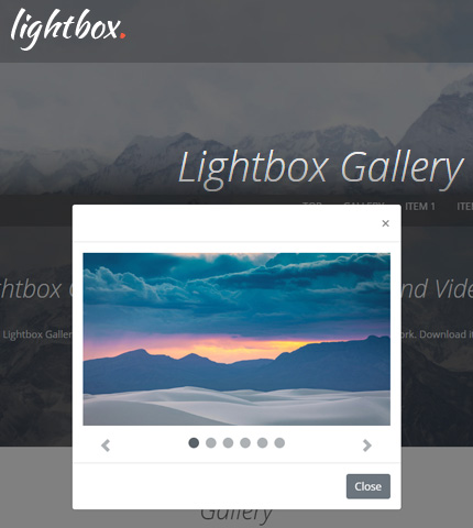
Welcome to another tutorial here on AZMIND! Today we will create a Lightbox Image and Video Gallery using the Bootstrap framework.
The gallery will showcase some images and videos that will open in a lightbox when the user clicks on any of them.
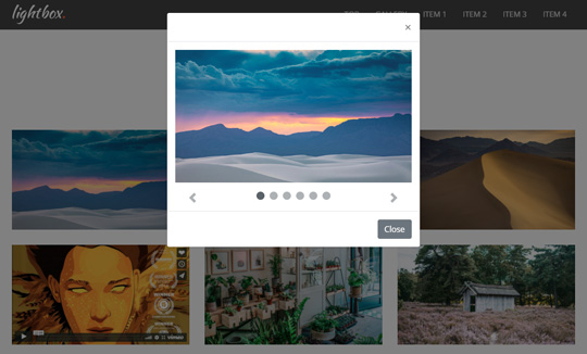
Once opened, the user will have the possibility to interact with the lightbox by scrolling through the images and videos, play / pause the videos, or close the lightbox popup.
This gallery can be used, for example, to create a portfolio page.
In the end, you can download all the files as a handy template.
So, let’s begin!
1. Introduction
Before creating this template I went on a search on Google to get some ideas. I found this tutorial which wasn’t using any additional JavaScript plugins.
That was the solution I wanted! – I thought.
So I studied it and came up with this template which has some added functionality, like the possibility to embed videos from YouTube/Vimeo, and of course a different design.
Here are all the templates features:
- Bootstrap v4.5.2;
- responsive;
- can embed videos from YouTube / Vimeo;
- can add more rows of images and videos;
- additional sections and elements (working navbar, image backgrounds, etc.) to create a fully functional web page;
- CSS animations.
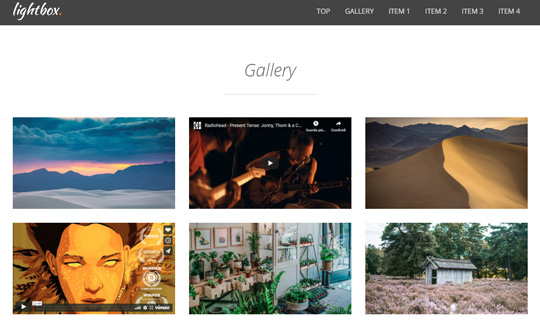
And here are some preview images of what we are going to create:
The image and video gallery:
The opened Lightbox popup:
Don’t miss: Bootstrap Hamburger Menu with Animations: Free Template + Tutorial
2. The HTML
The biggest part to understand in this tutorial is the HTML code.
We don’t have very much CSS and JavaScript code here, although the little code we have is very important (more on that later).
We will use the Bootstrap Modal and Carousel components, which will do the most work. Thanks, Bootstrap creators! 😉
I will show only the code of the gallery, not that of the other sections of the page. If you want to see all the code, you can find it in the file “index.html” when you download the template below.
The Gallery
So, let’s start by creating the gallery, here is the code:
<!-- Gallery -->
<div class="gallery-container section-container">
    <div class="container">
        <div class="row">
            <div class="col gallery section-description wow fadeIn">
                <h2>Gallery</h2>
                <div class="divider-1 wow fadeInUp"><span></span></div>
            </div>
        </div>
        <div class="row">
            <div class="col">
                <!-- First row of images -->
                <div class="row">
                    <div class="col-md-4 gallery-box wow fadeInDown">
                        <div data-toggle="modal" data-target="#myModal">
                            <img src="assets/img/gallery/1.jpg" alt="Image 1" data-target="#myCarousel" data-slide-to="0">
                        </div>
                    </div>
                    <div class="col-md-4 gallery-box wow fadeInUp">
                        <div data-toggle="modal" data-target="#myModal">
                            <img src="assets/img/gallery/video-1.jpg" alt="Video 1" data-target="#myCarousel" data-slide-to="1">
                        </div>
                    </div>
                    <div class="col-md-4 gallery-box wow fadeInDown">
                        <div data-toggle="modal" data-target="#myModal">
                            <img src="assets/img/gallery/2.jpg" alt="Image 2" data-target="#myCarousel" data-slide-to="2">
                        </div>
                    </div>
                </div>
                <!-- Second row of images -->
                <div class="row">
                    <div class="col-md-4 gallery-box wow fadeInUp">
                        <div data-toggle="modal" data-target="#myModal">
                            <img src="assets/img/gallery/video-2.jpg" alt="Video 2" data-target="#myCarousel" data-slide-to="3">
                        </div>
                    </div>
                    <div class="col-md-4 gallery-box wow fadeInDown">
                        <div data-toggle="modal" data-target="#myModal">
                            <img src="assets/img/gallery/3.jpg" alt="Image 3" data-target="#myCarousel" data-slide-to="4">
                        </div>
                    </div>
                    <div class="col-md-4 gallery-box wow fadeInUp">
                        <div data-toggle="modal" data-target="#myModal">
                            <img src="assets/img/gallery/4.jpg" alt="Image 4" data-target="#myCarousel" data-slide-to="5">
                        </div>
                    </div>
                </div>
            </div>
        </div>
    </div>
</div>
The gallery is just a collection of images organized in 2 rows and 3 columns. For the videos, I have used 2 image previews: we don’t embed videos here, we will do that only in the lightbox.
Also, make sure to use the same aspect ratio for all the images, I have used an aspect ratio of 16:9.
I use the same images for both the gallery and the lightbox, but you can also use different images, with different sizes, etc.
Now, the important part: we use some data-* attributes to open the modal popup and to position the carousel on the correct slide.
- we use data-toggle=”modal” data-target=”#myModal” on the images’ div container to open the modal;
- and data-target=”#myCarousel” data-slide-to=”slide_number” on the “img” tag to position the carousel on the desired / correct slide.
The “data-target” attributes have the “id” of the elements that they must open: the modal and the carousel, respectively “#myModal” and “#myCarousel”.
You can read more about all these attributes in the Bootstrap documentation for each component (Modal and Carousel) which I have linked to above.
The classes “wow fadeInUp / fadeInDown” are not needed, I have added them only for the animations.
The Lightbox
Now, we will create the Lightbox popup, here is the code:
<!-- Lightbox (made with Bootstrap modal and carousel) -->
<!-- Modal -->
<div class="modal fade" id="myModal" tabindex="-1" aria-hidden="true">
<div class="modal-dialog">
<div class="modal-content">
<div class="modal-header">
<button type="button" class="close" data-dismiss="modal" aria-label="Close">
<span aria-hidden="true">×</span>
</button>
</div>
<div class="modal-body">
<!-- Carousel -->
<div id="myCarousel" class="carousel slide">
<ol class="carousel-indicators">
<li data-target="#myCarousel" data-slide-to="0" class="active"></li>
<li data-target="#myCarousel" data-slide-to="1"></li>
<li data-target="#myCarousel" data-slide-to="2"></li>
<li data-target="#myCarousel" data-slide-to="3"></li>
<li data-target="#myCarousel" data-slide-to="4"></li>
<li data-target="#myCarousel" data-slide-to="5"></li>
</ol>
<div class="carousel-inner">
<div class="carousel-item active">
<img src="assets/img/gallery/1.jpg" class="d-block w-100" alt="Image 1">
</div>
<div class="carousel-item">
<div class="embed-responsive embed-responsive-16by9">
<iframe class="embed-responsive-item" src="https://www.youtube.com/embed/6hgVihWjK2c" allowfullscreen></iframe>
</div>
</div>
<div class="carousel-item">
<img src="assets/img/gallery/2.jpg" class="d-block w-100" alt="Image 2">
</div>
<div class="carousel-item">
<div class="embed-responsive embed-responsive-16by9">
<iframe class="embed-responsive-item" src="https://player.vimeo.com/video/84910153?title=0&byline=0&portrait=0&badge=0&color=ffffff" allowfullscreen></iframe>
</div>
</div>
<div class="carousel-item">
<img src="assets/img/gallery/3.jpg" class="d-block w-100" alt="Image 3">
</div>
<div class="carousel-item">
<img src="assets/img/gallery/4.jpg" class="d-block w-100" alt="Image 4">
</div>
</div>
<a class="carousel-control-prev" href="#myCarousel" role="button" data-slide="prev">
<span class="carousel-control-prev-icon" aria-hidden="true"></span>
<span class="sr-only">Previous</span>
</a>
<a class="carousel-control-next" href="#myCarousel" role="button" data-slide="next">
<span class="carousel-control-next-icon" aria-hidden="true"></span>
<span class="sr-only">Next</span>
</a>
</div>
</div>
<div class="modal-footer">
<button type="button" class="btn btn-secondary" data-dismiss="modal">Close</button>
</div>
</div>
</div>
</div>
As you can see, we use the Carousel component inside a Modal component, as suggested by the tutorial which I linked to in the introduction.
As we said before, the id tags of the modal and the carousel should be the same as the “data-target” attributes of the gallery: “myModal” and “myCarousel” (see previous paragraph, “The Gallery”).
The carousel has previous and next controls, and also indicators.
For the videos, we use the responsive embeds Bootstrap utility.
Again, images should have an aspect ratio of 16:9 which is the same ratio we use for the embedded videos.
On the other hand, if your videos have a different aspect ratio (for example 4:3), use the same ratio for images too.
Read also: Bootstrap Carousel with Videos, Images and Captions: How To + Template
3. The CSS
The CSS code is in the file “style.css” (folder “/assets/css/”). Here I will show only the code I have used for the gallery.
You can style the gallery as you like, of course. In this case, I have used the code below to position the indicators and controls outside the images and videos, so they don’t block the videos’ buttons (play, pause, volume, etc.).
I have also changed the colors of the controls’ arrow icons. By the way, to set the color, just change this property “fill=’%235a6268′”: the color is the “5a6268” hexadecimal value.
/***** Gallery *****/

.gallery-box {
    padding-top: 30px;
}
.gallery-box img {
    cursor: pointer;
}

.carousel .carousel-indicators {
    bottom: -20px;
}
.carousel .carousel-indicators li {
    width: 16px;
    height: 16px;
    margin-left: 5px;
    margin-right: 5px;
    border-radius: 50%;
    background-color: #5a6268;
}

.carousel .carousel-inner {
    padding-bottom: 40px;
}

.carousel .carousel-control-next,
.carousel .carousel-control-prev {
    top: auto;
    border: 0;
}

.carousel .carousel-control-prev-icon {
    background-image: url("data:image/svg+xml,%3csvg xmlns='http://www.w3.org/2000/svg' fill='%235a6268' width='8' height='8' viewBox='0 0 8 8'%3e%3cpath d='M5.25 0l-4 4 4 4 1.5-1.5L4.25 4l2.5-2.5L5.25 0z'/%3e%3c/svg%3e");
}

.carousel .carousel-control-next-icon {
    background-image: url("data:image/svg+xml,%3csvg xmlns='http://www.w3.org/2000/svg' fill='%235a6268' width='8' height='8' viewBox='0 0 8 8'%3e%3cpath d='M2.75 0l-1.5 1.5L3.75 4l-2.5 2.5L2.75 8l4-4-4-4z'/%3e%3c/svg%3e");
}
Now, the gallery and lightbox don’t need any additional code to make them responsive, they are already responsive.
For the other sections of the page, I have used some CSS Media Queries that you can find in the file “media-queries.css” (folder “/assets/css/”);
4. The JavaScript (jQuery)
We need to add one last thing to our lightbox to make it perfect 😉 , actually two things:
- we want to stop the video which is playing when the user closes the modal popup;
- and we also want to stop the current video when the user scrolls to the next slide.
We will do this with some jQuery code in the file “scripts.js” (folder “/assets/js/”). In that file, there is also some code for other sections of the page which I’m not showing.
First, let’s stop the video when the modal closes:
jQuery(document).ready(function() {

    /*
        Stop video playing when the MODAL is being closed (has finished closing)
    */
    $('#myModal').on('hidden.bs.modal', function(e) {
        $('#myModal iframe').each(function() {
            var videoURL = $(this).attr('src');
            $(this).attr('src', videoURL);
        });
    });

});
We use the “hidden.bs.modal” event as the documentation suggests, which is fired when the modal has finished closing.
When this happens, we just set the iframe’s “src” attribute to the same URL, for all videos (each video, its own URL), which makes them stop and “load” again.
I chose this solution which is simple and works well, but let me know if you find any other solution, which maybe is “cleaner” than this one.
For example, you can experiment with the YouTube and Vimeo API, and see if you can make it work by sending Play/Stop commands to the videos.
Next, let’s stop the video when the carousel moves to the next slide:
jQuery(document).ready(function() {

    /*
        Stop video playing when the CAROUSEL slides to another element
    */
    $('#myCarousel').on('slid.bs.carousel', function(e) {
        var currentSlide = $('#myCarousel .carousel-item').eq(e.from);
        var currentSlideEmbed = currentSlide.children('.embed-responsive');
        if(currentSlideEmbed.length > 0) {
            var videoIFrame = currentSlideEmbed.children('iframe');
            var videoURL = videoIFrame.attr('src');
            videoIFrame.attr('src', videoURL);
        }
    });

});
Following the documentation, we use the “slid.bs.carousel” event which is fired when the carousel has finished sliding.
When that happens, we check if the previous slide is a video. If so, we replace its iframe’s “src” attribute as we did before for the modal. This makes the video stop playing and reloads it.
5. Demo, Download and License
DOWNLOAD: Bootstrap Lightbox Gallery (5080 downloads )
LICENSE:
You can use this template as you like, in personal or commercial projects. Just don’t sell it as is.
6. Conclusion
That’s all for this tutorial! We just created a responsive lightbox gallery with Bootstrap and some of its components, and with no additional JS plugins.
As you can see, in this case, Bootstrap takes care of the most important parts of the work – we just have to tweak the code here and there to create the final design and set up the desired behavior.
What do you think? Do you have any questions or suggestions? Let me know in the comments.
Stay Updated
Subscribe to the Azmind Newsletter and I’ll update you as soon as I release a new WordPress Theme, Bootstrap Template, Tutorial or other Freebie:
To learn how we use your data when you sign up to our newsletter, read our Privacy Policy here.
