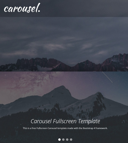
Sometimes you need an image slider for your site or for a landing page you are working on.
Usually, you need it to be on the top part of the page and to occupy the entire width of the browser.
Well, the Bootstrap Carousel component can do that quite easily!
What about an image slider that is not only full-width but also full-height? In other words, an image slider that occupies all the initial viewport when the page loads?
The Bootstrap Carousel can do that too, even though with a few more tweaks.
Today, we will see how you can create all the above: a Full-width and a Fullscreen Bootstrap Carousel, by using 3 methods that are slightly different from each other.
In the end, you can download all the templates as usual.
So, let’s begin!
1. Bootstrap Carousel Full Width
In this tutorial, we will use Bootstrap version 4.5.3 and of course, the Bootstrap Carousel component.
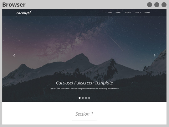
The final result will look like this:
The HTML
Let’s start with the HTML code (file “index.html”) and create a simple carousel.
To make it full-width we don’t use any Bootstrap “container” or “row”, just the carousel which I have placed inside a “div” tag (class “top-content”) with a 100% width.
The images I’ve used are 1920 pixels wide so they should cover pretty much every type of device.
* Note: I’ll not show the code for all the sections of the page here, just for the carousel. You can see the entire code by downloading the templates below, or by opening the demos from the links I’ll provide here and viewing their source code in your browser.
<!-- Top content -->
<div class="top-content">
    <!-- Carousel -->
    <div id="carousel-example" class="carousel slide" data-ride="carousel">

        <ol class="carousel-indicators">
            <li data-target="#carousel-example" data-slide-to="0" class="active"></li>
            <li data-target="#carousel-example" data-slide-to="1"></li>
            <li data-target="#carousel-example" data-slide-to="2"></li>
            <li data-target="#carousel-example" data-slide-to="3"></li>
        </ol>

        <div class="carousel-inner">
            <div class="carousel-item active">
                <img src="assets/img/slides/slide-img-1.jpg" class="d-block w-100" alt="slide-img-1">
                <div class="carousel-caption">
                    <h1>Carousel Fullscreen Template</h1>
                    <div class="carousel-caption-description">
                        <p>This is a free Fullscreen Carousel template made with the Bootstrap 4 framework.</p>
                    </div>
                </div>
            </div>
            <div class="carousel-item">
                <img src="assets/img/slides/slide-img-2.jpg" class="d-block w-100" alt="slide-img-2">
                <div class="carousel-caption">
                    <h3>Caption for Image 2</h3>
                    <div class="carousel-caption-description">
                        <p>This is the caption description text for image 2.</p>
                    </div>
                </div>
            </div>
            <div class="carousel-item">
                <img src="assets/img/slides/slide-img-3.jpg" class="d-block w-100" alt="slide-img-3">
                <div class="carousel-caption">
                    <h3>Caption for Image 3</h3>
                    <div class="carousel-caption-description">
                        <p>This is the caption description text for image 3.</p>
                    </div>
                </div>
            </div>
            <div class="carousel-item">
                <img src="assets/img/slides/slide-img-4.jpg" class="d-block w-100" alt="slide-img-4">
                <div class="carousel-caption">
                    <h3>Caption for Image 4</h3>
                    <div class="carousel-caption-description">
                        <p>This is the caption description text for image 4.</p>
                    </div>
                </div>
            </div>
        </div>

        <a class="carousel-control-prev" href="#carousel-example" role="button" data-slide="prev">
            <span class="carousel-control-prev-icon" aria-hidden="true"></span>
            <span class="sr-only">Previous</span>
        </a>
        <a class="carousel-control-next" href="#carousel-example" role="button" data-slide="next">
            <span class="carousel-control-next-icon" aria-hidden="true"></span>
            <span class="sr-only">Next</span>
        </a>
    </div>
    <!-- End carousel -->
</div>
As you can see, it’s a simple carousel with 4 images, captions, indicators, and controls, just like the documentation suggests.
The CSS
Let’s use some CSS code (file “assets/css/style.css”) to style it:
.top-content {
    width: 100%;
    padding: 0;
}

.top-content .carousel-control-prev {
    border-bottom: 0;
}

.top-content .carousel-control-next {
    border-bottom: 0;
}

.top-content .carousel-caption {
    padding-bottom: 60px;
}

.top-content .carousel-caption h1 {
    padding-top: 60px;
    color: #fff;
}

.top-content .carousel-caption h3 {
    color: #fff;
}

.top-content .carousel-caption .carousel-caption-description {
    color: #fff;
    color: rgba(255, 255, 255, 0.8);
}

.top-content .carousel-indicators li {
    width: 16px;
    height: 16px;
    margin-left: 5px;
    margin-right: 5px;
    border-radius: 50%;
}
Media Queries
With some CSS Media Queries (file “assets/css/media-queries.css”) we decide the layout of the page for mobile devices:
@media (max-width: 767px) {

    h1, h2 {
        font-size: 22px;
        line-height: 30px;
    }

    .top-content .carousel-caption {
        bottom: 20px;
    }

    .top-content .carousel-indicators {
        display: none;
    }

}

media (max-width: 575px) {

    .top-content .carousel-caption {
        bottom: 0;
        padding-bottom: 20px;
    }

    .top-content .carousel-caption-description {
        display: none;
    }

    .top-content h1,
    .top-content h2,
    .top-content h3 {
        font-size: 18px;
    }

}
We hide the indicators, decrease the font size of the headings, and hide the caption descriptions on smaller devices (with a viewport width smaller than 575 pixels).
And that’s all for the full-width carousel!
Don’t miss: Bootstrap 4 Lightbox Image + Video Gallery: Free Template + How To
2. Bootstrap Carousel Full Screen: 1st Method
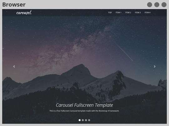
The final result will look like this:
The HTML
The HTML code is the same as the first example, so I will not show it. All the work is done by the CSS code, let’s see.
The CSS
The CSS code (file “style.css”) is very similar to the first example. We make the slider occupy all the viewport by adding this code:
.top-content .carousel-item {
    height: 100vh;
    min-height: 400px;
}

.top-content .carousel-item img {
    height: 100%;
    object-fit: cover;
}
We make the carousel items occupy all the height of the viewport with “height: 100vh”.
Then we give the images a 100% height and with “object-fit: cover”, we make them occupy all the space of their container (“.carousel-item”).
Media Queries
The media queries are also very similar. We just add the line below to set a minimum height of 400 pixels for the slider on smaller devices:
@media (max-width: 575px) {

    .top-content .carousel-item {
        max-height: 400px;
    }

}
That’s all, you can see a live preview below.
You might also like: Bootstrap Carousel with Videos, Images and Captions: How To + Template
3. Bootstrap Carousel Full Screen: 2nd Method
Another way to create a fullscreen slider is to set the images as backgrounds using CSS.
The final result is the same.
The HTML
We remove the images from the HTML code (the “img” tags inside “carousel-item”-s).
<!-- Top content -->
<div class="top-content">
    <!-- Carousel -->
    <div id="carousel-example" class="carousel slide" data-ride="carousel">

        <ol class="carousel-indicators">
            <li data-target="#carousel-example" data-slide-to="0" class="active"></li>
            <li data-target="#carousel-example" data-slide-to="1"></li>
            <li data-target="#carousel-example" data-slide-to="2"></li>
            <li data-target="#carousel-example" data-slide-to="3"></li>
        </ol>

        <div class="carousel-inner">
            <div class="carousel-item carousel-item-1 active">
                <div class="carousel-caption">
                    <h1>Carousel Fullscreen Template</h1>
                    <div class="carousel-caption-description">
                        <p>This is a free Fullscreen Carousel template made with the Bootstrap 4 framework.</p>
                    </div>
                </div>
            </div>
            <div class="carousel-item carousel-item-2">
                <div class="carousel-caption">
                    <h3>Caption for Image 2</h3>
                    <div class="carousel-caption-description">
                        <p>This is the caption description text for image 2.</p>
                    </div>
                </div>
            </div>
            <div class="carousel-item carousel-item-3">
                <div class="carousel-caption">
                    <h3>Caption for Image 3</h3>
                    <div class="carousel-caption-description">
                        <p>This is the caption description text for image 3.</p>
                    </div>
                </div>
            </div>
            <div class="carousel-item carousel-item-4">
                <div class="carousel-caption">
                    <h3>Caption for Image 4</h3>
                    <div class="carousel-caption-description">
                        <p>This is the caption description text for image 4.</p>
                    </div>
                </div>
            </div>
        </div>

        <a class="carousel-control-prev" href="#carousel-example" role="button" data-slide="prev">
            <span class="carousel-control-prev-icon" aria-hidden="true"></span>
            <span class="sr-only">Previous</span>
        </a>
        <a class="carousel-control-next" href="#carousel-example" role="button" data-slide="next">
            <span class="carousel-control-next-icon" aria-hidden="true"></span>
            <span class="sr-only">Next</span>
        </a>
    </div>
    <!-- End carousel -->
</div>
We also add the classes “carousel-item-1”, “carousel-item-2”, etc., to each carousel item, to set a different background for each of them with CSS.
The CSS
Now with some CSS, we set the background images.
.top-content .carousel-item {
    height: 100vh;
    min-height: 400px;
    background-repeat: no-repeat;
    background-size: cover;
}

.top-content .carousel-item-1 {
    background-image: url(../img/slides/slide-img-1.jpg);
}

.top-content .carousel-item-2 {
    background-image: url(../img/slides/slide-img-2.jpg);
}

.top-content .carousel-item-3 {
    background-image: url(../img/slides/slide-img-3.jpg);
}

.top-content .carousel-item-4 {
    background-image: url(../img/slides/slide-img-4.jpg);
}
We give a “background-size: cover” to the carousel items, so the backgrounds cover their entire container.
Media Queries
The media queries are the same, so nothing to show here, let’s move on to the live preview.
Download and License
DOWNLOAD: Bootstrap Carousel Fullscreen (4097 downloads )
LICENSE:
You can use this template as you like, in personal or commercial projects. Just don’t sell it as is.
Conclusion
In this tutorial, we created a full-width and two full-screen image sliders using the Bootstrap carousel component and a few simple tweaks.
I hope you find it useful!
Let me know if you have any questions or suggestions in the comments below.
Stay Updated
Subscribe to the Azmind Newsletter and I’ll update you as soon as I release a new WordPress Theme, Bootstrap Template, Tutorial or other Freebie:
To learn how we use your data when you sign up to our newsletter, read our Privacy Policy here.
