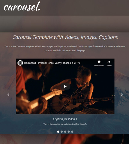
After publishing this Bootstrap carousel template with videos, there were a few users who tried it and asked how to add some additional featured.
For example, how to use a mix of videos and images in the carousel and how to add captions to a video carousel.
So, I added these features to the carousel and today I’ll show you how you can do the same and, at the end of the tutorial, you can download the template with all the files as usual.
Let’s begin!
1. Introduction
As you can see from the LIVE DEMO, in the carousel I’ve embedded two videos from YouTube, one from Vimeo and two images.
In the demo page I have also added some other sections, to give you an idea on how it might look on a real website. I’ll not explain these sections here as they are not relevant to the tutorial.
I’ve used version 4.4.1 of the Bootstrap framework.
Let’s begin with the HTML code.
2. The HTML
The HTML is very simple and you can find it in the file “index.html”.
We use the Bootstrap carousel component by following its documentation here, and the Bootstrap Embed for the videos (documentation here).
Here is the HTML code, I’m showing only the code for the carousel section:
<!-- Top content -->
<div class="top-content">
<div class="container">
<!-- Title and description row -->
<div class="row">
<div class="col col-md-10 offset-md-1">
<h1>Carousel Template with Videos, Images, Captions</h1>
<div class="description">
<p>
This is a free Carousel template with Videos, Images and Captions, made with the Bootstrap 4 framework.
Click on the indicators, controls and links to interact with the page.
</p>
</div>
</div>
</div>
<!-- End title and description row -->
<!-- Carousel row -->
<div class="row">
<div class="col col-md-10 offset-md-1 col-lg-8 offset-lg-2">
<!-- Carousel -->
<div id="carousel-example" class="carousel slide">
<ol class="carousel-indicators">
<li data-target="#carousel-example" data-slide-to="0" class="active"></li>
<li data-target="#carousel-example" data-slide-to="1"></li>
<li data-target="#carousel-example" data-slide-to="2"></li>
<li data-target="#carousel-example" data-slide-to="3"></li>
<li data-target="#carousel-example" data-slide-to="4"></li>
</ol>
<div class="carousel-inner">
<div class="carousel-item active">
<div class="embed-responsive embed-responsive-16by9">
<iframe class="embed-responsive-item" src="https://www.youtube.com/embed/6hgVihWjK2c" allowfullscreen></iframe>
</div>
<div class="carousel-caption">
<h3>Caption for Video 1</h3>
<div class="carousel-caption-description">
<p>This is the caption description text for video 1.</p>
</div>
</div>
</div>
<div class="carousel-item">
<img src="assets/img/slides/slide-img-1.jpg" class="d-block w-100" alt="slide-img-1">
<div class="carousel-caption">
<h3>Caption for Image 1</h3>
<div class="carousel-caption-description">
<p>This is the caption description text for image 1.</p>
</div>
</div>
</div>
<div class="carousel-item">
<div class="embed-responsive embed-responsive-16by9">
<iframe class="embed-responsive-item" src="https://player.vimeo.com/video/84910153?title=0&byline=0&portrait=0&badge=0&color=ffffff" allowfullscreen></iframe>
</div>
<div class="carousel-caption">
<h3>Caption for Video 2</h3>
<div class="carousel-caption-description">
<p>This is the caption description text for video 2.</p>
</div>
</div>
</div>
<div class="carousel-item">
<img src="assets/img/slides/slide-img-2.jpg" class="d-block w-100" alt="slide-img-2">
<div class="carousel-caption">
<h3>Caption for Image 2</h3>
<div class="carousel-caption-description">
<p>This is the caption description text for image 2.</p>
</div>
</div>
</div>
<div class="carousel-item">
<div class="embed-responsive embed-responsive-16by9">
<iframe class="embed-responsive-item" src="https://www.youtube.com/embed/oiKj0Z_Xnjc" allowfullscreen></iframe>
</div>
<div class="carousel-caption">
<h3>Caption for Video 3</h3>
<div class="carousel-caption-description">
<p>This is the caption description text for video 3.</p>
</div>
</div>
</div>
</div>
<a class="carousel-control-prev" href="#carousel-example" role="button" data-slide="prev">
<span class="carousel-control-prev-icon" aria-hidden="true"></span>
<span class="sr-only">Previous</span>
</a>
<a class="carousel-control-next" href="#carousel-example" role="button" data-slide="next">
<span class="carousel-control-next-icon" aria-hidden="true"></span>
<span class="sr-only">Next</span>
</a>
</div>
<!-- End carousel -->
</div>
</div>
<!-- End carousel row -->
</div>
</div>
Important: to make the carousel look good, with the videos and images being responsive and with the same aspect ratio, we use images with a ratio of 16:9. This is because we have embedded the videos with this ratio (16:9).
You can also embed them with other aspect ratios (see documentation of the Embed Bootstrap utility), and in that case you have to also adapt your images.
For example, the two images I’ve used have a size of 1024 x 576 pixels, which means an aspect ratio of 16:9.
Just search “aspect ratio calculator” on Google, to calculate the right size for your images.
3. The CSS
We use some CSS code here to style the page, of which I’ll only show the part that is more relevant to this tutorial. You can find the rest of the code in the file “style.css” (folder “assets/css”).
So, the most important part, relevant to the tutorial, is the part where we move the captions below the slideshow.
We do it with this code by setting the caption’s position to “relative”:
.top-content .carousel-caption {
    position: relative;
    left: auto;
    right: auto;
    bottom: auto;
}
We also adjust a bit the position of the indicators:
.top-content .carousel-indicators {
    bottom: -40px;
}
4. The JavaScript
I have used some JavaScript (jQuery) code here for the fullscreen backgrounds and for the top menu (learn how to create a Bootstrap hamburger top menu here).
I’ll not show this code, you can find it in the file “scripts.js” (folder “assets/js”).
5. Making It Responsive
The good thing about Bootstrap is the fact that all of its components are responsive and don’t need a lot of customization.
In this case we make just a few adjustments to our carousel to make the page look good on all devices.
We hide the indicators (the left and right arrows) when the page is viewed on small devices, for example smartphones.
Next, we increase the distance between control buttons (below the captions) to make them easier to use on touch devices (mobile phones).
We do these modifications with some CSS media queries, in the file “media-queries.css” (folder “assets/css”), as you can see below:
@media (max-width: 767px) {

    /* ... */

    .top-content .carousel-control-prev,
    .top-content .carousel-control-next {
        display: none;
    }

    .top-content .carousel-indicators li {
        margin-left: 10px;
        margin-right: 10px;
    }

    /* ... */

}
In this file there is some other code for other parts of the page, which I’ll not show here and you can find in the template that you can download below.
6. Demo, Download and License
DOWNLOAD: Bootstrap Carousel with Videos, Images, Captions (2950 downloads )
LICENSE:
You can use this template as you like, in personal or commercial projects. Just don’t sell it as is.
7. Conclusion
With some small adjustments and customizations, we just added a mix of videos and images to our Bootstrap carousel.
Next we added some captions with titles and descriptions and moved them below the slideshow with a few lines of CSS code.
We ended the tutorial with some CSS media queries, so that the page adapts well on mobile devices.
That’s all for this time! Do you have any question or suggestion? Let me know in the comments below.
Anli
Stay Updated
Subscribe to the Azmind Newsletter and I’ll update you as soon as I release a new WordPress Theme, Bootstrap Template, Tutorial or other Freebie:
To learn how we use your data when you sign up to our newsletter, read our Privacy Policy here.


What if I just want the carousel nothing else? I want the carousel with the captions and the navigation arrows working the way it is. I don’t need the other aspects of the webpage (though it is beautiful). I then need to be able to take that working carousel and place it in an iframe that can be embedded in a SSO.(Schoology). I can not find an answer to how to do this anywhere.
Hi,
Not sure if my ast comment got to you.
Is there anyway to make the images move with a finger swip for touch screen devices when its at a mobile or tablet size?
The carousel is great, but when I see it on mobile my intuition wants to swipe the images to change them.
Thanks
John