After seeing how to create a Hamburger Menu in HTML/CSS in the last tutorial and, of course, after learning what a Hamburger menu is, today we will continue with a similar type of menu.
More precisely, we will see how to create a Hamburger Top Menu/Navbar using the Bootstrap 4 framework (v4.4.1, latest version as I write this article).
In my opinion, creating this type of menu with Bootstrap is easier and quicker than if you had to create it with HTML and CSS starting from zero, like we did in the other tutorial.
This because Bootstrap comes with many (almost) ready-to-use components that you can customize, like the Navbar component that we will use here.
But on the other hand, Bootstrap has a learning curve and requires some time from you to study it.
So, let’s begin with the tutorial and at the end you can decide which way to go, Bootstrap or HTML/CSS. Free template also available for you to download.
Contents:
- 1. Getting Started: Preview Images of the Final Result
- 2. Page Structure: The HTML Code
- 3. Styling the Menu + Animations: The CSS Code
- 4. What About the JavaScript Code?
- 5. Making It Responsive: CSS Media Queries
- 6. Demo, Download and License
- 7. Conclusion
1. Getting Started: Preview Images of the Final Result
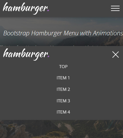
When the user opens the page, the menu will look like this:
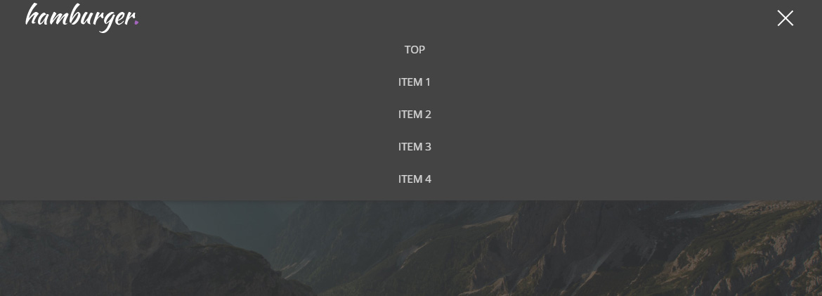
As you see, the menu is closed. By clicking the Hamburger button, the menu opens and it looks like this:
Other tutorial that you will like: Bootstrap 4 Sidebar Menu: Tutorial + Free Template
2. Page Structure: The HTML Code
Now we will begin with the page structure in HTML.
In the demo page I have also created some other sections to make it look more like a “real” website and make it easier for you to customize and maybe create something from it, a website, a web app, etc.
I’ve used Bootstrap version 4.4.1 and its Navbar component.
In this tutorial I will show only the code that is relevant to the menu, not the code for the entire page.
Here it is, file “index.html”:
<body>

    <!-- Top menu -->
    <nav class="navbar navbar-dark fixed-top">
        <div class="container">

            <a class="navbar-brand" href="index.html">Bootstrap Hamburger Menu</a>

            <button class="navbar-toggler" type="button" data-toggle="collapse" data-target="#navbarNav" aria-controls="navbarNav" aria-expanded="false" aria-label="Toggle navigation">
                <span></span>
                <span></span>
                <span></span>
            </button>

            <div class="collapse navbar-collapse" id="navbarNav">
                <ul class="navbar-nav ml-auto">
                    <li class="nav-item">
                        <a class="nav-link scroll-link" href="#top-content">Top</a>
                    </li>
                    <li class="nav-item">
                        <a class="nav-link scroll-link" href="#section-1">Item 1</a>
                    </li>
                    <li class="nav-item">
                        <a class="nav-link scroll-link" href="#section-2">Item 2</a>
                    </li>
                    <li class="nav-item">
                        <a class="nav-link scroll-link" href="#section-3">Item 3</a>
                    </li>
                    <li class="nav-item">
                        <a class="nav-link scroll-link" href="#section-4">Item 4</a>
                    </li>
                </ul>
            </div>

        </div>
    </nav>

    <!-- continues the page content ... -->

</body>
We use a simple navbar as specified in the Bootstrap documentation (link above to learn more). We use the class “fixed-top” to keep it always at the top of the viewport.
Our navbar has 3 main components:
- the logo which is a simple link with the class “navbar-brand”;
- the Hamburger button containing three “span” tags that create a hamburger icon and that we can style separately (hide, show and animate them),
- and the collapsible content: a list of menu items that will be shown / hidden by clicking the button.
One last thing to note here is the “scroll-link” class added to the menu links.
I use this with some JavaScript/jQuery code to make the page scroll to the clicked element. It’s not relevant to this tutorial so I’ll not show it here, but you can see it from the source files.
Let’s continue with the CSS code.
Read also: Bootstrap 4 Navbar Tutorial: How To Quickly Create a Beautiful Top Menu
3. Styling the Menu + Animations: The CSS Code
We’ll style the menu with CSS and add some nice animations to the Hamburger button.
Here is the CSS code only for the menu, file “style.css” (/assets/css/):
/***** Top menu *****/

.navbar {
    background: #444;
    transition: all .6s;
    backface-visibility: hidden;
    box-shadow: 0 2px 5px 1px rgba(51, 51, 51, 0.5);
}

.navbar-dark .navbar-nav {
    font-size: 15px;
    color: #fff;
    text-transform: uppercase;
}

.navbar-dark .navbar-nav .nav-link {
    color: #fff;
    color: rgba(255, 255, 255, 0.8);
    border: 0;
}

.navbar-dark .navbar-nav .nav-link:hover {
    color: #fff;
}

.navbar-dark .navbar-nav .nav-link:focus {
    color: #fff;
    outline: 0;
}

.navbar-dark .navbar-toggler {
    border-color: #444;
}

.navbar-dark .navbar-toggler:focus {
    background: none;
    outline: 0;
}

.navbar-dark .navbar-toggler span {
    display: block;
    width: 30px;
    height: 2px;
    margin: 6px auto;
    background: #fff;
    transition: all .6s cubic-bezier(0.250, 0.100, 0.250, 1.000);
}

.navbar-dark .navbar-toggler:hover span,
.navbar-dark .navbar-toggler:focus span {
    background: #ccc;
}

/* rotate first span */
.navbar-dark .navbar-toggler[aria-expanded="true"] span:first-of-type {
    transform: rotate(45deg) translate(6px, 6px);
}

/* hide second span */
.navbar-dark .navbar-toggler[aria-expanded="true"] span:nth-of-type(2) {
    opacity: 0;
}

/* rotate third span */
.navbar-dark .navbar-toggler[aria-expanded="true"] span:last-of-type {
    transform: rotate(-45deg) translate(5px, -5px);
}

.navbar-dark .navbar-toggler[aria-expanded="false"] span {
    transform: none;
    opacity: 1;
}

.navbar-brand {
    width: 162px;
    height: 44px;
    background: url(../img/logo.png) left center no-repeat;
    border: 0;
    text-indent: -99999px;
}
As you can see the code is almost all pretty simple: we just style the various parts of the menu.
The “difficult” parts and also the most important ones, relevant to the tutorial, are the parts where we style and animate the three “span”-s that make up our Hamburger icon.
Firstly, we “animate” the “span”-s with the CSS “transition” property (last row in the code below):
.navbar-dark .navbar-toggler span {
    display: block;
    width: 30px;
    height: 2px;
    margin: 6px auto;
    background: #fff;
    transition: all .6s cubic-bezier(0.250, 0.100, 0.250, 1.000);
}
This means that when the “span”-s move from one state/position to an other, the movement is smooth like an animations, not direct.
I have created the code for the animation with this tool. You can create many other types of animations using that tool.
Secondly, when the menu is open, we rotate the first and third “span”, and hide the second, thus creating an “X” sign. We use the CSS “transform” property:
/* rotate first span */
.navbar-dark .navbar-toggler[aria-expanded="true"] span:first-of-type {
    transform: rotate(45deg) translate(6px, 6px);
}

/* hide second span */
.navbar-dark .navbar-toggler[aria-expanded="true"] span:nth-of-type(2) {
    opacity: 0;
}

/* rotate third span */
.navbar-dark .navbar-toggler[aria-expanded="true"] span:last-of-type {
    transform: rotate(-45deg) translate(5px, -5px);
}
Lastly, when the menu is closed, we return to the default state, the Hamburger icon, using “transform: none” for all the “span”-s:
.navbar-dark .navbar-toggler[aria-expanded="false"] span {
    transform: none;
    opacity: 1;
}
To distinguish between the two menu states, open / closed, we use the “aria-expanded” attribute of the “button” HTML tag.
This attribute is handled by Bootstrap (and its JavaScript plugins) which gives it a value of “true” if the menu is open, and “false” if it’s closed, when the user clicks on the button.
We use the CSS attribute selector to select the two values of this attribute (“true” and “false”) and style the “span”-s depending on the value.
4. What About the JavaScript Code?
Many parts of this menu are handled by Bootstrap and for this reason it’s easier and faster to work with it, as I said in the beginning of this article.
So, I’ve not used any JavaScript or jQuery code for this menu. I’ve used some for other parts of the page, like for the fullscreen backgrounds or for making the page scroll to the desired location when the user clicks a menu link, but I’ll not show it here as it’s not relevant to the tutorial.
You can find it in the file “scripts.js” (/assets/js/).
5. Making It Responsive: CSS Media Queries
This part is also almost all handled by Bootstrap, I have just customized a few sections of the page.
For the menu I have adjusted the links’ padding on mobile screens (viewport <= 767px), in the file “media-queries.css” (/assets/css/):
@media (max-width: 767px) {

    .navbar-nav .nav-link { padding-top: 0.3rem; padding-bottom: 0.3rem; }

}
I have also used a double-sized logo for Retina devices (iPhones, iPads, etc.), you can see it in the file I mentioned above.
6. Demo, Download and License
DOWNLOAD: Bootstrap Hamburger Menu (4403 downloads )
LICENSE:
You can use this template as you like, in personal or commercial projects. Just don’t sell it as is.
7. Conclusion
That’s all for this tutorial! We just created a nice Hamburger Menu with Bootstrap that you can now download, customize and experiment with it.
Do you have any question? Or maybe any suggestion? Let me know in the comments below.
Anli.
Stay Updated
Subscribe to the Azmind Newsletter and I’ll update you as soon as I release a new WordPress Theme, Bootstrap Template, Tutorial or other Freebie:
To learn how we use your data when you sign up to our newsletter, read our Privacy Policy here.


Anli, thanks! This is the only one that has perfectly work for me.
Thanks Santiago 😉 !