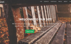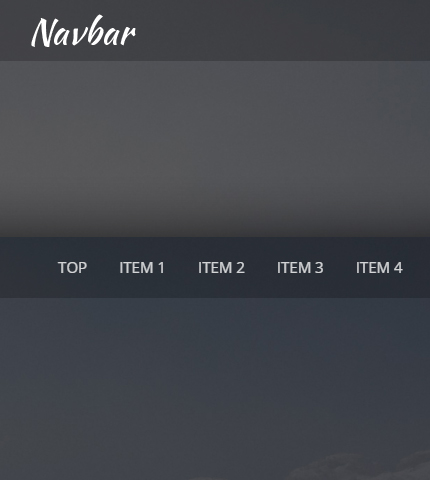
In the past I’ve created and published various Bootstrap navbar templates that you can find here, here and here. I use them in almost all my templates free and premium.
Today we’re going to create another navbar together, this time using Bootstrap version 4. It will be a simple yet very functional top menu, an important part to have in the header of your websites.
I hope you’ll learn one or two things from this tutorial. Let’s begin:
Contents
- 1. Introduction
- 2. Getting Started
- 3. Creating The Navbar
- 4. Styling The Navbar
- 5. Adding Animation To The Navbar’s Background
- 6. Making The Menu Links Work
- 7. Making It Responsive
- 8. Conclusion, Demo and Download
1. Introduction
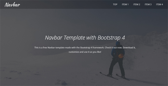
In this tutorial we’re going to create a simple Bootstrap 4 navbar / top menu with a logo and a few menu items that, when clicked, make the page scroll to the desired section.
The top menu will have a transparent background that, when the page scrolls down, will change and become a solid color background.
Below you can see a live preview and, at the end of the tutorial, you can download the navbar template with all its files.
2. Getting Started
Before we begin I recommend you read a few articles about the version 4 of Bootstrap, if you haven’t already. They’ll help you become more familiar with this new version and see what has changed.
These articles and pages are:
- Bootstrap 4: all the changes.
- Flexbox layout module: a complete guide.
- The rem CSS unit: an article to understand it.
- The new Bootstrap grid: the documentation page.
3. Creating The Navbar
In the “index.html” file we’ll have all the HTML code of our template including the code of the navbar. I’ve also added some other sections in this page to better illustrate the navbar functionalities.
First we add all the needed libraries: in the “head” part the CSS libraries, and at the end of “index.html” the JavaScript libraries.
Here you can see the Bootstrap 4 libraries that we need to import.
Next we open the documentation of the Bootstrap 4 navbar component and create the HTML code of our top menu:
<!-- Top menu -->
<nav class="navbar navbar-dark fixed-top navbar-expand-md navbar-no-bg">
    <div class="container">
        <a class="navbar-brand" href="index.html">Bootstrap 4 Navbar</a>
        <button class="navbar-toggler" type="button" data-toggle="collapse" data-target="#navbarNav" aria-controls="navbarNav" aria-expanded="false" aria-label="Toggle navigation">
            <span class="navbar-toggler-icon"></span>
        </button>
        <div class="collapse navbar-collapse" id="navbarNav">
            <ul class="navbar-nav ml-auto">
                <li class="nav-item">
                    <a class="nav-link scroll-link" href="#top-content">Top</a>
                </li>
                <li class="nav-item">
                    <a class="nav-link scroll-link" href="#section-1">Item 1</a>
                </li>
                <li class="nav-item">
                    <a class="nav-link scroll-link" href="#section-2">Item 2</a>
                </li>
                <li class="nav-item">
                    <a class="nav-link scroll-link" href="#section-3">Item 3</a>
                </li>
                <li class="nav-item">
                    <a class="nav-link scroll-link" href="#section-4">Item 4</a>
                </li>
            </ul>
        </div>
    </div>
</nav>
I’m showing only the code of the navbar here. You can see the code for the other sections of the template by downloading it below.
As you can see above, we use a link with the class “navbar-brand” for the logo. We add the logo image in the CSS code (see below).
Next we have a toggle button that is visible in mobile screens to hide/show the menu items.
Last we have the menu items in a “div” tag with classes “collapse navbar-collapse”. Inside of it we use a “ul” list for the items, with classes “navbar-nav ml-auto”.
The class “ml-auto” is used to push the menu items to the right.
4. Styling The Navbar
Next we style the menu with some CSS code in the file “style.css” (assets/css/style.css) like this:
/***** Top menu *****/

.navbar {
    background: #444;
    -o-transition: all .6s;
    -moz-transition: all .6s;
    -webkit-transition: all .6s;
    -ms-transition: all .6s;
    transition: all .6s;
    backface-visibility: hidden;
}

.navbar.navbar-no-bg {
    background: #444;
    background: rgba(0, 0, 0, 0.2);
}

.navbar-dark .navbar-nav {
    font-size: 15px;
    color: #fff;
    text-transform: uppercase;
}

.navbar-dark .navbar-nav .nav-link {
    color: #fff;
    color: rgba(255, 255, 255, 0.8);
    border: 0;
}

.navbar-dark .navbar-nav .nav-link:hover {
    color: #fff;
}

.navbar-dark .navbar-nav .nav-link:focus {
    color: #fff;
    outline: 0;
}

.navbar-expand-md .navbar-nav .nav-link {
    padding-left: 1rem;
    padding-right: 1rem;
}

.navbar-brand {
	width: 105px;
	background: url(../img/logo.png) left center no-repeat;
	border: 0;
	text-indent: -99999px;
}
We style the navbar background and links, and we add a logo image.
For the background we use an additional class called “navbar-no-bg” to make the menu transparent when the user is at the top of the page.
When the page scrolls down to a certain point, we remove the class “navbar-no-bg” from the HTML code using JavaScript, and the menu’s background becomes of a solid color (#444) with no transparency (see next paragraph).
5. Adding Animation To The Navbar’s Background
As you saw above, as the user scrolls up and down the page, we add and remove the class “navbar-no-bg” in the navbar’s HTML code using JavaScript.
But how do we know when to add or remove this class? We need to know in which point of the page the user is as he scrolls up and down.
This way, when the point of the page that we have decided is crossed, we trigger our function to add / remove the “navbar-no-bg” class.
We achieve this using the Waypoints jQuery library.
Here is our JavaScript code in the file “scripts.js” (assets/js/scripts.js):
jQuery(document).ready(function() {

    // ...

    // toggle "navbar-no-bg" class
    $('.top-content .text').waypoint(function() {
        $('nav').toggleClass('navbar-no-bg');
    });

    // ...

});
6. Making The Menu Links Work
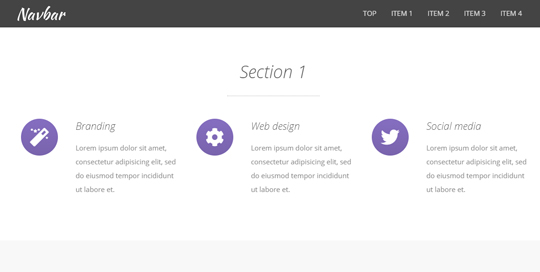
Now we have to make the menu links work, so that when a user clicks on a link, the page must scroll to the desired section.
In the HTML code, that you can see above, we add the class “scroll-link” to each menu link and add the name of the desired section in the “href” property.
Here is again how our link looks like:
<a class="nav-link scroll-link" href="#section-1">Item 1</a>
The class “nav-link” is used from the Bootstrap library.
Now we add the scroll animation and make the links work with JavaScript:
function scroll_to(clicked_link, nav_height) {
    var element_class = clicked_link.attr('href').replace('#', '.');
    var scroll_to = 0;
    if(element_class != '.top-content') {
        element_class += '-container';
        scroll_to = $(element_class).offset().top - nav_height;
    }
    if($(window).scrollTop() != scroll_to) {
        $('html, body').stop().animate({scrollTop: scroll_to}, 1000);
    }
}

jQuery(document).ready(function() {

    /*
        Navigation
    */
    $('a.scroll-link').on('click', function(e) {
        e.preventDefault();
        scroll_to($(this), $('nav').outerHeight());
    });

    // ...

});
We have the function “scroll_to” that handles the scroll animation to the desired location of the page.
Then, each time a user clicks a link with the class “scroll-link”, this function gets called.
You can see all the JavaScript code of this template in the file “scripts.js”.
7. Making It Responsive
The Bootstrap navbar component is responsive by default, but here we have customized it so we have to make sure that it looks good in every device, from mobile phones to desktop computers.
So, we use some CSS Media Queries in the file “media-queries.css” (assets/css/media-queries.css):
@media (min-width: 768px) and (max-width: 991px) {

    .navbar-expand-md .navbar-nav .nav-link { padding-left: 0.6rem; padding-right: 0.6rem; }

    /* ... */

}

@media (max-width: 767px) {

    .navbar.navbar-no-bg { background: #444; }
    .navbar-dark .navbar-toggler { border-color: #444; }
    .navbar-dark .navbar-toggler:focus { background: #333; outline: 0; }
    .navbar-expand-md .navbar-nav .nav-link { padding-top: 0.3rem; padding-bottom: 0.3rem; }

    /* ... */

}
We also use a double sized logo image for Retina devices and define it in “media-queries.css”:
/* Retina-ize images/icons */

@media
only screen and (-webkit-min-device-pixel-ratio: 2),
only screen and (   min--moz-device-pixel-ratio: 2),
only screen and (     -o-min-device-pixel-ratio: 2/1),
only screen and (        min-device-pixel-ratio: 2),
only screen and (                min-resolution: 192dpi),
only screen and (                min-resolution: 2dppx) {

    /* logo */
    .navbar-brand {
        background-image: url(../img/logo@2x.png) !important;
        background-repeat: no-repeat !important;
        background-size: 105px 33px !important;
    }

}
8. Conclusion, Demo and Download
That’s it! We just created a top menu / navbar with Bootstrap 4 and some custom HTML, CSS and JavaScript code.
Now we can add some other elements to our navbar, like icons, search boxes, dropdown menus, etc. These are interesting topics for future tutorials.
Below you can see a live demo and download the template:
DOWNLOAD: Bootstrap 4 Navbar Template (8674 downloads )
I hope you liked it!
All the best,
Anli
Stay Updated
Subscribe to the Azmind Newsletter and I’ll update you as soon as I release a new WordPress Theme, Bootstrap Template, Tutorial or other Freebie:
To learn how we use your data when you sign up to our newsletter, read our Privacy Policy here.
