


In the last few years, I’ve always been amazed by the beautiful admin templates created by different developers, using the Bootstrap framework and listed for sale on ThemeForest or WrapBootstrap, or just released for free to gain some exposure for their work.
The part of these templates that has really caught my attention and that has been very popular these days, is the collapsible sidebar menu.
This type of menu is not only very nice to see, but it also improves the user interface and usability of these templates, especially admin templates. Google has also used it as part of their Material Design style.
As you probably know UI and UX have been two very popular concepts in the last few years, making the internet full of articles about them, and I think learning how to improve them in your websites, templates and web apps is a good thing as it can increase users and returning visitors.
So, for fun, a few days ago I decided to learn how to create one of these sidebar menus using Bootstrap.
I have created many templates in the past but have never used this type of menu, and after asking the developer’s best friend, Google, I found this (very useful) tutorial by Ondrej.
After a few hours of study and work, I created a template with a beautiful sidebar menu and wrote this tutorial hoping that you can learn something from it too. Or just download the template and use it in your projects 😉 .
So, in a few words, if you don’t want to read all of the above, in this tutorial we’ll see how to create a page with a collapsible sidebar menu using Bootstrap.
Let’s get started!
Contents:
- 1. Getting Started: The Page Structure
- 2. The HTML
- 3. The CSS
- 4. The JavaScript (jQuery)
- 5. Making It Responsive (CSS Media Queries)
- 6. Demo and Download
- 7. Conclusion
1. Getting Started: The Page Structure
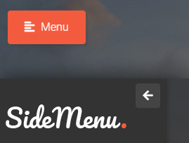
Firstly, before starting let’s see the final result that we are going to achieve.
Here is how our page looks like when it’s loaded on the browser. The sidebar menu is closed and there is a button on the upper left part to open it.

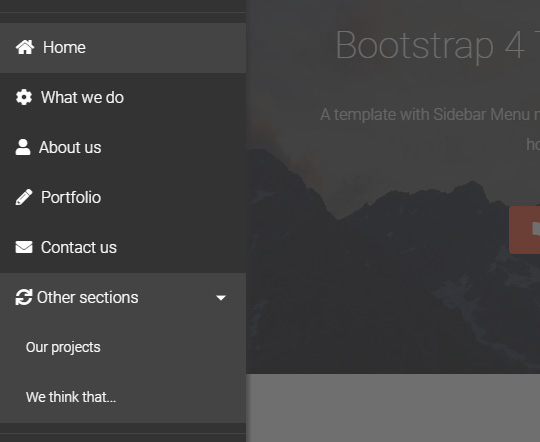
As you can see it’s a simple page that you can use for a portfolio, agency or small business website. It also comes with a working AJAX contact form (here you can learn how to create a similar contact form).
It has two main parts:
- the sidebar menu on the left, also often called “navbar”,
- and the content.
The page’s content is very similar to the Maren template, so in this tutorial I’ll explain only the sidebar part. For the content part you can take a look at this other (similar) tutorial.
As for the look and style, I have used the BootZard form wizard template as a reference, because I like its style and also because this way you now have two templates that you can use in the same project.
In the future I may create other templates with this style.
Let’s continue with the preview of the opened sidebar:

You can see a LIVE DEMO here.
Now let’s begin creating our page with some HTML code.
2. The HTML
The HTML code of our page is in the file “index.html”. First, we include all the CSS and JavaScript resources and libraries, as well as the fonts and icons.
In the “head” part we import the CSS files:
<!doctype html>
<html lang="en">

    <head>

        <!-- Required meta tags -->
        <meta charset="utf-8">
        <meta name="viewport" content="width=device-width, initial-scale=1, shrink-to-fit=no">

        <title>Bootstrap 4 Template with Sidebar Menu</title>

        <!-- CSS -->
        <link rel="stylesheet" href="https://fonts.googleapis.com/css?family=Roboto:100,300,400,500&display=swap">
        <link rel="stylesheet" href="https://stackpath.bootstrapcdn.com/bootstrap/4.3.1/css/bootstrap.min.css" integrity="sha384-ggOyR0iXCbMQv3Xipma34MD+dH/1fQ784/j6cY/iJTQUOhcWr7x9JvoRxT2MZw1T" crossorigin="anonymous">
        <link rel="stylesheet" href="https://use.fontawesome.com/releases/v5.7.2/css/all.css" integrity="sha384-fnmOCqbTlWIlj8LyTjo7mOUStjsKC4pOpQbqyi7RrhN7udi9RwhKkMHpvLbHG9Sr" crossorigin="anonymous">
        <link rel="stylesheet" href="assets/css/jquery.mCustomScrollbar.min.css">
        <link rel="stylesheet" href="assets/css/animate.css">
        <link rel="stylesheet" href="assets/css/style.css">
        <link rel="stylesheet" href="assets/css/media-queries.css">

        <!-- Favicon and touch icons -->
        <link rel="shortcut icon" href="assets/ico/favicon.png">
        <link rel="apple-touch-icon-precomposed" sizes="144x144" href="assets/ico/apple-touch-icon-144-precomposed.png">
        <link rel="apple-touch-icon-precomposed" sizes="114x114" href="assets/ico/apple-touch-icon-114-precomposed.png">
        <link rel="apple-touch-icon-precomposed" sizes="72x72" href="assets/ico/apple-touch-icon-72-precomposed.png">
        <link rel="apple-touch-icon-precomposed" href="assets/ico/apple-touch-icon-57-precomposed.png">

    </head>

    <body>
And at the bottom of the page, right before the closing “body” tag, we import the JavaScript files:
        <!-- Javascript -->
        <script src="assets/js/jquery-3.3.1.min.js"></script>
        <script src="assets/js/jquery-migrate-3.0.0.min.js"></script>
        <script src="https://cdnjs.cloudflare.com/ajax/libs/popper.js/1.14.7/umd/popper.min.js" integrity="sha384-UO2eT0CpHqdSJQ6hJty5KVphtPhzWj9WO1clHTMGa3JDZwrnQq4sF86dIHNDz0W1" crossorigin="anonymous"></script>
        <script src="https://stackpath.bootstrapcdn.com/bootstrap/4.3.1/js/bootstrap.min.js" integrity="sha384-JjSmVgyd0p3pXB1rRibZUAYoIIy6OrQ6VrjIEaFf/nJGzIxFDsf4x0xIM+B07jRM" crossorigin="anonymous"></script>
        <script src="assets/js/jquery.backstretch.min.js"></script>
        <script src="assets/js/wow.min.js"></script>
        <script src="assets/js/jquery.waypoints.min.js"></script>
        <script src="assets/js/jquery.mCustomScrollbar.concat.min.js"></script>
        <script src="assets/js/scripts.js"></script>

    </body>

</html>
As you can see in the code above, we have imported:
- the Bootstrap CSS and JS files (I’ve used version 4.3.1 of Bootstrap),
- the Roboto Google font,
- Font Awesome icons,
- the jQuery library,
- animate.css and wow.js files for animating some parts of the content as soon as they become visible in the viewport (this is not relevant to the tutorial, just to make the page look nicer 😉 ),
- Backstretch jQuery plugin, for the full-screen backgrounds,
- Waypoints to highlight the active menu item as the page scrolls up and down (we’ll see it below),
- jQuery custom content scroller (files “jquery.mCustomScrollbar…”), to replace the default browser scrollbar in the sidebar (we’ll see it below),
- and our custom files, “style.css”, “media-queries.css” and “scripts.js” (we’ll see them below).
Now we’ll create our page. We’ll wrap all our page’s content inside a div tag with the class “wrapper”.
<body>

    <!-- Wrapper -->
    <div class="wrapper">

    </div>
    <!-- End wrapper -->

<!-- ... -->
Next we add our sidebar and content containers inside the wrapper:
<!-- Wrapper -->
<div class="wrapper">

    <!-- Sidebar -->
    <nav class="sidebar">

    </nav>
    <!-- End sidebar -->

    <!-- Content -->
    <div class="content">

    </div>
    <!-- End content -->

</div>
<!-- End wrapper -->
As I mentioned above I’ll not explain the content part in-depth here, I’ll just explain some parts of it that are relevant to the tutorial.
At this point, we are going to create our sidebar by adding all the elements that we need inside its container.
The sidebar HTML code looks like this:
<!-- Sidebar -->
<nav class="sidebar">

    <!-- close sidebar menu -->
    <div class="dismiss">
        <i class="fas fa-arrow-left"></i>
    </div>

    <div class="logo">
        <h3><a href="index.html">Bootstrap 4 Template with Sidebar Menu</a></h3>
    </div>

    <ul class="list-unstyled menu-elements">
        <li class="active">
            <a class="scroll-link" href="#top-content"><i class="fas fa-home"></i> Home</a>
        </li>
        <li>
            <a class="scroll-link" href="#section-1"><i class="fas fa-cog"></i> What we do</a>
        </li>
        <li>
            <a class="scroll-link" href="#section-2"><i class="fas fa-user"></i> About us</a>
        </li>
        <li>
            <a class="scroll-link" href="#section-5"><i class="fas fa-pencil-alt"></i> Portfolio</a>
        </li>
        <li>
            <a class="scroll-link" href="#section-6"><i class="fas fa-envelope"></i> Contact us</a>
        </li>
        <li>
            <a href="#otherSections" data-toggle="collapse" aria-expanded="false" class="dropdown-toggle" role="button" aria-controls="otherSections">
                <i class="fas fa-sync"></i>Other sections
            </a>
            <ul class="collapse list-unstyled" id="otherSections">
                <li>
                    <a class="scroll-link" href="#section-3">Our projects</a>
                </li>
                <li>
                    <a class="scroll-link" href="#section-4">We think that...</a>
                </li>
            </ul>
        </li>
    </ul>

    <div class="to-top">
        <a class="btn btn-primary btn-customized-3" href="#" role="button">
            <i class="fas fa-arrow-up"></i> Top
        </a>
    </div>

    <div class="dark-light-buttons">
        <a class="btn btn-primary btn-customized-4 btn-customized-dark" href="#" role="button">Dark</a>
        <a class="btn btn-primary btn-customized-4 btn-customized-light" href="#" role="button">Light</a>
    </div>

</nav>
<!-- End sidebar -->
If you find it complex, don’t worry, because I’ll explain everything as we go through the tutorial.
So, what have we done here? We have:
- added a button to close the sidebar (the button with the small left arrow);
- added a logo section;
- added all the menu links that, if clicked, take the user to various sections of the page (we’ll explain it below). The menu has also a hidden part which is collapsible where we can put additional links to keep the height of the menu reasonable. It’s done with the Collapse Bootstrap component;
- added a button that takes the user at the top of the page;
- added two buttons to change the style of the sidebar menu, from dark to light and vice versa.
Next, we add a dark overlay level to the page, so that when the sidebar is opened, the rest of the page is darker.
Then, we add a “Menu” button that when clicked, it opens the sidebar and makes visible the overlay layer. We add this button inside the “content” div.
Here is the final HTML code of our page (without the page’s content):
<!-- Wrapper -->
<div class="wrapper">

    <!-- Sidebar -->
    <nav class="sidebar">

        <!-- close sidebar menu -->
        <div class="dismiss">
            <i class="fas fa-arrow-left"></i>
        </div>

        <div class="logo">
            <h3><a href="index.html">Bootstrap 4 Template with Sidebar Menu</a></h3>
        </div>

        <ul class="list-unstyled menu-elements">
            <li class="active">
                <a class="scroll-link" href="#top-content"><i class="fas fa-home"></i> Home</a>
            </li>
            <li>
                <a class="scroll-link" href="#section-1"><i class="fas fa-cog"></i> What we do</a>
            </li>
            <li>
                <a class="scroll-link" href="#section-2"><i class="fas fa-user"></i> About us</a>
            </li>
            <li>
                <a class="scroll-link" href="#section-5"><i class="fas fa-pencil-alt"></i> Portfolio</a>
            </li>
            <li>
                <a class="scroll-link" href="#section-6"><i class="fas fa-envelope"></i> Contact us</a>
            </li>
            <li>
                <a href="#otherSections" data-toggle="collapse" aria-expanded="false" class="dropdown-toggle" role="button" aria-controls="otherSections">
                    <i class="fas fa-sync"></i>Other sections
                </a>
                <ul class="collapse list-unstyled" id="otherSections">
                    <li>
                        <a class="scroll-link" href="#section-3">Our projects</a>
                    </li>
                    <li>
                        <a class="scroll-link" href="#section-4">We think that...</a>
                    </li>
                </ul>
            </li>
        </ul>

        <div class="to-top">
            <a class="btn btn-primary btn-customized-3" href="#" role="button">
                <i class="fas fa-arrow-up"></i> Top
            </a>
        </div>

        <div class="dark-light-buttons">
            <a class="btn btn-primary btn-customized-4 btn-customized-dark" href="#" role="button">Dark</a>
            <a class="btn btn-primary btn-customized-4 btn-customized-light" href="#" role="button">Light</a>
        </div>

    </nav>
    <!-- End sidebar -->

    <!-- Dark overlay -->
    <div class="overlay"></div>

    <!-- Content -->
    <div class="content">

        <!-- open sidebar menu -->
        <a class="btn btn-primary btn-customized open-menu" href="#" role="button">
            <i class="fas fa-align-left"></i> <span>Menu</span>
        </a>

        <!-- ... -->

        <!-- here is the page's content (not shown here) -->

        <!-- ... -->

    </div>
    <!-- End content -->

</div>
<!-- End wrapper -->
Now let’s begin with the CSS code, to style the various elements and position them correctly in the page.
3. The CSS
The CSS code is in the file “style.css”, in the folder “/assets/css/”. We will start by styling the main containers of our page, the wrapper, sidebar and content.
3.1 Styling the wrapper, sidebar and content
Here is the CSS code for these 3 containers:
/***** Wrapper *****/

.wrapper {
    display: block;
}

/***** Sidebar *****/

.sidebar {
    width: 250px;
    height: 100vh;
    position: fixed;
    top: 0;
    left: -255px;
    z-index: 999;
    background: #333;
    color: #fff;
    transition: all .3s;
    box-shadow: 3px 3px 3px rgba(51, 51, 51, 0.5);
    text-align: left;
}

.sidebar.active {
    left: 0;
}

/***** Content *****/

.content {
    width: 100%;
    transition: all 0.3s;
}
As you can see, the wrapper and content are simple: we give a display “block” to the wrapper and a width of 100% of the page to the content. We also add a transition to the content so that the change between the two states “sidebar open / closed” is animated.
As for the sidebar, we give it a fixed width of 250px and a height of 100vh, which means that it will occupy all the height of the browser’s viewport.
Next, we give it a fixed position: we place it in the top left part of the page. We give it a negative left position, so by default it is hidden.
We use “z-index” to keep the sidebar to the front level, so when opened, it is always visible.
We style the background, font color and text alignment, add a transition effect just like we did with the content container above, and we add a shadow with “box-shadow”.
Finally, we define an “active” class that will be toggled with JavaScript (we’ll see it below) that has a left position of 0, which means that if our sidebar has the class “active”, it is opened.
Now you may ask: why I have used a left position of -255px while the sidebar’s width is 250px? This is to make sure that the “box-shadow” of the sidebar is not seen when the sidebar is closed. I could also add the “box-shadow” to the “active” class only (“sidebar.active”).
3.2 Styling the overlay dark layer
For the overlay we have:
/***** Dark overlay *****/

.overlay {
    display: none;
    position: fixed;
    width: 100vw;
    height: 100vh;
    background: rgba(51, 51, 51, 0.7);
    z-index: 998;
    opacity: 0;
    transition: all .5s ease-in-out;
}

.overlay.active {
    display: block;
    opacity: 1;
}
By default the overlay layer is hidden. When it has the “active” class, it is visible. We use JavaScript just like for the sidebar, to add and remove the “active” class (we’ll see it below).
To make sure that this layer covers all our page, we give it a width of 100vw and a height of 100vh. This way it covers all the viewport.
The overlay’s background is dark and transparent, and this layer also has a transition effect.
Lastly, we use a z-index of 998 so the layer is always on the front level, but beneath the sidebar which has a z-index of 999, as we saw above.
3.3 Styling the sidebar’s “Open” and “Close” buttons
Here is the “Open” button’s code:
.open-menu {
    position: fixed;
    top: 20px;
    left: 10px;
    z-index: 997;
    box-shadow: 3px 3px 3px rgba(51, 51, 51, 0.2);
}

.open-menu.btn-customized,
.open-menu.btn-customized:hover,
.open-menu.btn-customized:active,
.open-menu.btn-customized:focus,
.open-menu.btn-customized:active:focus,
.open-menu.btn-customized.active:focus,
.open-menu.btn-customized.btn.btn-primary:not(:disabled):not(.disabled):active,
.open-menu.btn-customized.btn.btn-primary:not(:disabled):not(.disabled):active:focus {
    box-shadow: 3px 3px 3px rgba(51, 51, 51, 0.2);
}

/* Style for all buttons with the class btn-customized */

a.btn-customized {
    margin-left: 5px;
    margin-right: 5px;
    padding: .75rem 1.5rem;
    background: #f35b3f;
    border: 0;
    border-radius: 4px;
    font-size: 16px;
    font-weight: 300;
    color: #fff;
    box-shadow: none;
}

a.btn-customized:hover,
a.btn-customized:active,
a.btn-customized:focus,
a.btn-customized:active:focus,
a.btn-customized.active:focus,
a.btn-customized.btn.btn-primary:not(:disabled):not(.disabled):active,
a.btn-customized.btn.btn-primary:not(:disabled):not(.disabled):active:focus {
    outline: 0;
    background: #cd533d; /* for browsers that don't recognize rgba */
    background: rgba(243, 91, 63, 0.7);
    border: 0;
    color: #fff;
    box-shadow: none;
}
We use some custom CSS code for this button and then inherit the other styling properties, like background and colors, with the class “btn-customized”.
We give it a fixed position at the top left part of the page, so it is always visible and available if and when the user wants to open the sidebar.
Also we use a z-index of 997 so that it is always at the front, but beneath the overlay layer and the sidebar. The button’s icon is from Font Awesome.
Note:
For the “Open” button, I’ve used an “a” tag instead of a “button” tag, because I had already styled the “a.btn-customized” class, but you can also use a “button” and style it separately.
If you don’t like the design of the “Open” button, with a few CSS modifications, you can customize it. For example, you can add a right arrow icon and attach it to the left side of the browser.
Now let’s move on to the “Close” button’s code:
.dismiss {
    width: 35px;
    height: 35px;
    position: absolute;
    top: 10px;
    right: 10px;
    transition: all .3s;
    background: #444;
    border-radius: 4px;
    text-align: center;
    line-height: 35px;
    cursor: pointer;
}

.dismiss:hover,
.dismiss:focus {
    background: #555;
    color: #fff;
}
The code is simple: we set a fixed width and height of 35px, set an absolute position inside the sidebar, we add a transition animation, and we style the background, border radius and text.
Lastly, we style the hover and focus states of the button.
3.4 Styling the Logo, Menu Links and Buttons
Let’s see the CSS code of the logo:
.sidebar .logo {
    padding: 40px 20px;
    border-bottom: 1px solid #444;
    transition: all .3s;
}

.sidebar .logo a {
    display: inline-block;
    width: 172px;
    height: 34px;
    background: url(../img/logo.png) left top no-repeat;
    border: 0;
    text-indent: -999999px;
}
First we style the logo’s container (class “.logo”), we set the padding, border and transition.
Next we style the logo itself: we set the display property to “inline-block”, set a fixed width and height depending on the size of the logo image, add our logo image as background by specifying its url, and set the border to 0.
As a last step, we use the “text-indent” property with a negative value to hide the text of the logo (you can see this text in the HTML code above). This way the logo’s text is not viewable and we see only the logo image that we set as background above.
But why do we add the text to the logo if we don’t want to show it?
This is for accessibility reasons, for screen readers and it is a best practice in general.
Let’s continue with the CSS code for the menu links:
.sidebar ul.menu-elements {
    padding: 10px 0;
    border-bottom: 1px solid #444;
    transition: all .3s;
}

.sidebar ul li a {
    display: block;
    padding: 10px 20px;
    border: 0;
    color: #fff;
}

.sidebar ul li a:hover,
.sidebar ul li a:focus,
.sidebar ul li.active > a:hover,
.sidebar ul li.active > a:focus {
    outline: 0;
    background: #555;
    color: #fff;
}

.sidebar ul li a i {
    margin-right: 5px;
}

.sidebar ul li.active > a,
a[aria-expanded="true"] {
    background: #444;
    color: #fff;
}

.sidebar ul ul a {
    background: #444;
    padding-left: 30px;
    font-size: 14px;
}

.sidebar ul ul li.active > a {
    background: #555;
}

.sidebar a[data-toggle="collapse"] {
    position: relative;
}

.sidebar .dropdown-toggle::after {
    display: block;
    position: absolute;
    top: 50%;
    right: 20px;
    transform: translateY(-50%);
}
As you can see we style the positions, backgrounds, borders, of all menu elements, links, icons and arrows.
Continuing with other parts of our sidebar, we have a “To Top” button and, below it, two other buttons for changing the style of the sidebar.
Here is the CSS for the “To Top” button:
.sidebar .to-top {
    padding: 20px;
    text-align: center;
}

a.btn-customized-3 {
    display: inline-block;
    width: 100%;
    margin: 0;
    padding: .75rem 1.5rem;
    background: #444;
    border: 0;
    border-radius: 4px;
    font-size: 16px;
    font-weight: 300;
    color: #fff;
    box-shadow: none;
}

a.btn-customized-3:hover,
a.btn-customized-3:active,
a.btn-customized-3:focus,
a.btn-customized-3:active:focus,
a.btn-customized-3.active:focus,
a.btn-customized-3.btn.btn-primary:not(:disabled):not(.disabled):active,
a.btn-customized-3.btn.btn-primary:not(:disabled):not(.disabled):active:focus {
    outline: 0;
    background: #555;
    border: 0;
    color: #fff;
    box-shadow: none;
}

a.btn-customized-3 i {
    margin-right: 5px;
}
The code is simple: we first style the button’s container (class “to-top”), and then the button itself (class “btn-customized-3”).
The last sidebar elements are two buttons that we use to change the sidebar’s style. We have two styles, one with dark colors and one with light colors.
The light style is similar to the dark style, so I will not show its code here.
But I’ll show the CSS code for the two buttons (light / dark):
.sidebar .dark-light-buttons {
    padding: 10px 20px 30px 20px;
    text-align: center;
}

a.btn-customized-4 {
    display: inline-block;
    width: 28px;
    height: 28px;
    margin: 0 3px;
    padding: 0;
    background: #444;
    border: 0;
    border-radius: 50%;
    font-size: 16px;
    font-weight: 300;
    color: #fff;
    box-shadow: none;
    text-indent: -999999px;
}

a.btn-customized-4.btn-customized-dark {
    background: #222;
}

a.btn-customized-4.btn-customized-light {
    background: #fff;
}

a.btn-customized-4.btn-customized-dark:hover,
a.btn-customized-4.btn-customized-dark:active,
a.btn-customized-4.btn-customized-dark:focus,
a.btn-customized-4.btn-customized-dark:active:focus,
a.btn-customized-4.btn-customized-dark.active:focus,
a.btn-customized-4.btn-customized-dark.btn.btn-primary:not(:disabled):not(.disabled):active,
a.btn-customized-4.btn-customized-dark.btn.btn-primary:not(:disabled):not(.disabled):active:focus {
    outline: 0;
    background: #555;
    border: 0;
    color: #fff;
    box-shadow: none;
}

a.btn-customized-4.btn-customized-light:hover,
a.btn-customized-4.btn-customized-light:active,
a.btn-customized-4.btn-customized-light:focus,
a.btn-customized-4.btn-customized-light:active:focus,
a.btn-customized-4.btn-customized-light.active:focus,
a.btn-customized-4.btn-customized-light.btn.btn-primary:not(:disabled):not(.disabled):active,
a.btn-customized-4.btn-customized-light.btn.btn-primary:not(:disabled):not(.disabled):active:focus {
    outline: 0;
    background: #555;
    border: 0;
    color: #fff;
    box-shadow: none;
}
The code is similar to that of the previous button: we style the buttons’ container (class “dark-light-buttons”), and then the buttons themselves (class “btn-customized-4”).
That’s it for the CSS code. Now let’s continue with the JavaScript (jQuery) code.
4. The JavaScript (jQuery)
The JavaScript (jQuery) code is in the file “scripts.js” (folder “/assets/js/”).
We will use it to “animate” our sidebar menu and define its behaviour as the user interacts with the page. In a few words, we’ll “make it work”.
Let’s see the various sidebar features one by one:
4.1 Make the Sidebar Menu Open and Close
This is the main feature of a sidebar menu: making it open and close when the user clicks on the “Open” and “Close” buttons. We saw these buttons above.
Here is the code for doing this:
jQuery(document).ready(function() {

    $('.dismiss, .overlay').on('click', function() {
        $('.sidebar').removeClass('active');
        $('.overlay').removeClass('active');
    });

    $('.open-menu').on('click', function(e) {
        e.preventDefault();
        $('.sidebar').addClass('active');
        $('.overlay').addClass('active');
        // close opened sub-menus
        $('.collapse.show').toggleClass('show');
        $('a[aria-expanded=true]').attr('aria-expanded', 'false');
    });

    /* other code */

});
The first part is for closing the sidebar. If the user clicks on the “Close” button (class “dismiss”), or on the “Overlay” layer, we remove the class “active” from both the sidebar and the overlay. By doing this, we hide them, obtaining what we wanted.
The second part is for opening the sidebar. If the user clicks on the “Open” button (class “open-menu”), we add the class “active” to the sidebar and overlay, and close any opened sub-menus.
4.2 Make the Sidebar Menu’s Links Work
We want that when the user clicks on one of the menu’s links, the page scrolls to the right section: for example, if the user clicks on the “About us” link, the page should scroll to the “About us” section.
Here is the code:
/*
    Navigation
*/
$('a.scroll-link').on('click', function(e) {
    e.preventDefault();
    scroll_to($(this), 0);
});

function scroll_to(clicked_link, nav_height) {
    var element_class = clicked_link.attr('href').replace('#', '.');
    var scroll_to = 0;
    if(element_class != '.top-content') {
        element_class += '-container';
        scroll_to = $(element_class).offset().top - nav_height;
    }
    if($(window).scrollTop() != scroll_to) {
        $('html, body').stop().animate({scrollTop: scroll_to}, 1000);
    }
}
All the menu’s links that point to different sections of the page have the class “scroll-link”.
When one of these links is clicked, we call the function “scroll_to” which uses the attribute “href” of the link, calculates the right point where the page should scroll to, and then scrolls it.
4.3 Make the “To Top” Button Work
This is similar to the paragraph above, but in this case we don’t call the function “scroll_to” because we already know the right point where to scroll the page to, which is the top.
Here is the code:
$('.to-top a').on('click', function(e) {
    e.preventDefault();
    if($(window).scrollTop() != 0) {
        $('html, body').stop().animate({scrollTop: 0}, 1000);
    }
});
4.4 Change the Sidebar’s Style / Color Scheme
In the previous paragraphs, we said that we have two buttons which we can use to choose between two sidebar styles.
This is very easy to do with this code:
$('a.btn-customized-dark').on('click', function(e) {
    e.preventDefault();
    $('.sidebar').removeClass('light');
});

$('a.btn-customized-light').on('click', function(e) {
    e.preventDefault();
    $('.sidebar').addClass('light');
});
In a few words, we just add or remove the class “light” from the sidebar, depending on which of the two buttons has been clicked.
4.5 Highlighting the Menu’s Active Link
We highlight the active menu item by adding an “active” class to it, as we saw above in the HTML code.
Then we style this class with CSS and we give it a different background, so it looks different from the other menu items / links, which are not active. You can see the CSS code above.
Now, we want to move the “active” class automatically as the page scrolls up and down, and add it to the current active link. We decide the current active link depending on the position where the user has scrolled the page to.
For this we use the Waypoints library (version 4.0.1), that basically will tell us which element of the page hit the top of the viewport.
If you want to learn more about this library and the many ways you can use it, you can check out its website, linked above.
Here I will only show the code I’ve used, which is this:
$('.section-container').waypoint(function(direction) {
    if (direction === 'down') {
        $('.menu-elements li').removeClass('active');
        $('.menu-elements a[href="#' + this.element.id + '"]').parents('li').addClass('active');
    }
},
{
    offset: '0'
});

$('.section-container').waypoint(function(direction) {
    if (direction === 'up') {
        $('.menu-elements li').removeClass('active');
        $('.menu-elements a[href="#' + this.element.id + '"]').parents('li').addClass('active');
    }
},
{
    offset: '-5'
});
As you can see, when a certain element of the page hits the top of the viewport, first we remove the class “active” from all menu items.
Then we use the “id” attribute’s value of that element to find the menu’s link which has the same value in its “href” attribute.
Finally, we add the class “active” to the “li” tag (or tags, if its a submenu) that contains our link.
Note: I’ve added two waypoints for each direction “up/down” with different offsets, because the “up” direction doesn’t work with only one waypoint and with an offset of 0 (I didn’t understand why, if you find out, let me know).
4.6 Adding a Custom Scrollbar to the Sidebar
We want a custom scrollbar to replace the browser’s default scrollbar in the sidebar, in case the sidebar menu has a height that is bigger than the viewport.
As I mentioned it in the beginning of the tutorial, we use jQuery custom content scroller.
We initialize it and choose a theme:
$('.sidebar').mCustomScrollbar({
    theme: "minimal-dark"
});
And that’s it for the JavaScript code.
5. Making It Responsive (CSS Media Queries)
Bootstrap is responsive by default but we need to customize some parts of the page – the way they look in different screen sizes, on smartphones, tablets and desktops. So we’ll use some custom CSS media queries.
The code is in the file “media-queries.css” (in the folder “/assets/css/”).
Here I’ll show only the code for the sidebar, which you can see below:
@media
only screen and (-webkit-min-device-pixel-ratio: 2),
only screen and (   min--moz-device-pixel-ratio: 2),
only screen and (     -o-min-device-pixel-ratio: 2/1),
only screen and (        min-device-pixel-ratio: 2),
only screen and (                min-resolution: 192dpi),
only screen and (                min-resolution: 2dppx) {

    .sidebar .logo a {
        background-image: url(../img/logo@2x.png) !important;
        background-repeat: no-repeat !important;
        background-size: 172px 34px !important;
    }

    .sidebar.light .logo a {
        background-image: url(../img/logo-dark@2x.png) !important;
    }

}
As you can see, we only customize the sidebar’s logo and replace it with the “@2x” version (double size) of the logo image. This is done to make it look good on Retina devices.
If you want to see the media queries for the other parts of the page, take a look at the file I mentioned above.
6. Demo and Download
And here we are finished with the tutorial. Our sidebar menu is ready! Below you can see a live demo and download the files.
DOWNLOAD FREE on Gumroad: Get the Bootstrap Sidebar Menu Template
7. Conclusion
We just created a sidebar menu using the Bootstrap 4 framework and some custom code. Now you can download the template, customize it and use it in your websites or apps.
I hope you found this tutorial useful and if you have any questions or suggestions, or if I forgot to explain some part, let me know in the comments.
All the best,
Anli
Stay Updated
Subscribe to the Azmind Newsletter and I’ll update you as soon as I release a new WordPress Theme, Bootstrap Template, Tutorial or other Freebie:
To learn how we use your data when you sign up to our newsletter, read our Privacy Policy here.

thanks !
gracias! muy bueno