


In simple words, in modern web design, a “Hamburger Menu” is a simple menu either horizontal or vertical, that can be activated or deactivated by clicking on a button which has an icon with three rows when the menu is closed, and an “X” sign when the menu is open.
This icon with three rows resembles a hamburger and gives the name “Hamburger Menu” to this type of menu.
Usually the menu comes with nice animations when you open or close it that can be created with CSS3, JavaScript or a mix of these two as in the case we’ll see today.
So, as you can read from the title, today we will see how to create a Hamburger Menu with animations.
It will be an horizontal navbar / top menu and at the end you will also have all the files as a handy template to customize and use in projects.
Let’s begin!
Contents:
- 1. Before we begin: Image Previews of the Final Result
- 2. Page Structure: The HTML Code
- 3. Styling the Menu + Animations: The CSS code
- 4. Handling the “Open / Closed” states with jQuery
- 5. Making It Responsive with CSS Media Queries
- 6. Demo, Download and License
- 7. Conclusion
1. Before we begin: Image Previews of the Final Result
Ok, let’s start with some image previews.
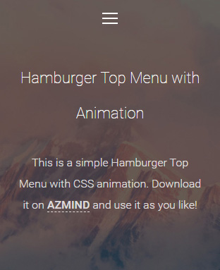
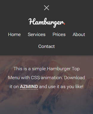
Below you can see how our menu looks like when it’s open, which is the default state when the page is viewed from a Desktop computer or a Tablet. On Mobile screens the default state of the menu is closed (we’ll see this later).
Menu Open:

Menu Closed:

Other tutorial that you will like: Bootstrap 4 Sidebar Menu: Tutorial + Free Template
2. Page Structure: The HTML Code
To create the menu we will use HTML, CSS and JavaScript (jQuery). The animations will be created with CSS3 and the change between the two states “open/closed” will be handled with jQuery.
We will also use some CSS media queries to customize the look for mobile screens.
We will begin with the page structure/elements in HTML. Here is the HTML code, file “index.html”, I’ll only show the relevant parts of the code to keep the tutorial short:
<body>

    <nav class="top-menu active">

        <div class="components">

            <div class="logo">
                <a href="index.html">Hamburger Top Menu</a>
            </div>

            <ul class="navigation">
                <li><a href="#">Home</a></li>
                <li><a href="#">Services</a></li>
                <li><a href="#">Prices</a></li>
                <li><a href="#">About</a></li>
                <li><a href="#">Contact</a></li>
            </ul>

        </div>

    </nav>

    <div class="hamburger-button">
        <button type="button">
            <span></span>
            <span></span>
            <span></span>
        </button>
    </div>

    <div class="page-content">
        <h1>Hamburger Top Menu with Animation</h1>
        <p>This is a simple Hamburger Top Menu...</p>
    </div>

<!-- ... -->

</body>
As you can see, we have created a simple menu (the “nav” tag) with a logo and a list of menu items. We use the class “active” to distinguish between the open and closed states.
Then we have the hamburger button outside the menu: this way it is easier to handle it and give it an absolute position in the page.
The hamburger icon (the three rows) inside the button is created with three “span” tags. We use “span”-s so we can “animate” them separately to create a nice effect when the user opens or closes the menu.
After that, we have the page content: I’ve added some text content for demo purposes, just to give an idea about how the menu looks like on a real website.
Read next: Bootstrap 4 Navbar Tutorial: How To Quickly Create a Beautiful Top Menu
3. Styling the Menu + Animations: The CSS code
Ok, now we will style the menu and create the animations with some CSS code. You can find this code in the file “style.css” (/assets/css/).
Here I’ll show only the code for the menu and the hamburger icon, not for the entire page.
Let’s start with the menu’s code:
/* Menu code */

.top-menu {
    position: fixed;
    top: -65px;
    left: 0;
    width: 100%;
    padding: 10px 0;
    background: #333;
    box-shadow: 0 2px 5px 1px rgba(51, 51, 51, 0.5);
    transition: all .5s cubic-bezier(0.250, 0.250, 0.750, 0.750);
}

.top-menu.active {
    top: 0;
}

.top-menu .components {
    max-width: 1140px;
    margin: 0 auto;
    overflow: hidden;
}

.top-menu .logo {
    float: left;
    width: 20%;
    text-align: left;
}

.top-menu .logo a {
    display: inline-block;
    width: 123px;
    height: 40px;
    background: url(../img/logo.png) left center no-repeat;
    border: 0;
    text-indent: -999999px;
}

.top-menu .navigation {
    float: left;
    width: 70%;
    text-align: right;
}

.top-menu .navigation li {
    display: inline-block;
}

.top-menu .navigation li a {
    display: inline-block;
    padding: 5px 10px;
    color: #fff;
    border: 0;
}

.top-menu .navigation li a:hover,
.top-menu .navigation li a:focus {
    color: #ccc;
    border: 0;
    outline: 0;
}
The code is very simple. A few things that need mentioning are:
- The menu has a “fixed” position on the top part of the viewport.
- The menu has initially a top position of -65px, so by default it is not visible. We make it visible by using the class “.active” which has a top position of 0px.
- We add some animation to the menu by using the CSS “transition” property. I’ve used this handy tool for creating nice animations.
Now let’s continue with the hamburger button’s code:
/* Hamburger button code */

.hamburger-button {
    position: relative;
    max-width: 1140px;
    margin: 0 auto;
}

.hamburger-button button {
    position: absolute;
    top: 10px;
    right: 0;
    width: 40px;
    height: 40px;
    background: none;
    border: 0;
    box-shadow: none;
    cursor: pointer;
    vertical-align: middle;
    z-index: 999;
}

.hamburger-button button:focus {
    outline: 0;
}

.hamburger-button button span {
    display: block;
    width: 80%;
    height: 2px;
    margin: 5px auto;
    background: #fff;
    transition: all .8s cubic-bezier(0.250, 0.100, 0.250, 1.000);
}

.hamburger-button button:hover span,
.hamburger-button button:focus span {
    background: #ccc;
}

/* rotate first span */
.hamburger-button button span:first-of-type {
    transform: rotate(45deg) translate(5px, 5px);
}

/* hide second span */
.hamburger-button button span:nth-of-type(2) {
    opacity: 0;
}

/* rotate third span */
.hamburger-button button span:last-of-type {
    transform: rotate(-45deg) translate(5px, -5px);
}

.hamburger-button button.menu-closed span {
    transform: none;
    opacity: 1;
}
Our button has a width of 40px, an absolute position and a “z-index” of 999 to make it remain always visible.
Next, we style our three “span”-s: we set their width, height, margins, etc., and use the CSS “transition” property to add some animation as we did with the menu.
After that, we get to one of the most important parts of this tutorial: “transforming” the “span”-s so we have three rows in one state (closed menu) and an “X” sign in the other state (open menu).
For this, we use the CSS “transform” property. To create the “X” sign, we rotate the first and the third “span”, and hide the second.
To distinguish between the two states, we use the class “.menu-closed” which we add to the button. When the button has this class, we remove all transformations and make all “span”-s visible, thus returning to the hamburger icon (the three rows).
4. Handling the “Open / Closed” states with jQuery
We have a few rows of jQuery code, file “scripts.js” (/assets/js/), just for adding and removing the classes “active” and “menu-closed” when the user clicks the hamburger button:
$('.hamburger-button button').on('click', function(){
    $('.top-menu').toggleClass('active');
    $(this).toggleClass('menu-closed');
});
5. Making It Responsive with CSS Media Queries
On mobile devices, like smartphones, the menu will be closed by default and it will look like this:
When the user clicks on the hamburger button, it will look like this:
We will use CSS Media Queries to handle all this. Here is the code, file “media-queries.css” (/assets/css/), as usual I’ll show only the relevant code:
@media (min-width: 992px) and (max-width: 1199px) {

    .top-menu .components {
        max-width: 992px; padding-left: 15px; padding-right: 15px;
    }

    .hamburger-button { max-width: 992px; }
    .hamburger-button button { right: 15px; }

}

@media (min-width: 768px) and (max-width: 991px) {

    .top-menu .components {
        max-width: 768px; padding-left: 15px; padding-right: 15px;
    }

    .hamburger-button { max-width: 768px; }
    .hamburger-button button { right: 15px; }

}

@media (max-width: 767px) {

    .top-menu { top: 0; }

    .top-menu.active {
        top: -300px;
        transition: all 1.2s cubic-bezier(0.250, 0.250, 0.750, 0.750);
    }

    .top-menu .components { max-width: 100%; padding-top: 50px; }
    .top-menu .logo { float: none; width: 100%; text-align: center; }
    .top-menu .navigation { float: none; width: 100%; text-align: center; }

    .hamburger-button { width: 40px; }

    .hamburger-button button span:first-of-type { transform: none; opacity: 1; }
    .hamburger-button button span:nth-of-type(2) { transform: none; opacity: 1; }
    .hamburger-button button span:last-of-type { transform: none; opacity: 1; }

    .hamburger-button button.menu-closed span:first-of-type {
        transform: rotate(45deg) translate(5px, 5px);
    }
    .hamburger-button button.menu-closed span:nth-of-type(2) {
        opacity: 0;
    }
    .hamburger-button button.menu-closed span:last-of-type {
        transform: rotate(-45deg) translate(5px, -5px);
    }

    .page-content { padding-top: 80px; padding-bottom: 60px; }

}
First, we make some small adjustments to the menu, for tablets and other devices with smaller screens than desktops.
Then, we get to the mobile devices part: screens (viewport) smaller than 767px.
To set the closed menu as the default state, the “active” and “menu-closed” classes will be changed: the “active” class which we previously used for when the menu was open, will now be used when the menu is closed. Not the most elegant way of doing it, but it works.
We will do the same for the “menu-closed” class (which controls the hamburger button) and overwrite the initial CSS rules, only for these screen sizes (<= 767px), of course. Also, to hide the menu by default we give a top position of "-300px" to the “active” class.
Next, we place the hamburger button in the center of the page. We do this by giving a width of 40px to the “hamburger-button” class which is the wrapper of our button, and has left and right margins set to “auto”. So, it always stays in the center of the page.
6. Demo, Download and License
DOWNLOAD: Hamburger Menu (3562 downloads )
LICENSE:
You can use this template as you like, in personal or commercial projects. Just don’t sell it as is.
7. Conclusion
That’s it! We just created a nice top menu with a hamburger “open/close” button, all accompanied by some nice animations. Now, you can integrate it with a “real” website, web app or other project.
I hope you found this tutorial helpful and, as usual, for every question or suggestion let me know in the comments below.
Anli
Stay Updated
Subscribe to the Azmind Newsletter and I’ll update you as soon as I release a new WordPress Theme, Bootstrap Template, Tutorial or other Freebie:
To learn how we use your data when you sign up to our newsletter, read our Privacy Policy here.
