


In our daily web design work it happens often that we find a good free resource, for example a form or a beautiful animated button, and we immediately think to integrate it in one of our sites.
Or it can happen that a client has purchased a premium template for his site and wants to add a login and a registration page.
So you search on the web and find a really nice and free login form, you download it and are ready to integrate it in your client’s template.
What happens oftentimes is that you find it difficult to integrate the form in your project, or it lacks support from the creator. This also happens with some of my free resources as you can see in some users’ comments on this site.
In today’s tutorial we’ll do something very similar. We’ll take a free login form here and integrate it in the Lancar Bootstrap template, to create a beautiful login page with fullscreen background.
And if I see that the tutorial is useful to you, in the future I’ll do more of these tutorials for my other free forms and resources.
Let’s begin!
1. Introduction
Before we begin let’s see the end result that we’re going to achieve:

Do you like it? I hope so!
Now, with the live demo out of the way, you can choose to use this tutorial in two ways:
- you can follow it and learn how to integrate the form in your project;
- or you can get the ready-to-use version included in the Lancar template and save some time.
If you’ve chosen the first option, download these free login templates, extract the .zip package and choose one of the templates. Each one of them is placed in its own folder, named “form-1”, “form-2”, etc.
I’d choose the first, but they’re similar.
2. The HTML
Open the “index.html” file inside the “form-1” folder with your favorite code editor. I use Eclipse.
Select and copy only the form’s code. It looks like this:
<div class="container">
    <div class="row">
        <div class="col-sm-8 col-sm-offset-2 text">
            <h1><strong>Bootstrap</strong> Login Form</h1>
            <div class="description">
                <p>
                    This is a free responsive login form made with Bootstrap.
                    Download it on <a href="https://azmind.com"><strong>AZMIND</strong></a>, customize and use it as you like!
                </p>
            </div>
        </div>
    </div>
    <div class="row">
        <div class="col-sm-6 col-sm-offset-3 form-box">
            <div class="form-top">
                <div class="form-top-left">
                    <h3>Login to our site</h3>
                    <p>Enter your username and password to log on:</p>
                </div>
                <div class="form-top-right">
                    <i class="fa fa-key"></i>
                </div>
            </div>
            <div class="form-bottom">
                <form role="form" action="" method="post" class="login-form">
                    <div class="form-group">
                        <label class="sr-only" for="form-username">Username</label>
                        <input type="text" name="form-username" placeholder="Username..." class="form-username form-control" id="form-username">
                    </div>
                    <div class="form-group">
                        <label class="sr-only" for="form-password">Password</label>
                        <input type="password" name="form-password" placeholder="Password..." class="form-password form-control" id="form-password">
                    </div>
                    <button type="submit" class="btn">Sign in!</button>
                </form>
            </div>
        </div>
    </div>
    <div class="row">
        <div class="col-sm-6 col-sm-offset-3 social-login">
            <h3>...or login with:</h3>
            <div class="social-login-buttons">
                <a class="btn btn-link-1 btn-link-1-facebook" href="#">
                    <i class="fa fa-facebook"></i> Facebook
                </a>
                <a class="btn btn-link-1 btn-link-1-twitter" href="#">
                    <i class="fa fa-twitter"></i> Twitter
                </a>
                <a class="btn btn-link-1 btn-link-1-google-plus" href="#">
                    <i class="fa fa-google-plus"></i> Google Plus
                </a>
            </div>
        </div>
    </div>
</div>
Now create a new HTML page in your template’s folder. It must have the same header and footer as the rest of the template, and an empty body where we’ll add the login form.
I’ve created the file “login.html”. Here is its structure, without the form’s code:
<!DOCTYPE html>
<html lang="en">
<head>
<meta charset="utf-8">
<meta http-equiv="X-UA-Compatible" content="IE=edge">
<meta name="viewport" content="width=device-width, initial-scale=1">
<title>Lancar - Bootstrap Business Template</title>
<!-- CSS -->
<link rel="stylesheet" href="https://fonts.googleapis.com/css?family=Open+Sans:300,300i,400,700,700i">
<link rel="stylesheet" href="assets/bootstrap/css/bootstrap.min.css">
<link rel="stylesheet" href="assets/font-awesome/css/font-awesome.min.css">
<link rel="stylesheet" href="assets/elegant-font/code/style.css">
<link rel="stylesheet" href="assets/css/animate.css">
<link rel="stylesheet" href="assets/css/magnific-popup.css">
<link rel="stylesheet" href="assets/css/awesome-bootstrap-checkbox.css">
<link rel="stylesheet" href="assets/css/style.css">
<link rel="stylesheet" href="assets/css/media-queries.css">
<!-- HTML5 Shim and Respond.js IE8 support of HTML5 elements and media queries -->
<!-- WARNING: Respond.js doesn't work if you view the page via file:// -->
<!--[if lt IE 9]>
<script src="https://oss.maxcdn.com/libs/html5shiv/3.7.0/html5shiv.js"></script>
<script src="https://oss.maxcdn.com/libs/respond.js/1.4.2/respond.min.js"></script>
<![endif]-->
<!-- Favicon and touch icons -->
<link rel="shortcut icon" href="assets/ico/favicon.png">
<link rel="apple-touch-icon-precomposed" sizes="144x144" href="assets/ico/apple-touch-icon-144-precomposed.png">
<link rel="apple-touch-icon-precomposed" sizes="114x114" href="assets/ico/apple-touch-icon-114-precomposed.png">
<link rel="apple-touch-icon-precomposed" sizes="72x72" href="assets/ico/apple-touch-icon-72-precomposed.png">
<link rel="apple-touch-icon-precomposed" href="assets/ico/apple-touch-icon-57-precomposed.png">
</head>
<body class="dark">
<!-- Loader -->
<div class="loader">
<div class="loader-img"></div>
</div>
<!-- Top menu -->
<nav class="navbar navbar-fixed-top navbar-no-bg" role="navigation">
<div class="container">
<div class="navbar-header">
<button type="button" class="navbar-toggle collapsed" data-toggle="collapse" data-target="#top-navbar-1">
<span class="sr-only">Toggle navigation</span>
<span class="icon-bar"></span>
<span class="icon-bar"></span>
<span class="icon-bar"></span>
</button>
<a class="navbar-brand" href="index.html">Lancar - Bootstrap Business Template</a>
</div>
<!-- Collect the nav links, forms, and other content for toggling -->
<div class="collapse navbar-collapse" id="top-navbar-1">
<ul class="nav navbar-nav navbar-right">
<li><a href="index.html">Home</a></li>
<li><a href="services.html">Services</a></li>
<li><a href="portfolio.html">Work</a></li>
<li><a href="prices.html">Price</a></li>
<li><a href="blog.html">Blog</a></li>
<li><a href="about.html">About</a></li>
<li><a href="contact.html">Contact</a></li>
</ul>
</div>
</div>
</nav>
<!-- Login page -->
<div class="login-page">
<!-- THE FORM'S CODE WILL BE HERE -->
</div>
<!-- Footer -->
<footer>
<div class="container">
<div class="row">
<div class="col-sm-12">
<div class="scroll-to-top">
<a href="#"><i class="fa fa-chevron-up"></i></a>
</div>
</div>
</div>
<div class="row">
<div class="col-sm-7 footer-copyright">
© Lancar Bootstrap Template by <a href="https://azmind.com">Azmind</a>.
</div>
<div class="col-sm-5 footer-social">
<a href="#"><i class="fa fa-facebook"></i></a>
<a href="#"><i class="fa fa-dribbble"></i></a>
<a href="#"><i class="fa fa-twitter"></i></a>
<a href="#"><i class="fa fa-google-plus"></i></a>
<a href="#"><i class="fa fa-pinterest"></i></a>
</div>
</div>
</div>
</footer>
<!-- Javascript -->
<script src="assets/js/jquery-3.2.1.min.js"></script>
<script src="assets/js/jquery-migrate-3.0.0.min.js"></script>
<script src="assets/bootstrap/js/bootstrap.min.js"></script>
<script src="assets/js/jquery.backstretch.min.js"></script>
<script src="assets/js/wow.min.js"></script>
<script src="assets/js/retina-1.1.0.min.js"></script>
<script src="assets/js/jquery.magnific-popup.min.js"></script>
<script src="assets/js/waypoints.min.js"></script>
<script src="assets/js/jquery.countTo.js"></script>
<script src="assets/js/masonry.pkgd.min.js"></script>
<script src="assets/js/scripts.js"></script>
<!--[if lt IE 10]>
<script src="assets/js/placeholder.js"></script>
<![endif]-->
</body>
</html>
Paste the form’s code we copied above. It will look like this:
<!-- Login page -->
<div class="login-page">

    <!-- THE FORM'S CODE WILL BE HERE -->

    <div class="container">
        <div class="row">
            <div class="col-sm-8 col-sm-offset-2 login-text wow fadeIn">
                <h1>Login to our site</h1>
                <p>Use the form below to login to our website if you have an account.</p>
            </div>
        </div>
        <div class="row">
            <div class="col-sm-6 col-sm-offset-3 login-box wow fadeInUp">

                <div class="l-form-top">
                    <div class="l-form-top-left">
                        <h3>Sign in</h3>
                        <p>Enter your username and password to log on:</p>
                    </div>
                    <div class="l-form-top-right">
                        <i class="fa fa-lock"></i>
                    </div>
                </div>
                <div class="l-form-bottom">
                    <form role="form" action="" method="post">
                        <div class="form-group">
                            <label class="sr-only" for="l-form-username">Username</label>
                            <input type="text" name="l-form-username" placeholder="Username..." class="l-form-username form-control" id="l-form-username">
                        </div>
                        <div class="form-group">
                            <label class="sr-only" for="l-form-password">Password</label>
                            <input type="password" name="l-form-password" placeholder="Password..." class="l-form-password form-control" id="l-form-password">
                        </div>
                        <button type="submit" class="btn">Sign in!</button>
                        <div class="checkbox">
                            <input type="checkbox" id="remember-me" class="styled">
                            <label for="remember-me">Remember me</label>
                        </div>
                    </form>
                </div>

            </div>
        </div>
        <div class="row">
            <div class="col-sm-6 col-sm-offset-3 login-social">
                <h3>...or login with:</h3>
                <div class="login-social-buttons">
                    <a class="btn btn-link-1" href="#">
                        <i class="fa fa-facebook"></i> Facebook
                    </a>
                    <a class="btn btn-link-1" href="#">
                        <i class="fa fa-twitter"></i> Twitter
                    </a>
                    <a class="btn btn-link-1" href="#">
                        <i class="fa fa-google"></i> Google
                    </a>
                </div>
            </div>
        </div>
    </div>

</div>
As you can see, apart from changing some text, I’ve also changed some classes’ names in the HTML code, to make it more consistent and easier to read and work with, but the structure is the same.
Depending on the template you are using, you might want to use your own classes. I encourage this, because I think experimenting by yourself will help you learn better.
In this template I’m using Bootstrap v3.3.7. You can learn more about forms and their correct use from the Bootstrap documentation.
And here you can learn more about the Bootstrap grid system, if you need.
I’m also using some classes for the animation effects, like “wow”, “fadeIn”, “fadeInUp”. They are defined in the files “animate.css” and “wow.min.js”. This is a topic for another tutorial.
3. The CSS
Next we style the form using CSS in the file “style.css” in “/assets/css/”. Here is the code:
/***** Login page *****/

.login-page { padding: 140px 0 100px 0; }
.login-text { padding-bottom: 60px; color: #fff; }
.login-text h1 { color: #fff; text-shadow: 0 1px 6px rgba(51, 51, 51, 0.2); }
.login-text p { margin-top: 20px; font-size: 22px; line-height: 36px; text-shadow: 0 1px 5px rgba(51, 51, 51, 0.4); }

.l-form-top {
    overflow: hidden; padding: 0 30px 20px 30px; background: #404040; background: rgba(51, 51, 51, 0.8); text-align: left;
    -moz-border-radius: 6px 6px 0 0; -webkit-border-radius: 6px 6px 0 0; border-radius: 6px 6px 0 0;
}
.l-form-top-left { float: left; width: 75%; padding-top: 30px; }
.l-form-top-left h3 { margin-top: 0; color: #fff; }
.l-form-top-left p { opacity: 0.8; font-size: 18px; line-height: 32px; color: #fff; }
.l-form-top-right { float: left; width: 25%; padding-top: 10px; font-size: 66px; color: #fff; line-height: 100px; text-align: right; opacity: 0.3; }
.l-form-bottom {
    padding: 30px 30px 35px 30px; background: #404040; background: rgba(51, 51, 51, 0.7); text-align: left;
    -moz-border-radius: 0 0 6px 6px; -webkit-border-radius: 0 0 6px 6px; border-radius: 0 0 6px 6px;
}

.login-box input[type="text"],
.login-box input[type="password"] {
    height: 52px;
    margin: 0;
    padding: 0 20px;
    vertical-align: middle;
    background: #fff;
    border: 3px solid #fff;
    font-family: 'Open Sans', sans-serif;
    font-size: 22px;
    font-weight: 300;
    line-height: 52px;
    color: #888;
    -moz-border-radius: 6px; -webkit-border-radius: 6px; border-radius: 6px;
    -moz-box-shadow: none; -webkit-box-shadow: none; box-shadow: none;
    -o-transition: all .3s; -moz-transition: all .3s; -webkit-transition: all .3s; -ms-transition: all .3s; transition: all .3s;
}

.login-box input[type="text"]:focus,
.login-box input[type="password"]:focus {
    outline: 0; background: #fff; border: 3px solid #2ba560;
    -moz-box-shadow: none; -webkit-box-shadow: none; box-shadow: none;
}

.login-box input.input-error { border-color: #e7603c; }

.login-box input[type="text"]::-moz-placeholder, .login-box input[type="password"]::-moz-placeholder { color: #888; }
.login-box input[type="text"]:-ms-input-placeholder, .login-box input[type="password"]:-ms-input-placeholder { color: #888; }
.login-box input[type="text"]::-webkit-input-placeholder, .login-box input[type="password"]::-webkit-input-placeholder { color: #888; }

.login-box button.btn {
    width: 100%;
    height: 52px;
    margin: 0;
    padding: 0 20px;
    vertical-align: middle;
    background: #2ba560;
    border: 0;
    font-family: 'Open Sans', sans-serif;
    font-size: 22px;
    font-weight: 300;
    line-height: 52px;
    color: #fff;
    -moz-border-radius: 6px; -webkit-border-radius: 6px; border-radius: 6px;
    text-shadow: none;
    -moz-box-shadow: none; -webkit-box-shadow: none; box-shadow: none;
    -o-transition: all .3s; -moz-transition: all .3s; -webkit-transition: all .3s; -ms-transition: all .3s; transition: all .3s;
}

.login-box button.btn:hover,
.login-box button.btn:focus,
.login-box button.btn:active,
.login-box button.btn:active:focus,
.login-box button.btn.active:focus {
    outline: 0; background: #279456; border: 0; color: #fff;
    -moz-box-shadow: none; -webkit-box-shadow: none; box-shadow: none;
}

.login-box .checkbox { margin-top: 15px; margin-bottom: 0; }
.login-box .checkbox label { font-size: 18px; line-height: 18px; font-weight: 300; color: #fff; color: rgba(255,255,255,.8); }
.login-box .checkbox label::before { border-color: #fff; border-radius: 4px; }

.login-social { margin-top: 35px; }
.login-social h3 { color: #fff; }
.login-social-buttons { margin-top: 30px; }
First, we style the page container and the text, classes “login-page” and “login-text”.
Second, we style the form’s parts / components, classes “l-form-top”, “l-form-top-left”, “l-form-top-right” and “l-form-bottom”.
Third, we style the input fields, username and password, and the submit button.
For the “Remember me” checkbox I’ve used the Awesome Bootstrap Checkbox CSS library, the file “awesome-bootstrap-checkbox.css” in “/assets/css/”. It is a pure CSS way to make checkboxes and radio inputs look prettier and add some style to them.
I’ve used a few lines of code for styling the checkbox and making it match the overall look of the form.
Lastly, we style the social buttons. In the above code we define only their position. Their look is defined in the beginning of “style.css”, because these buttons are also used in other pages of the template. Here is the code:
/* button link 1 */

.btn-link-1 {
    display: inline-block; height: 52px; margin: 5px; padding: 0 20px; background: #2ba560; border: 0;
    font-size: 22px; font-weight: 300; line-height: 50px; color: #fff;
    -moz-border-radius: 6px; -webkit-border-radius: 6px; border-radius: 6px;
}
.btn-link-1:hover, .btn-link-1:focus, .btn-link-1:active, .btn-link-1:active:focus  { outline: 0; background: #279456; color: #fff; }

.btn-link-1 i { padding-right: 5px; }
Media Queries
In the template I use some CSS media queries to make it responsive, so it looks good when viewed from different devices, desktop computers, smartphones, tablets, etc.
The Bootstrap framework has its own media queries but, depending on the template or website I’m creating, I often need to add some other media queries to make the various page components responsive.
In this case I’ve added them in the file “media-queries.css”, in “/assets/css/”.
For our login form we need only a line of code to make the “lock” icon on the top smaller when viewed on screens with a width narrower than 415 pixels, class “l-form-top-right”:
@media (max-width: 415px) {

    h1, h2 { font-size: 32px; }

    .l-form-top-right { font-size: 40px; line-height: 90px; }

}
4. The JavaScript
We use some JavaScript (jQuery) for the fullscreen background and for the simple form validation that prevents users from leaving empty input fields.
We do this in “scripts.js”, in “/assets/js/”.
Fullscreen Background
For the fullscreen background I’ve used the Backstretch jQuery plugin, defined in “jquery.backstretch.min.js”, in “/assets/js/”, and included in “index.html”.
Then we initialize it in “scripts.js” with the name and path to our preferred background:
jQuery(document).ready(function() {

    /* other code */

    $('.login-page').backstretch("assets/img/backgrounds/2.jpg");

    /* other code */

});
Form Validation
Here is the code for our simple form validation:
jQuery(document).ready(function() {

    /* other code */

    $('.login-box input[type="text"], .login-box input[type="password"]').on('focus', function() {
        $(this).removeClass('input-error');
    });

    $('.login-box form').on('submit', function(e) {

        $(this).find('input[type="text"], input[type="password"]').each(function(){
            if( $(this).val() == "" ) {
                e.preventDefault();
                $(this).addClass('input-error');
            }
            else {
                $(this).removeClass('input-error');
            }
        });

    });

    /* other code */

});
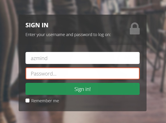
As you can see we check if the username or password input fields are empty. If so, we block the form submission and add the class “input-error” to the input field.
Here is how the form looks like if the user leaves a field empty, in this case the password field:
5. Conclusion
That’s all! Here is again the DEMO and here you can get the Lancar template with this login page included, along with free support.
Remember: this is the front-end part of the login page. Now you have to implement the back-end part to make it fully functional: user validation, session creation, etc., with your favorite platform and programming language. I might create another tutorial for this.
So, I hope you liked this article. If you have any question or want to suggest a specific tutorial, let me know in the comments below.
All the best,
Anli
Stay Updated
Subscribe to the Azmind Newsletter and I’ll update you as soon as I release a new WordPress Theme, Bootstrap Template, Tutorial or other Freebie:
To learn how we use your data when you sign up to our newsletter, read our Privacy Policy here.
