Centering an HTML element horizontally with CSS, be it a “div” or a “form”, has been always easy for web developers at least for the past 10 years or so.
But what about centering the same element vertically, so that it always remains in the center of the page or in the center of its parent element?
Well, this has been a very tricky task for years (at least for me) and some developers have also used JavaScript in some situations to obtain the desired result.
This has continued to be a problem, at least for me, until the advent of the CSS flexbox layout and the flexbox utilities offered in Bootstrap 4.
And that’s what we’ll be talking about in today’s tutorial.
We’ll see 3 examples where we take a “div” and a “form” and align them in the center, vertically and horizontally, using Bootstrap 4 (current version 4.3.1).
At the end of the tutorial, you can download all the files as handy templates.
Let’s begin!
Example 1: Align a “Div” in the Center of Another “Div”, Fixed Height, Not Full Screen
In this first example we’ll align a “div” element inside its parent “div” which has a fixed height. This is the final result:
We will achieve this with some HTML and CSS code and with some handy classes offered by Bootstrap 4. Let’s see the code first and explain it after that.
The HTML code (file “index.html”, I’m not showing all the page’s code):
<div class="section-1-container section-container">
    <div class="container">
        <div class="row">
            <div class="col section-1 section-description">
                <h1>Bootstrap 4: Align Center</h1>
                <div class="divider-1"><span></span></div>
                <p>A tutorial on how to align a "div" element vertically and horizontally in Bootstrap 4.</p>
            </div>
        </div>
        <div class="row">
            <div class="col-10 offset-1 col-lg-8 offset-lg-2 div-wrapper d-flex justify-content-center align-items-center">

                <div class="div-to-align">
                    <p>This is our center aligned "div".</p>
                </div>

            </div>
        </div>
    </div>
</div>
The CSS code (file “style.css”, folder “assets/css/”, I’m not showing all the page’s CSS code):
.div-wrapper {
    height: 200px;
    margin-top: 40px;
    border: 2px dashed #ddd;
    border-radius: 8px;
}

.div-to-align {
    width: 75%;
    padding: 40px 20px;

    /* .... */
}
So, in a few words, we want to align the div with the class “div-to-align” in the center of its parent div which has the class “div-wrapper”.
The parent div has a fixed height of 200 pixels (set with CSS).
To align our div we will follow 3 easy steps:
- 1. First, we add the class “d-flex” to our “div-wrapper”. By doing this, we enable flex behaviors and create a flexbox container (our “div-wrapper” class), and also transform its direct children elements into flex items, as explained in the Bootstrap documentation here.
- 2. Next, we add the class “justify-content-center” to our “div-wrapper” to align horizontally, in the center, its child div (with class “div-to-align”), the one that we want to align. Documentation here.
- 3. Lastly, the most important part, the vertical alignment. We do it by adding the class “align-items-center” to our “div-wrapper”, to align vertically, in the center, its child div. Documentation here.
That’s all for this example. You can see the LIVE PREVIEW here.
Example 2: Align a “Form” in the Center of the Page, Full Screen
In the second example we’ll learn how to align a form, so that it always remains in the center of the page, independently from the device or screen size.
This is the final result:
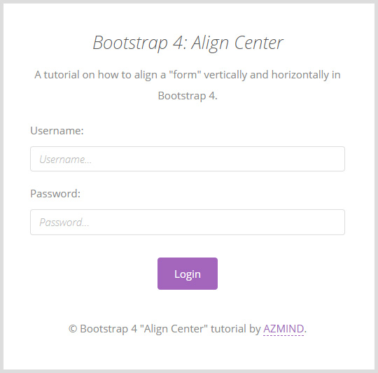
To achieve this result, we need all the parent elements of our form, “div-s”, “body” and “html” tags, to have a height of 100%.
They should occupy all the vertical space of the page, so that the form can be placed in the center of this space.
We set a height of 100% to these elements with the Bootstrap class “h-100”.
We add this class to the “html” tag:
<html lang="en" class="h-100">
And to the “body” tag:
<body class="h-100">
Now let’s see the form’s HTML code and then explain it:
<div class="container h-100">
<div class="row h-100 justify-content-center align-items-center">
<div class="col-10 col-md-8 col-lg-6">
<!-- Form -->
<form class="form-example" action="" method="post">
<h1>Bootstrap 4: Align Center</h1>
<p class="description">A tutorial on how to align a "form" vertically and horizontally in Bootstrap 4.</p>
<!-- Input fields -->
<div class="form-group">
<label for="username">Username:</label>
<input type="text" class="form-control username" id="username" placeholder="Username..." name="username">
</div>
<div class="form-group">
<label for="password">Password:</label>
<input type="password" class="form-control password" id="password" placeholder="Password..." name="password">
</div>
<button type="submit" class="btn btn-primary btn-customized">Login</button>
<!-- End input fields -->
<p class="copyright">© Bootstrap 4 "Align Center" tutorial by <a href="https://azmind.com">AZMIND</a>.</p>
</form>
<!-- Form end -->
</div>
</div>
</div>
As you can see, we also add the class “h-100” to the first two div parents of the form, the “container” and “row” divs.
One important thing to notice here is the fact that we haven’t used the “d-flex” class which we used in the first example.
This is because “rows” are already flexbox containers in Bootstrap 4.
Lastly, we align the form horizontally and vertically with the same classes of the previous example, “justify-content-center” and “align-items-center”.
As for the CSS code, I’m not showing it here because I’ve only used it to style the form, not for its alignment. You can find it in the file “style.css” (folder “assets/css/”).
And we’re finished! LIVE PREVIEW here.
Example 3: Align a “Form” in the Center of the Page, Full Screen, Image Background
The last example is the same as the previous one, I’ve just added a full-screen image background with some JavaScript (that you can see when you download the template) and styled the form differently.
The code for its alignment is the same too, so I’m not showing it again.
I just thought it looks nicer and it’s more complete, (almost) ready to be included in a real project. That’s why I added it, let’s call it a “bonus” example.
Here is the final result:
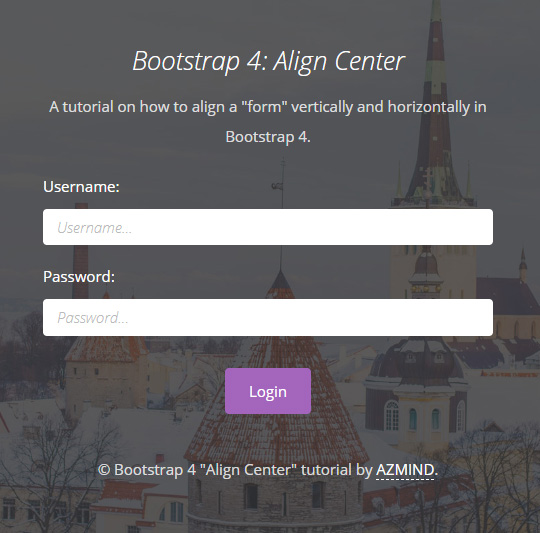
And here is the LIVE PREVIEW.
Demo, Download and License
VIEW DEMO (all 3 examples)
DOWNLOAD: Bootstrap 4 Align Center (5610 downloads )
LICENSE:
You can use these templates in personal and commercial projects, but you can’t sell or distribute them directly, “as is”. If you plan to use them, a link to this page or any form of spreading the word will be much appreciated.
Conclusion
Bootstrap offers some handy and intuitive flexbox utilities to manage the layouts of our pages, as we saw in this tutorial.
We used just 3 or 4 classes to align our elements quickly and easily. This translates in considerable time saved in our day to day development work.
What do you think of this tutorial? Do you have any question or suggestion? Let me know in the comments below.
Stay Updated
Subscribe to the Azmind Newsletter and I’ll update you as soon as I release a new WordPress Theme, Bootstrap Template, Tutorial or other Freebie:
To learn how we use your data when you sign up to our newsletter, read our Privacy Policy here.






Your example #2 does not work.