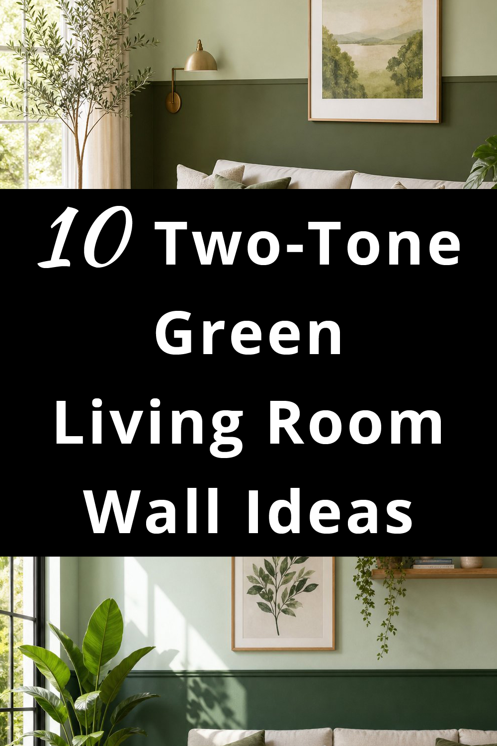
If you’ve been staring at your living room walls thinking, “You deserve a little personality, sweetie,” two‑tone green is such a fun way to do it.
It’s fresh, calm, and natural without making you feel like you suddenly live inside a paint catalog.
These ideas are cozy, easy to pull off, and perfect for anyone who wants their space to feel a tiny bit more grown‑up while still keeping that comfy, lived‑here-for-real vibe.
Let’s get into the good stuff:
Want to Save this Article?
To create these inspiring designs and make them as specific as possible, I use the latest AI design software.
1. Sage + Olive Green
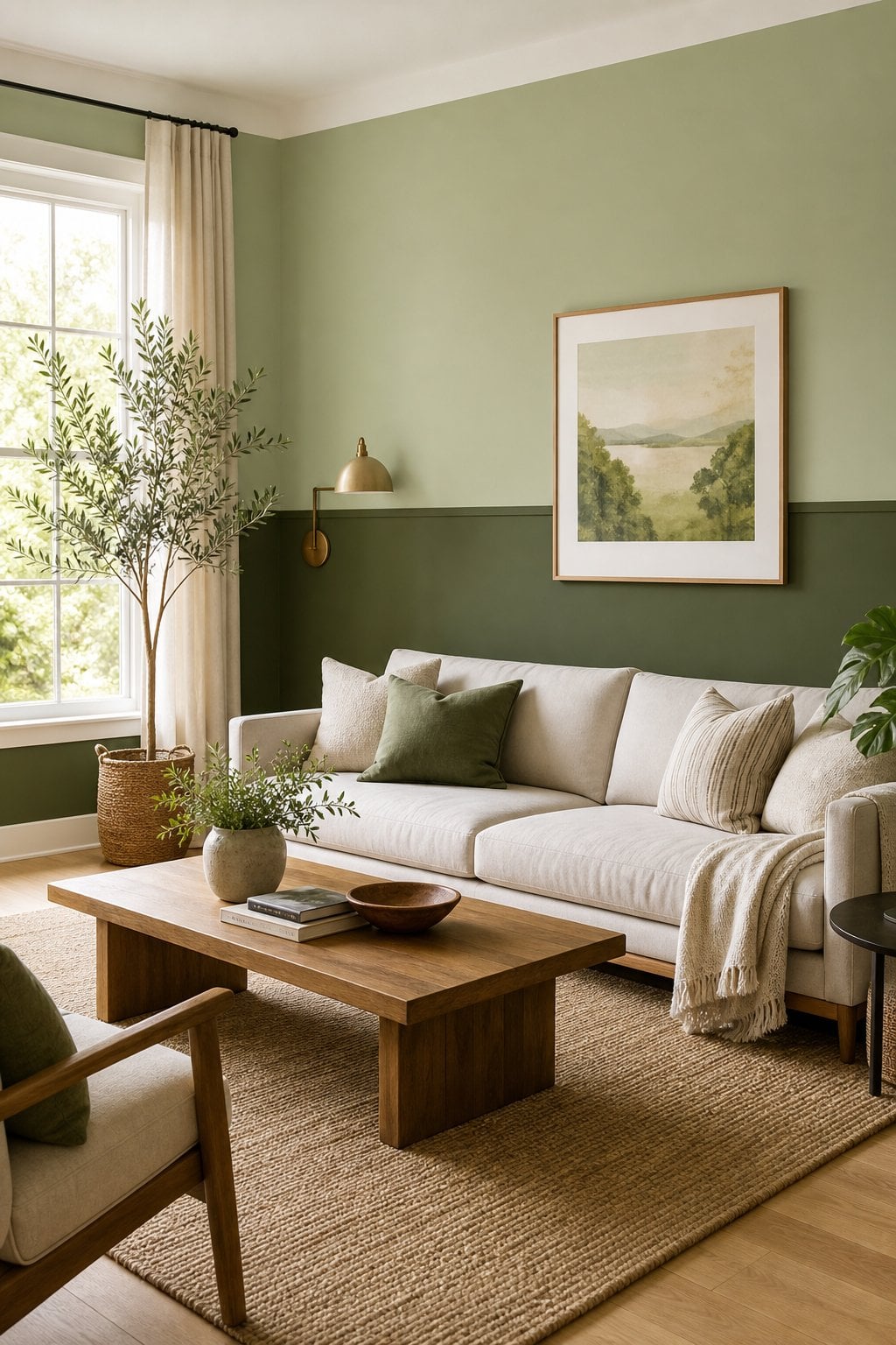
This combo feels like your living room took a deep breath and finally decided to chill. Sage on top keeps things soft, while olive on the bottom adds just enough cozy weight without turning the room into a cave.
If you already love warm greens, you’ll fall for these olive green ideas too. It’s the kind of wall that makes guests say, “Wow, you’re so calm,” even if you were yelling at the vacuum five minutes ago.
2. Mint + Forest Green
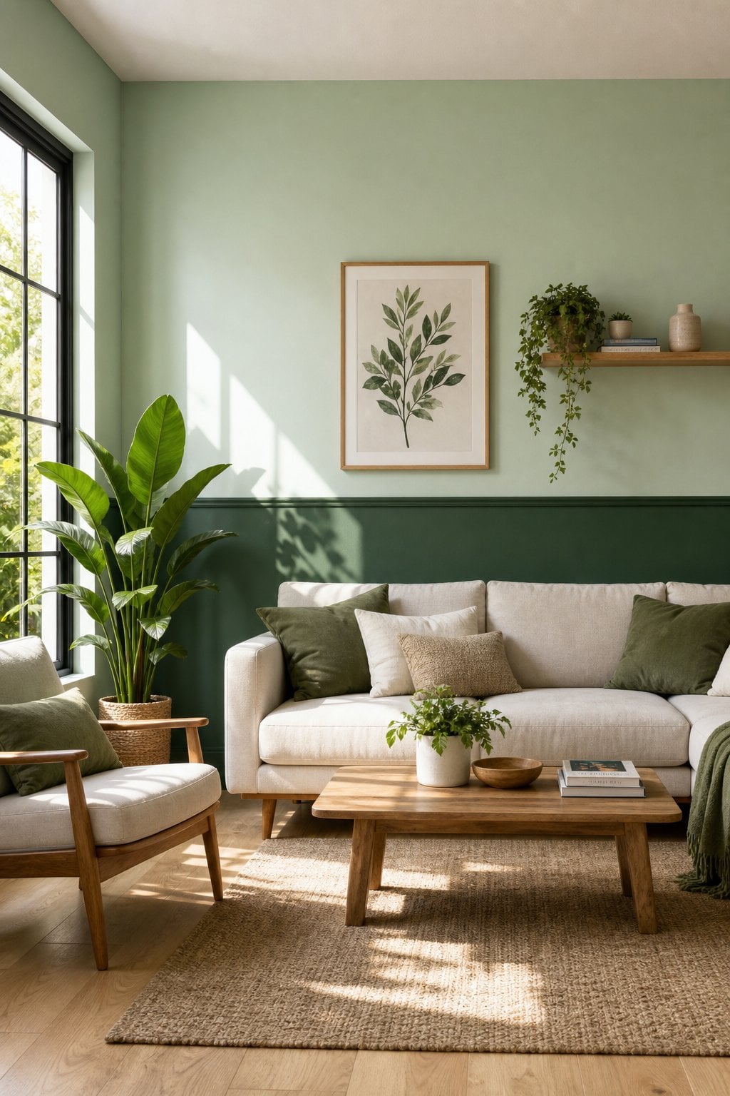
Mint on top is basically your wall saying, “I’m friendly, I promise,” while forest green below gives the room a little drama without going full soap‑opera.
It’s fresh, cheerful, and secretly great for hiding scuff marks from kids, pets, or that time you tried to move the sofa alone. If you like deeper greens, peek at these forest green decor ideas for more inspiration.
✨ What's Your Living Room Personality?
Discover your vibe - take this quick quiz to reveal the living room style that matches your personality.
-
1. When you walk into your living room, how do you want it to feel?
-
2. Pick a must-have living room item:
-
3. Your ideal living room soundtrack:
Your Living Room Personality:
3. Pistachio + Deep Emerald
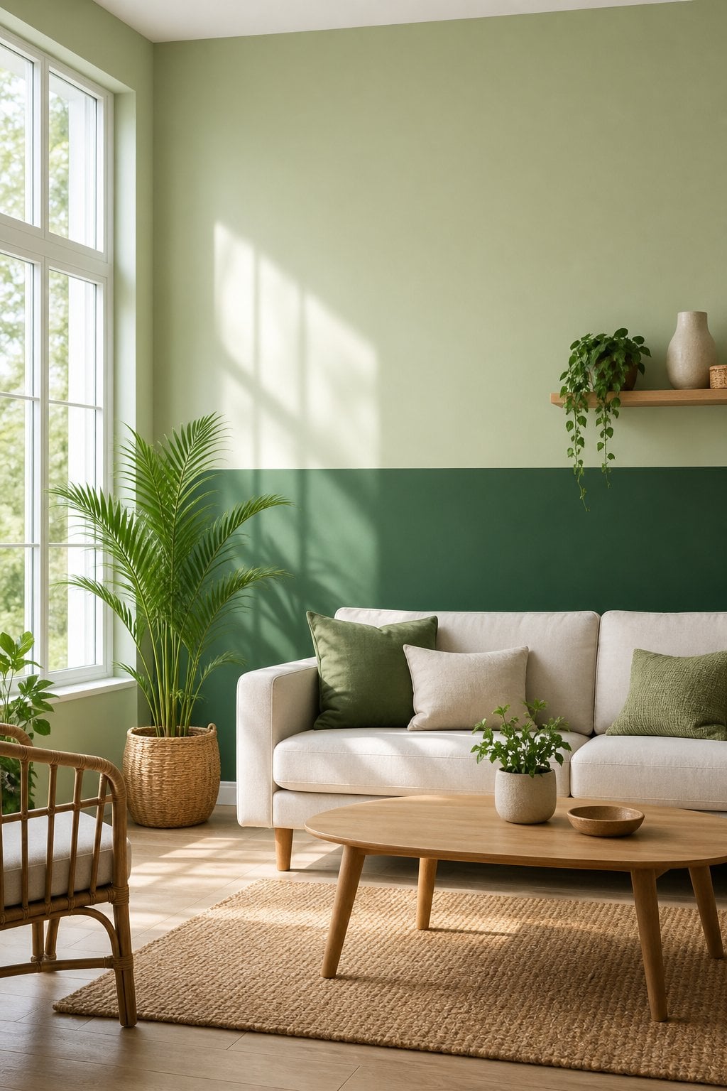
Pistachio is the sweet one, emerald is the fancy one, and together they look like your living room got dressed up but still knows how to relax.
The top half looks playful, while the bottom half whispers “I have good taste,” even if you’re eating cereal for dinner. For more emerald goodness, check out these emerald green ideas.
4. Seafoam + Moss
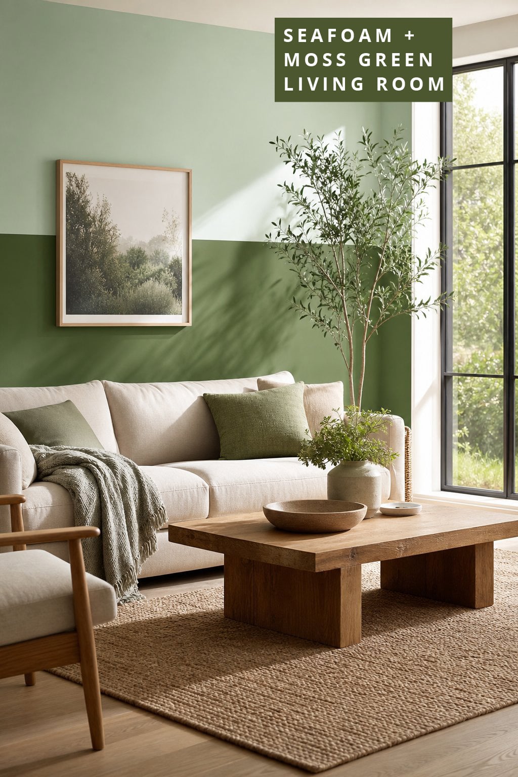
Seafoam is breezy and happy, like your wall just came back from a beach walk. Moss green below adds a comfy, curled‑up‑with-a-blanket vibe.
It’s great if you want your living room to feel soft and friendly without repainting every six months. If you’re into the cozy side of green, these cozy green decor ideas fit right in.
5. Lime + Olive
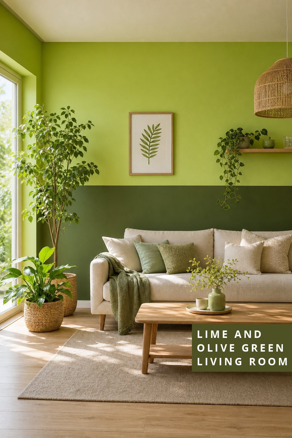
Lime on top is the energetic friend who shows up with iced coffee and big plans. Olive on the bottom is the friend who reminds you to take a nap. Together they make a fun, modern combo that doesn’t look chaotic.
If you’re into modern greens, don’t miss these modern green living room ideas.
6. Soft Green + Charcoal Green
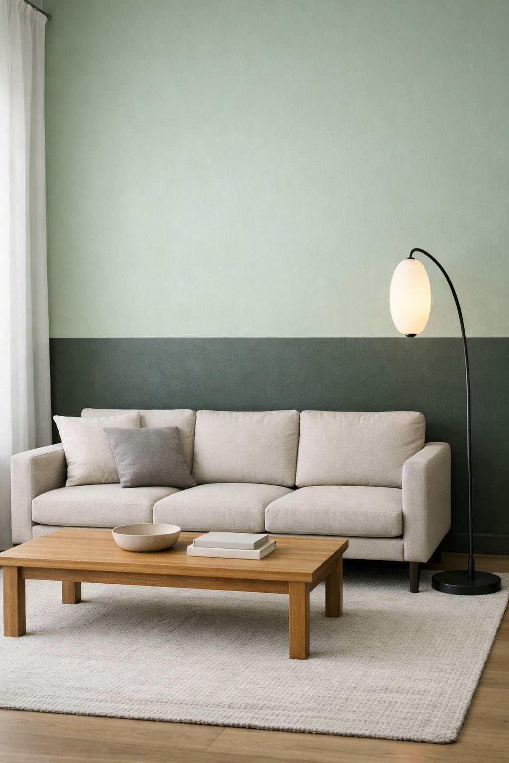
Soft green keeps things gentle, while charcoal green adds a moody vibe that feels grown‑up but not “I only drink black coffee now.” It’s perfect if you want depth without going full dungeon. For more moody inspo, these moody green ideas are a great match.
7. Warm Green + Beige-Green
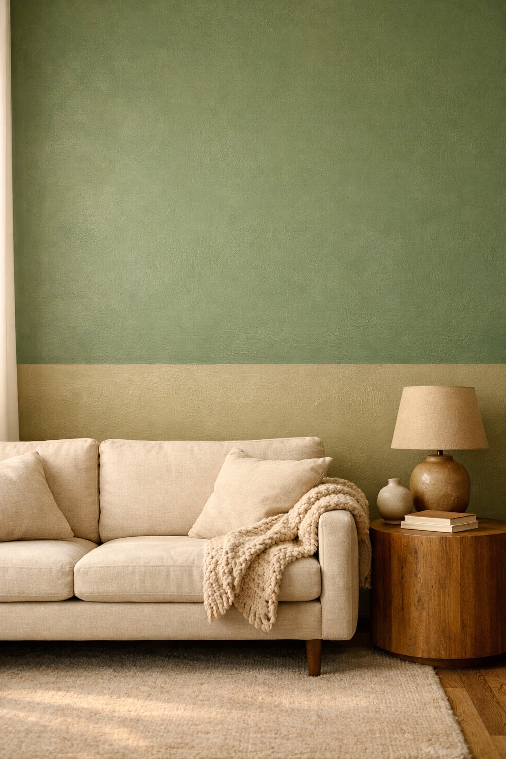
This pairing is basically comfort food for your walls. Warm green looks cozy and friendly, while beige‑green keeps everything soft and easygoing.
It’s perfect if you want a gentle two‑tone look that doesn’t scream for attention. If you love green, these light green decor ideas will give you even more inspiration.
8. Muted Mint + Sage
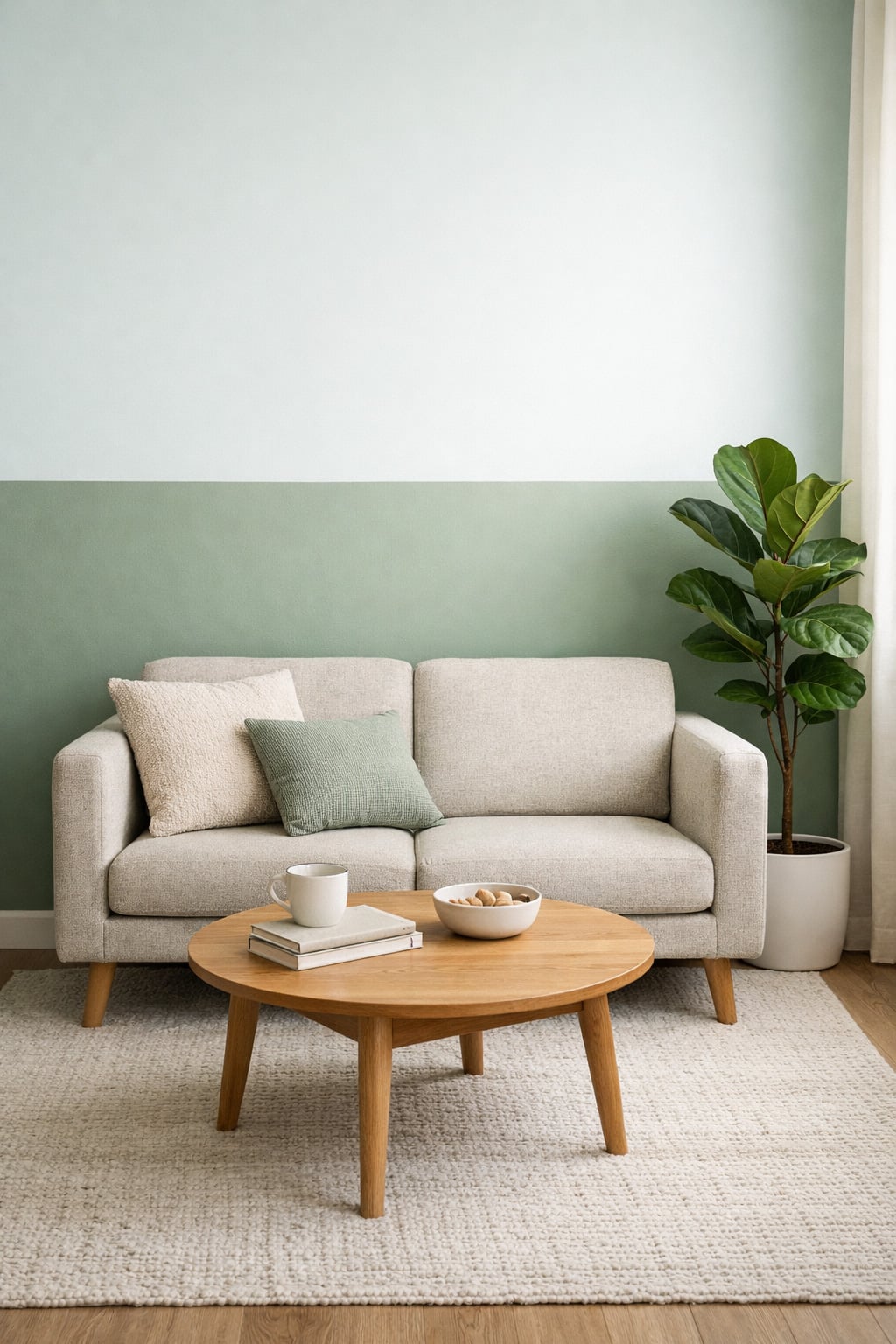
Muted mint is the quiet overachiever of greens, and sage is the chill friend who never causes drama. Together, they make a soothing combo that’s perfect for small living rooms or anyone who wants calm vibes without repainting every season.
For more sage inspiration, check out these sage green ideas.
9. Hunter Green + White-Green
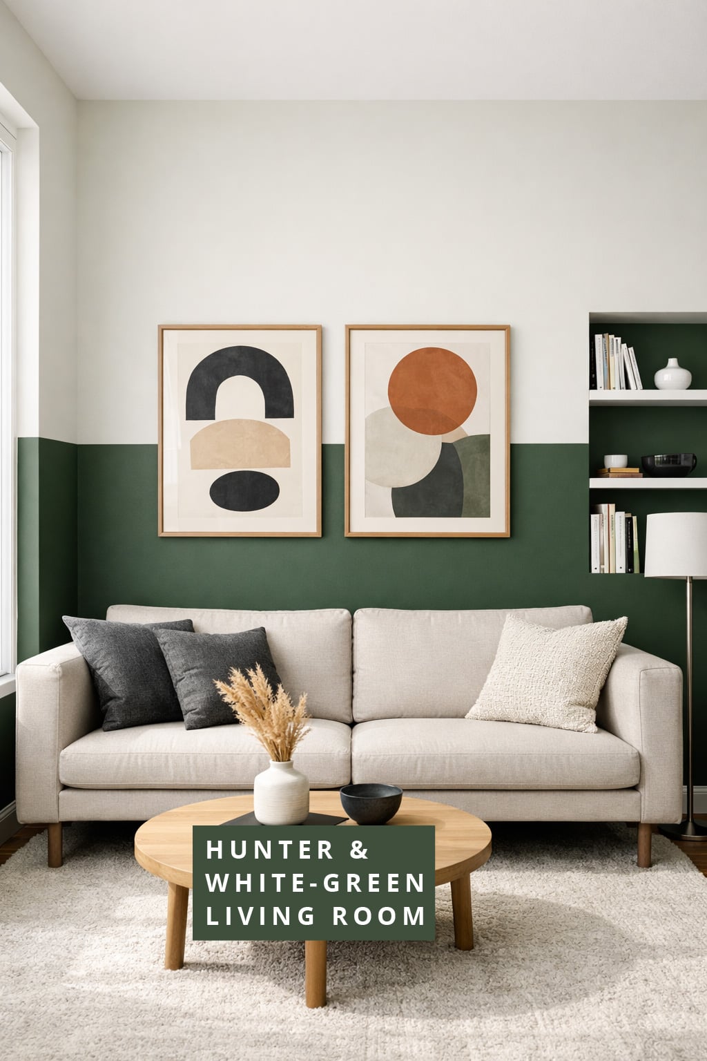
Hunter green on the bottom gives your room a bold, confident base, while white‑green on top keeps everything bright and friendly. It’s crisp, clean, and secretly great for rooms that need a little “I tried” energy.
10. Eucalyptus + Deep Pine
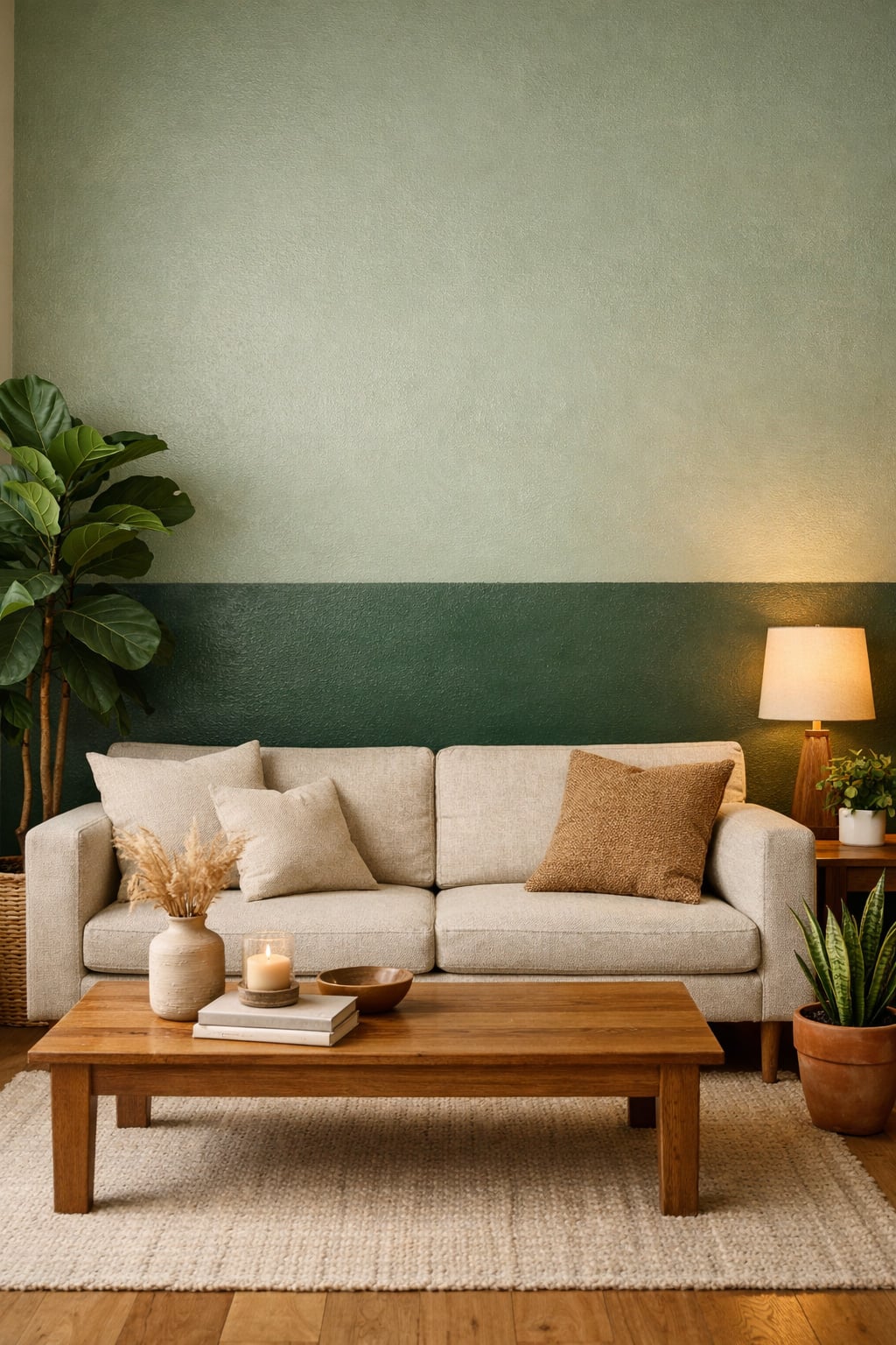
Eucalyptus feels fresh and airy, while deep pine adds a cozy forest vibe that makes your room feel like a retreat. It’s perfect if you love plants or just want your walls to pretend you’re good at keeping them alive.
For more inspiration, these dark green ideas are a great match.
Which Combo is Best For You?
Here’s a cozy little guide to help you pick the combo that feels like your living room’s soulmate:
The Calm Combo
- Sage + Olive
- Muted Mint + Sage
- Warm Green + Beige‑Green
You love soft lighting, quiet mornings, and walls that don’t demand attention. These combos keep everything gentle and peaceful, like your living room is politely whispering instead of shouting.
The Playful Combo
- Pistachio + Deep Emerald
- Mint + Forest
- Seafoam + Moss
You’re the type who buys cheerful throw pillows and actually rotates them for fun. These combos feel friendly, upbeat, and just a tiny bit mischievous in the best way.
The Moody Combo
- Soft Green + Charcoal Green
- Hunter Green + White‑Green
- Eucalyptus + Deep Pine
You love depth, drama, and maybe a candle that smells like “mysterious forest.” These combos bring that cozy, moody vibe without turning your living room into a cave.
The Minimal Combo
- Sage + Olive
- Muted Mint + Sage
- Soft Green + Charcoal Green
You like tidy corners, simple lines, and walls that behave. These combos stay clean and calm, perfect for anyone who wants a soothing backdrop that doesn’t compete with the rest of the room.
The Cozy Combo
- Seafoam + Moss
- Warm Green + Beige‑Green
- Eucalyptus + Deep Pine
You want your space to feel like a warm hug and maybe a snack. These combos bring softness, comfort, and that “I could nap right here” energy.
Some FAQs:
1. Can I use any shade of green for a two‑tone wall?
Absolutely. As long as the two greens look friendly together, you’re good. No need to overthink it or become a paint scientist.
2. Do I paint the lighter color on top or bottom?
Most people put the lighter color on top because it keeps the room feeling open, but you can flip it if you like a cozier vibe.
3. Will two‑tone walls make my living room look smaller?
No. Using a lighter shade on top usually makes the room feel taller, which is basically a free optical illusion.
4. How high should the color split be?
Around chair‑rail height works for most rooms, but you can go higher if you want a more dramatic look. Just don’t split it at a random height, or your wall will look confused.
5. Can I still hang art on a two‑tone wall?
Yes. Your art will look great, and the two‑tone background actually helps it stand out without being loud about it.
Thanks for reading,
Anli