Choosing living room colors shouldn’t feel like an emotional crisis, but here we are, standing in the paint aisle, clutching 35 swatches, wondering why “greige” has 700 personalities.
If picking a palette makes you sweat more than assembling IKEA furniture, this guide is your new comfort blanket.
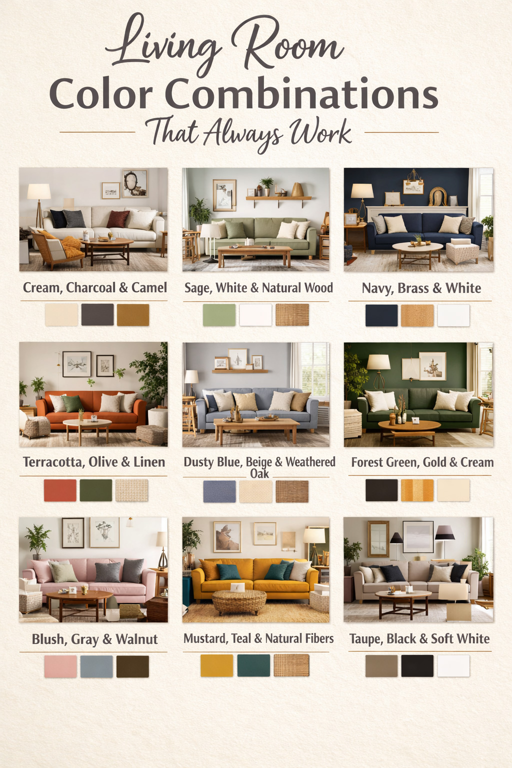
These 10 color combinations are the design world’s equivalent of a guaranteed good hair day: reliable, flattering, and impossible to mess up even if you’ve repainted the same wall three times.
And if your room still feels a little unfinished after all this, these tips for making a living room feel more finished will save your sanity.
Let’s get you a palette that works every single time – no panic attacks required.
Want to Save this Article?
You’ll also love: 10+ Pretty Cottagecore Living Room Ideas for Renters (No Paint, All Charm)
To create these inspiring designs and make them as specific as possible, I use the latest AI design software.
1. Cream + Charcoal + Camel
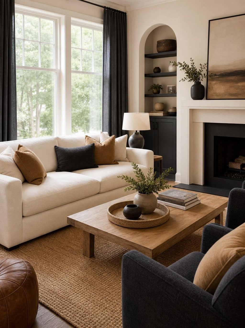
If you panic at the paint aisle, this combo is your emotional support palette.
Cream keeps things soft and glowy, charcoal adds just enough drama to feel intentional, and camel warms everything up like a latte you didn’t have to reheat three times.
Add a textured rug and a few layered throws and suddenly your living room looks “professionally curated” instead of “I bought whatever was on sale.”
For more cozy inspiration, peek at these cozy vintage shabby chic ideas.
2. Sage Green + Warm White + Natural Wood
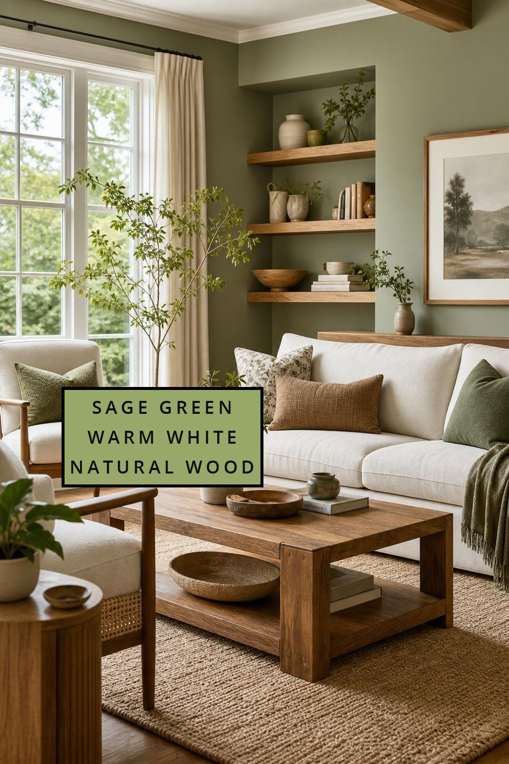
This is the palette for homeowners who want their living room to feel like a deep exhale.
Sage is universally flattering (yes, even on that wall you’ve repainted three times), warm white keeps things bright without going sterile, and natural wood adds that “I’m calm and grounded” energy, even if you’re not.
If you want more soft, earthy inspiration, these sage green ideas are your new best friend.
✨ What's Your Living Room Personality?
Discover your vibe - take this quick quiz to reveal the living room style that matches your personality.
-
1. When you walk into your living room, how do you want it to feel?
-
2. Pick a must-have living room item:
-
3. Your ideal living room soundtrack:
Your Living Room Personality:
3. Navy Blue + Brass + Crisp White
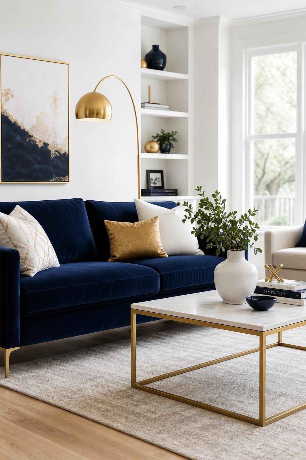
Navy is the color equivalent of a tailored blazer: timeless, polished, and makes you look like you have your life together.
Pair it with crisp white for contrast and brass for a little sparkle, and suddenly your living room feels like it belongs in a coastal boutique hotel.
If you love a breezy vibe, check out these Hamptons-style coastal ideas.
Mistakes to Avoid
- Choosing a navy that’s too dark without balancing it with lighter textiles.
- Using shiny brass everywhere: mix in brushed finishes to avoid glare overload.
- Letting white dominate so much that the room feels cold instead of crisp.
- Skipping texture: navy needs softness to avoid looking flat.
4. Terracotta + Olive + Linen
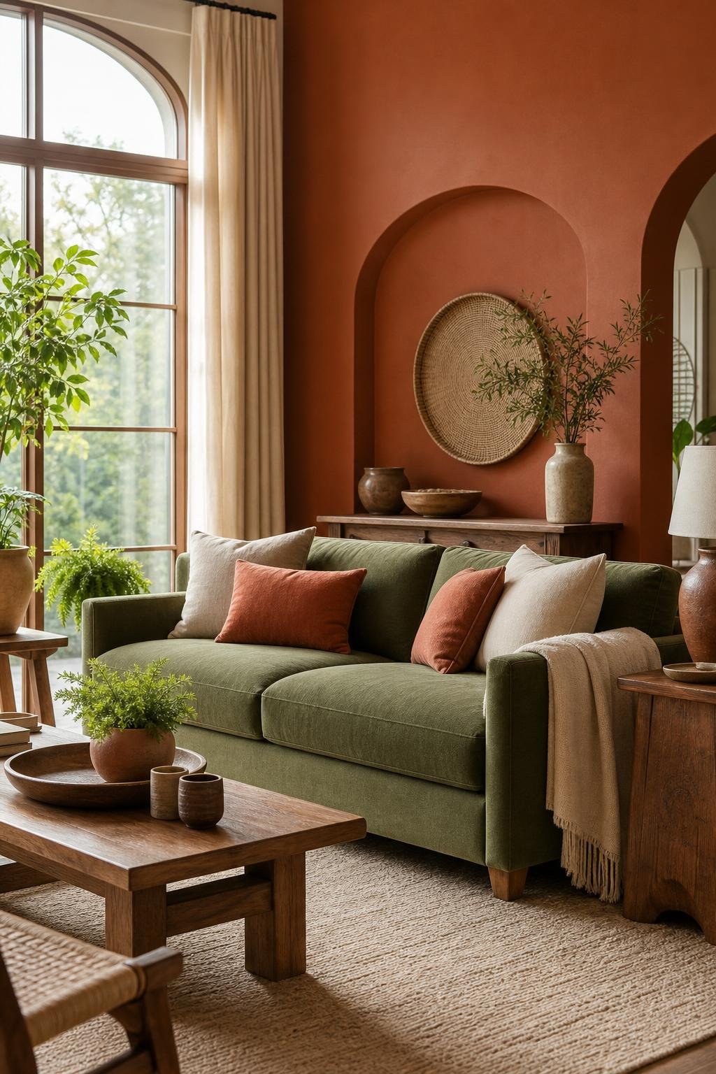
This palette is for the homeowner who secretly identifies as a plant parent who loves pottery. Terracotta brings warmth, olive adds grounded coziness, and linen keeps everything breezy and natural.
It’s earthy without going full “I forage for mushrooms on weekends.” For more green‑leaning inspiration, these olive green ideas hit the vibe perfectly.
5. Soft Black + Ivory + Warm Wood
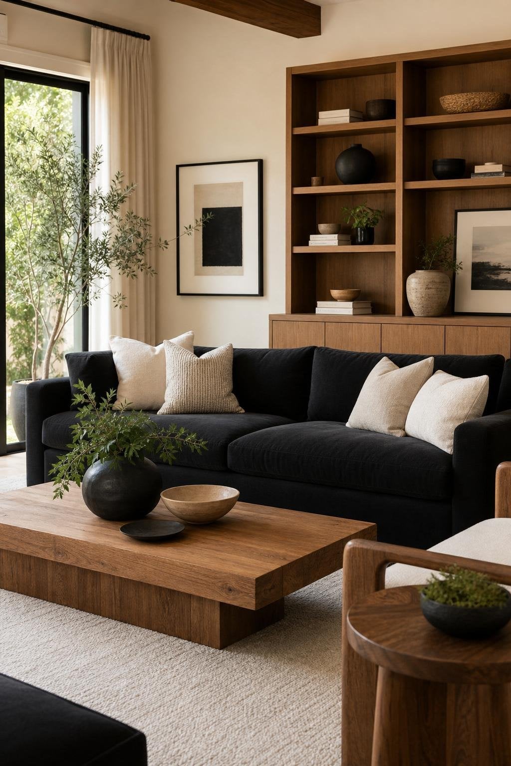
If you want drama but fear commitment, soft black is your gateway shade. It’s moody without being overwhelming, especially when paired with ivory and warm wood.
Think “sophisticated coffee shop” but without the barista judging your order. For more moody inspiration, peek at these dark moody minimalist ideas.
6. Dusty Blue + Beige + Weathered Oak
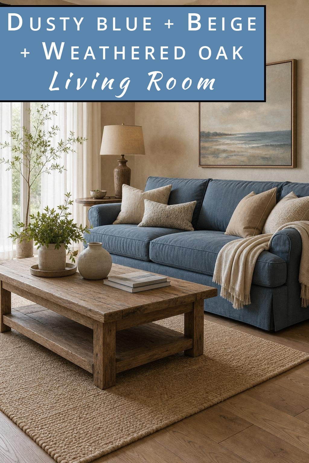
This is coastal energy without the seashell trend of 2008. Dusty blue is calm and grown‑up, beige adds warmth, and weathered oak brings that soft sun‑washed charm.
Perfect for anyone who wants their room to feel like a quiet morning by the water. For more breezy inspiration, these coastal boho ideas are spot‑on.
Mistakes to Avoid
- Using blues that are too bright: keep it muted for a sophisticated look.
- Mixing too many wood tones that clash with the weathered oak vibe.
- Going overboard with coastal decor (no starfish, please).
- Letting beige dominate so much that the room looks washed out.
7. Forest Green + Gold + Cream
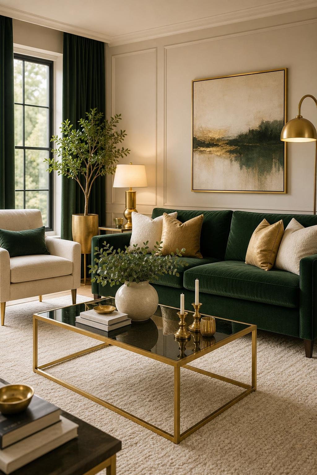
Forest green is the color of confidence: perfect for homeowners who want their living room to whisper, “I read design magazines… occasionally.”
Gold adds a touch of glam without going full palace, and cream keeps everything soft and inviting. For more deep‑green inspiration, you’ll love these forest green ideas.
8. Blush Pink + Warm Gray + Walnut
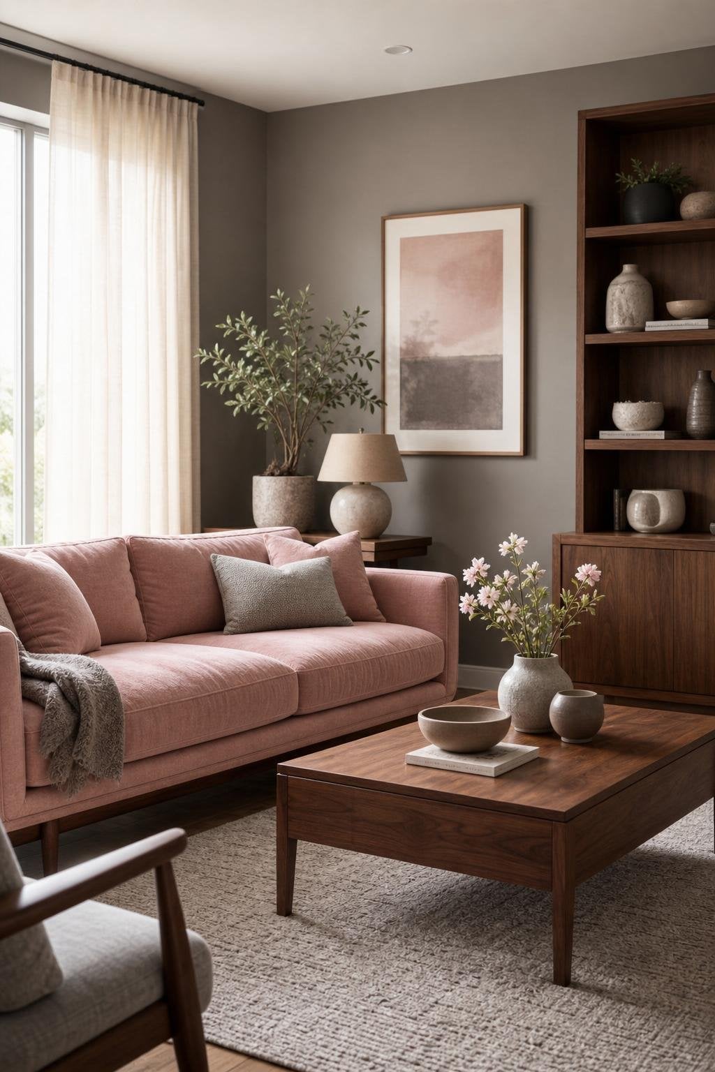
Blush is the unsung hero of modern palettes: soft, warm, and surprisingly neutral when paired with warm gray and walnut.
It’s perfect for couples who disagree on literally everything else. Add a few textured pillows and suddenly the room looks intentional, not “accidentally pink.”
For more romantic‑leaning inspiration, these pink romantic shabby chic ideas are a great match.
9. Mustard + Deep Teal + Natural Fiber Textures
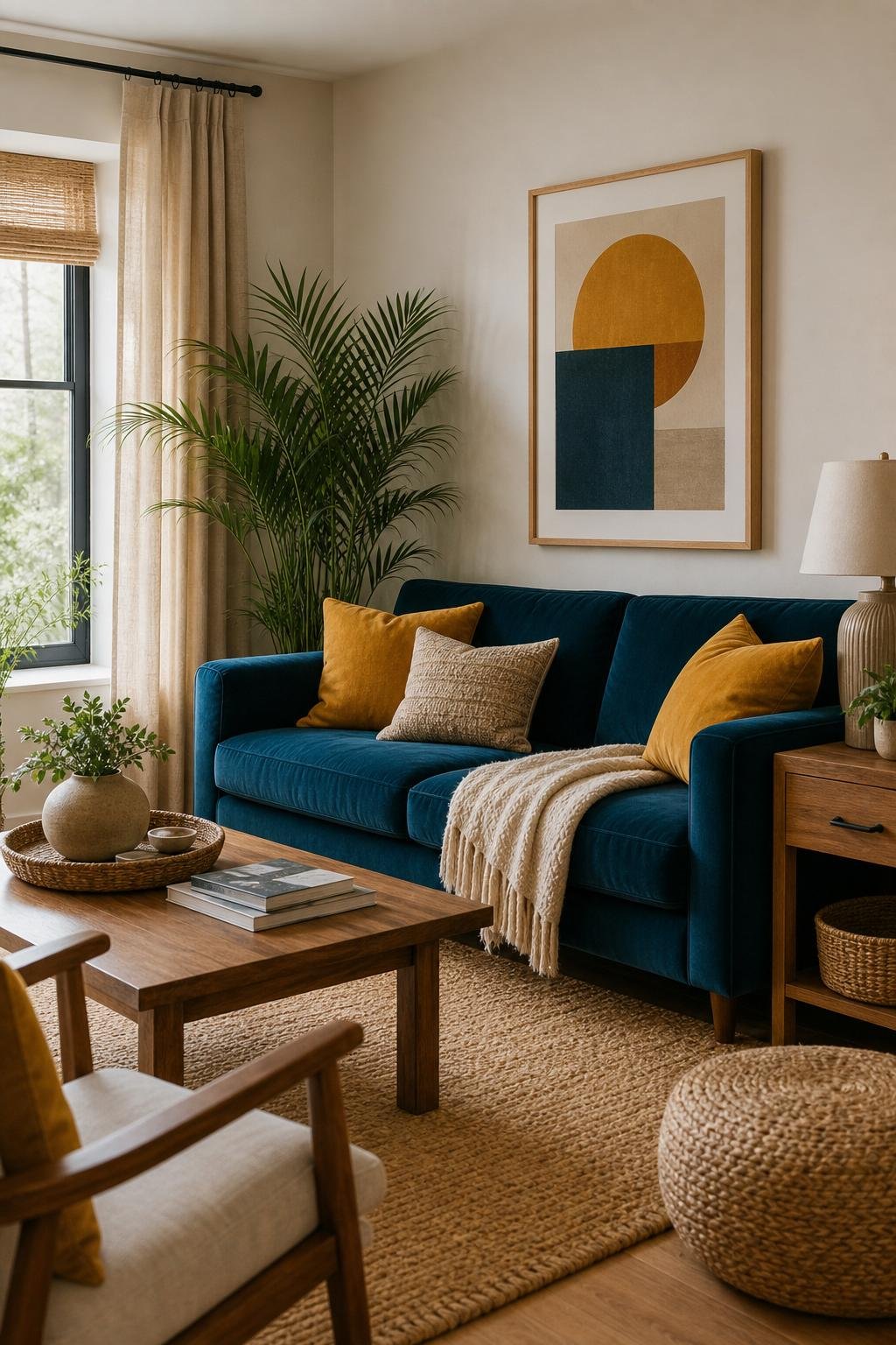
Bold but balanced, this combo is for the homeowner who wants color but doesn’t want their living room to look like a kindergarten classroom.
Mustard brings warmth, deep teal adds richness, and natural textures (jute, rattan, seagrass) keep everything grounded. For more colorful inspiration, check out these colorful boho ideas.
Mistakes to Avoid
- Using mustard too heavily: keep it to accents, not entire walls.
- Choosing a teal that’s too bright instead of deep and saturated.
- Skipping natural textures, which keep the palette from feeling heavy.
- Mixing too many additional colors and losing the palette’s balance.
10. Taupe + Black Accents + Soft White
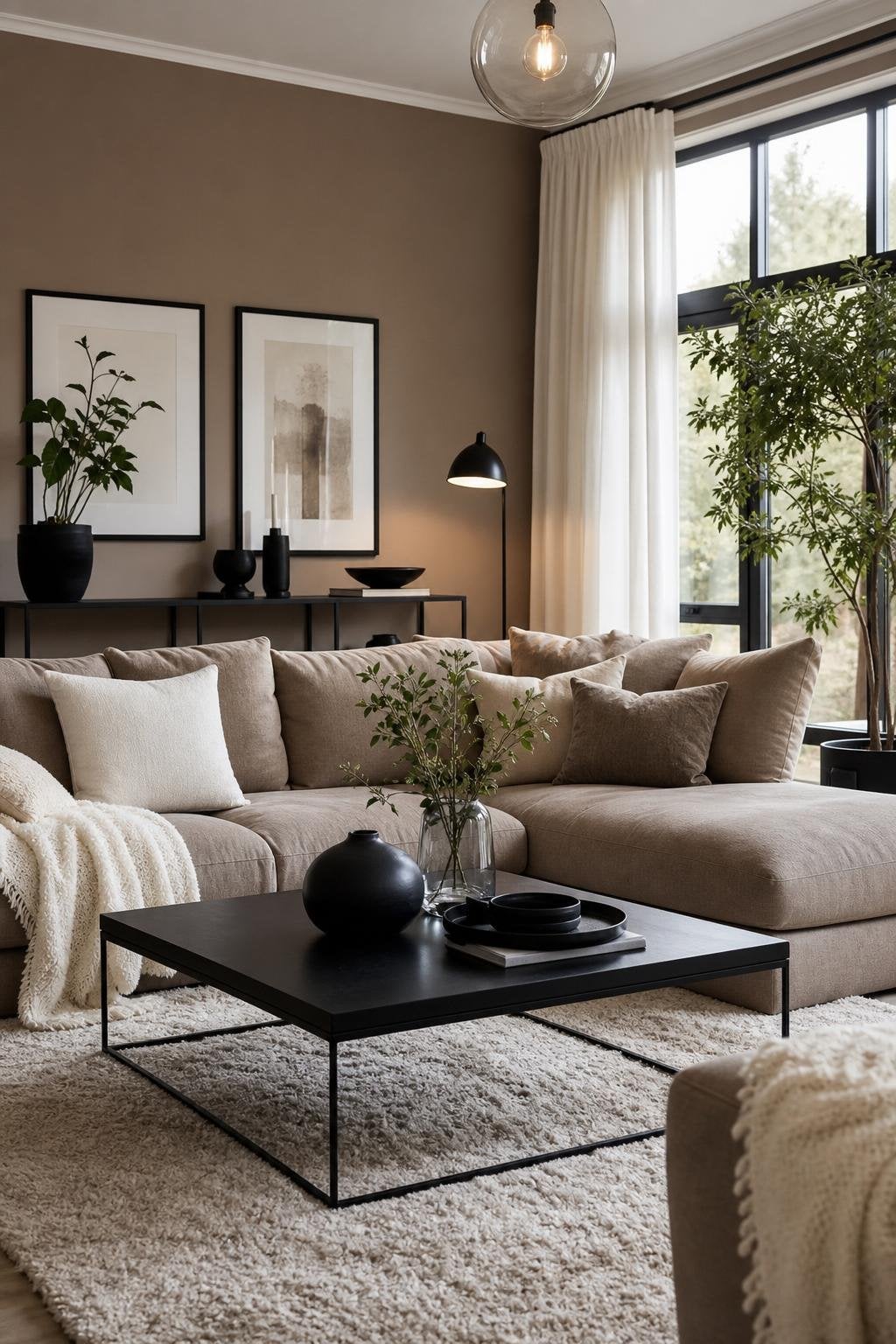
This is the palette for homeowners who panic at the idea of choosing a “real color.” Taupe is timeless, soft white keeps things airy, and black accents add just enough contrast to make the room intentional.
It’s minimalist without being cold, and cozy without being cluttered. For more neutral inspiration, these minimalist ideas fit the vibe perfectly.
Some FAQs:
1. What’s the easiest color combination for beginners?
If picking colors makes you break out in hives, start with neutrals like cream, taupe, and soft white. They’re basically the training wheels of interior design.
2. How do I know if my color palette actually works?
If the room looks calm, cohesive, and not like a bag of Skittles opened, you’re on the right track.
3. Can I mix warm and cool tones?
Absolutely. In fact, mixing them often makes a room more layered and intentional. Just keep the undertones consistent so nothing looks accidentally mismatched.
4. What if my living room has awkward lighting?
Stick to softer, muted shades: they’re more forgiving. Harsh lighting loves to expose your mistakes, so let warm whites and earthy tones do the heavy lifting.
5. How many colors should I use in one room?
Three is the sweet spot: a main color, a supporting color, and an accent. Anything beyond that requires a PhD in color theory or a very brave soul.
6. Do I need to repaint if I change my decor?
Not always. Sometimes swapping pillows, throws, or art is enough to make your palette feel brand new, especially if you’re working with flexible shades like sage, cream, or charcoal.
Thanks for reading,
Anli