It’s unbelievable that there are still so many non-responsive sites on the web. It has become of huge importance to make every piece of content that you provide on the pages of your site look well on all screen sizes.
The popularity of mobile devices continues to grow and today you will hardly find a person who doesn’t use a smartphone. It has become very convenient to search for information from the smaller screens of smartphones and tablets.
In order to boost user engagement and make your web resource more easy to browse, it’s necessary to make every piece of content and design element fully responsive. As many of you already know, this is possible with the help of the Bootstrap framework and its advanced features.
Responsive sites are not only more user-friendly but in a lot of cases they are ranked higher by search engines.
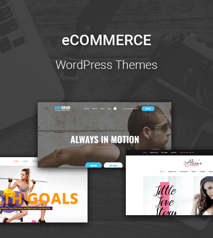
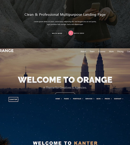
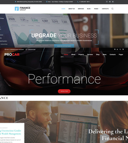
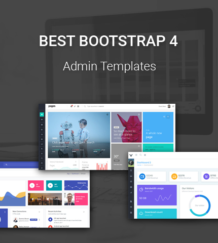
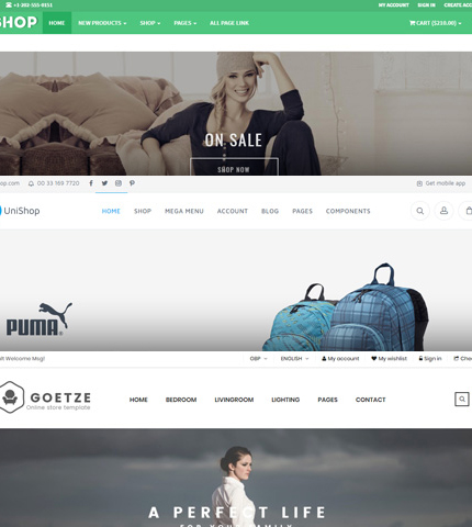
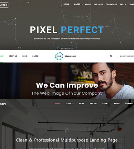
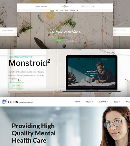
So, in today’s template collection, we’ll take a look at 12 new and premium Bootstrap themes from TemplateMonster that you can use to build a modern responsive website this year.
They are of different types and loaded with advanced features that will be particularly useful during the customization work. Let’s begin right away!
Read more