Blue has a reputation for being one of the safest colors you can use in a living room. It feels classic, calming, and versatile.
But there’s a thin line between a room that’s fresh and welcoming and one that feels like it accidentally wandered into a permanent overcast forecast.
The problem usually is not the blue itself, but what happens when every surface, furniture piece, and accessory starts pulling in the same cool direction.
All of a sudden, a color known for helping people relax can leave a room feeling flatter, colder, and less inviting than expected.
So, before you commit to blue walls, a blue sofa, or an entire blue color palette, take a look at these living rooms that lost their warmth along the way.
You might discover that the secret to a cozy blue living room is not using less blue at all, but knowing what to pair with it.
Want to Save this Article?
To create these inspiring designs and make them as specific as possible, I use the latest AI design software.
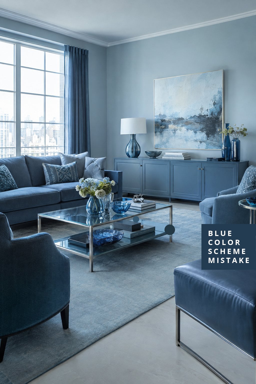
1. The Blue Walls that Matched the Sofa a Little Too Well
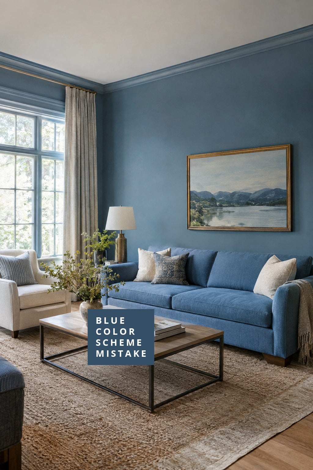
Blue walls and a blue sofa can sound like a foolproof match until everything starts blending into one giant block of color.
Instead of feeling cozy and inviting, the room can end up looking like the walls and furniture signed a pact never to stand apart. A little contrast goes a long way.
For examples of blue used with better balance, take a look at these beige and blue living room ideas.
2. The Navy-on-Navy Living Room that Felt More Heavy Than Cozy
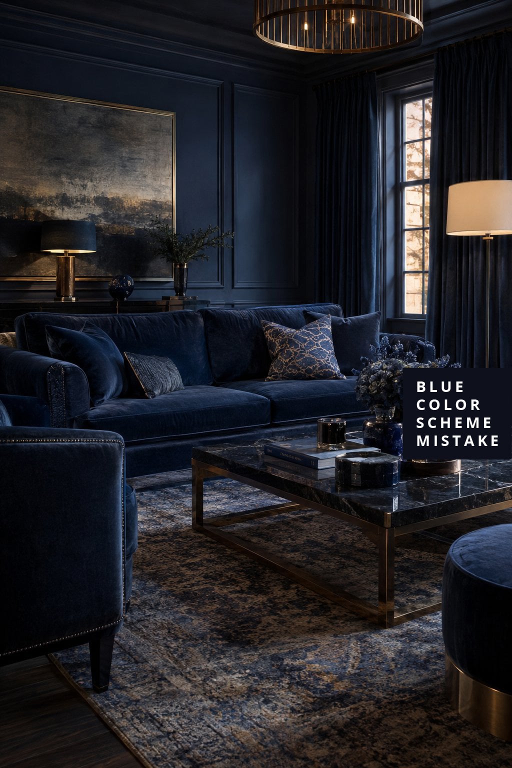
Navy is beautiful, rich, and timeless, but doubling down on it can make a room feel too serious.
When the walls, sofa, and major furniture pieces all lean deep navy, the space may start looking more like a formal waiting room than somewhere you’d happily spend a lazy Sunday afternoon.
The darkness is not the problem. The problem is lack of balance.
✨ What's Your Living Room Personality?
Discover your vibe - take this quick quiz to reveal the living room style that matches your personality.
-
1. When you walk into your living room, how do you want it to feel?
-
2. Pick a must-have living room item:
-
3. Your ideal living room soundtrack:
Your Living Room Personality:
3. The Blue Room that Forgot to Add Any Warm Wood Tones
Blue naturally leans cool, which is why wood furniture often does so much heavy lifting in a room. Without oak, walnut, pine, or other warm finishes, a blue color scheme can feel chilly no matter how many blankets are tossed around.
Compare the effect with rooms that use natural materials more generously, like these brown and blue ideas.
4. The Cool Blue Palette that Made the Space Feel Distant
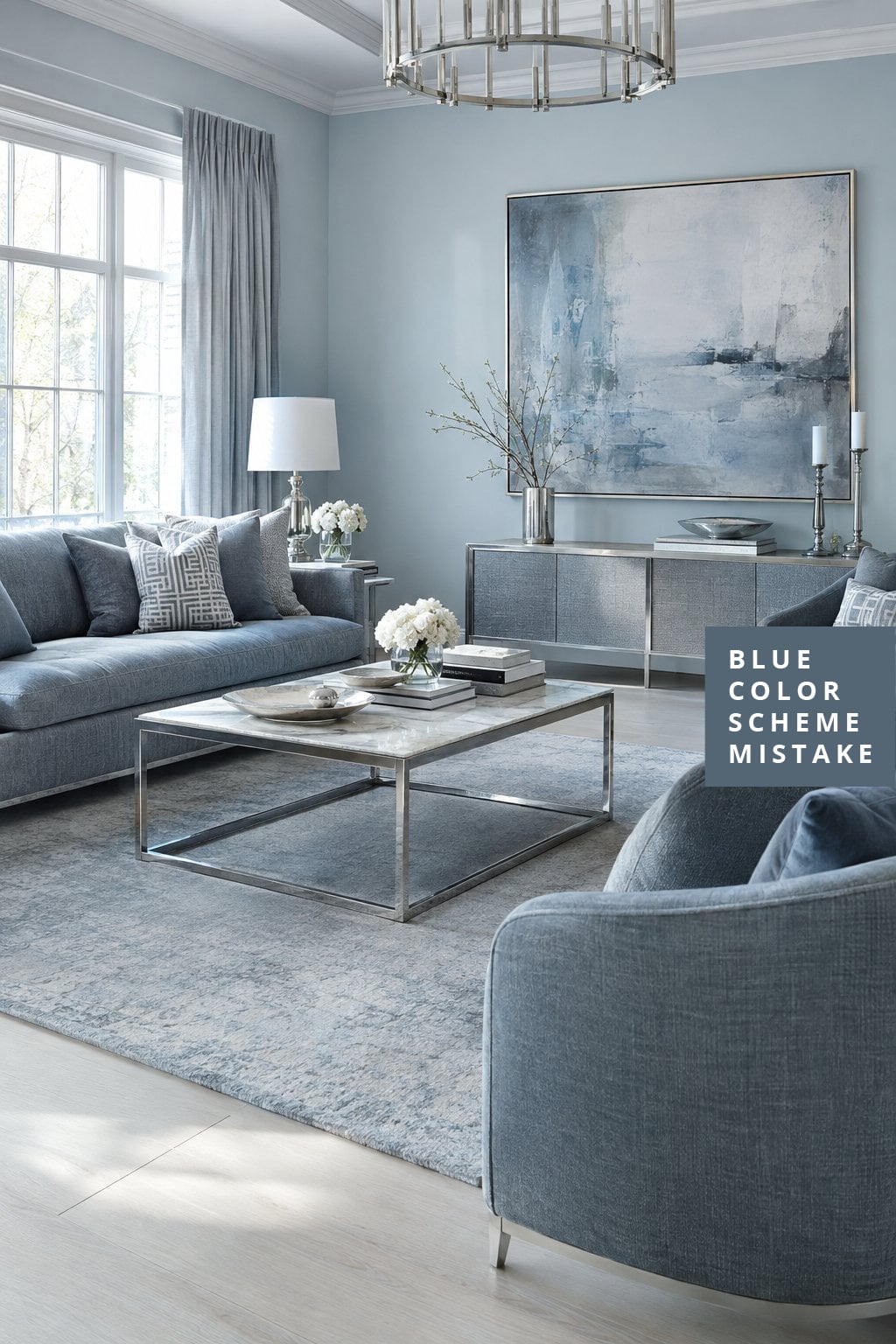
Not all blues behave the same way. Some carry soft hints of gray, while others feel almost icy. In this room, cool-toned blue appeared on nearly every surface, creating a space that looked polished but never quite welcoming.
It felt a little like the room was politely shaking hands instead of inviting people to stay awhile.
5. The Blue Accent Pieces that Took Over Every Surface
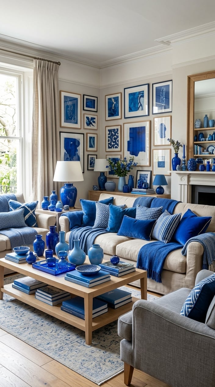
(Maybe too many?)
Throw pillows, artwork, vases, lamps, trays, and books all arrived wearing the same blue uniform. Individually, they looked beautiful, but together they started competing for attention.
A color scheme works best when it has room to breathe. Sometimes the most effective blue accessory is the one you decide not to buy.
6. The Coastal Blue Living Room that Drifted into Cold Territory
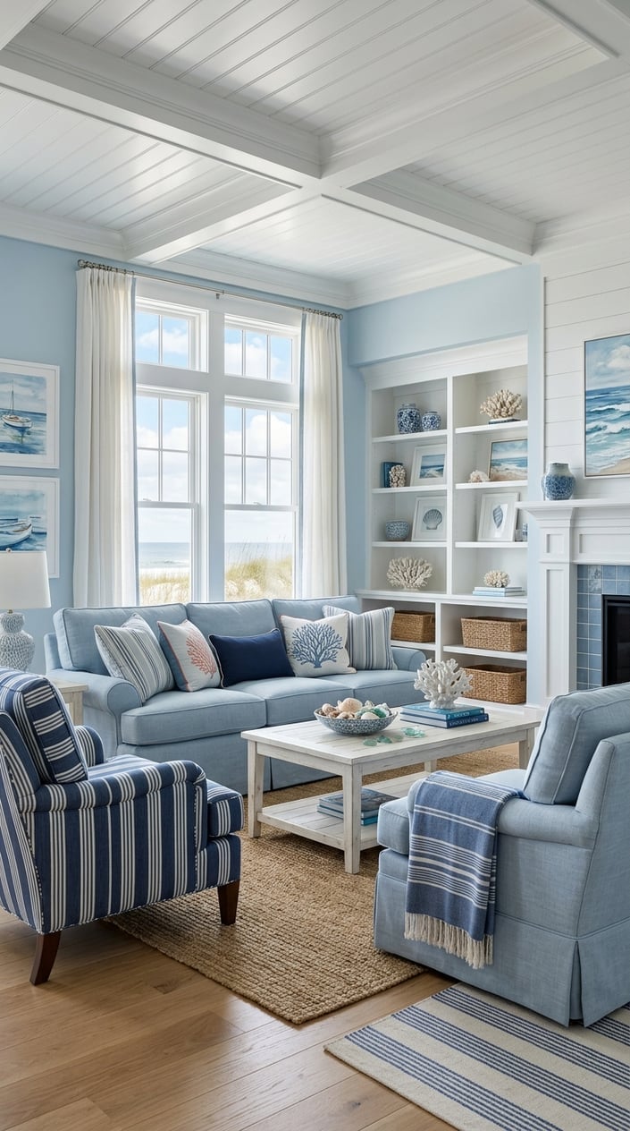
Coastal spaces often rely on blue, but when every detail points toward sea and sky, warmth can slowly disappear. This room needed a few richer textures and warmer shades to keep it from feeling brisk year-round.
For a look at coastal spaces that strike a better balance, check out these blue coastal decor ideas.
7. The Blue-and-Gray Combo that Drained the Room of Energy
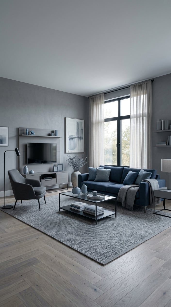
Blue and gray have become one of the most popular living room combinations around, but they can accidentally create a space that feels sleepy when used in large amounts.
Here, the walls, sofa, rug, and accents all leaned cool. The result was calm, but a little too calm. The energy level of a rainy Tuesday afternoon.
8. The Layered Blue Color Scheme that Needed a Warmer Counterbalance
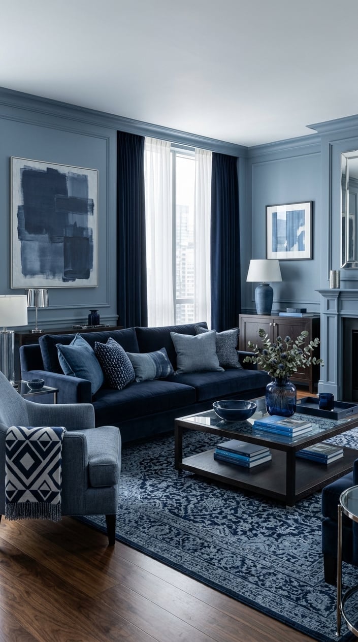
Layering multiple shades of blue is a smart design move, but it’s not magic. This room featured dusty blue, navy, slate, and denim tones, yet still felt incomplete because there was nothing warmer to balance them.
Adding even a few warmer materials could have completely changed the mood. For more inspo, don’t miss these dusty blue decor ideas.
9. The Living Room Where Every Shade of Blue Blended Together
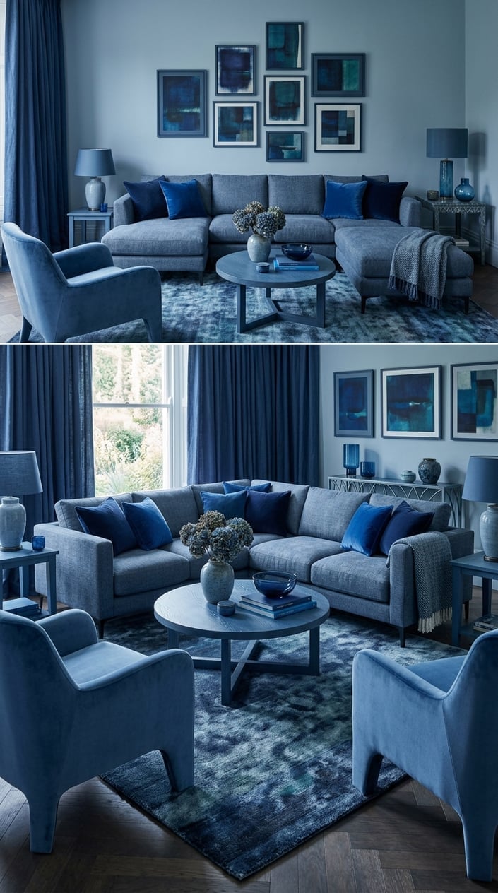
The goal here was depth, but the result was sameness. Every blue selected for this room sat so close together that individual pieces almost disappeared into the background.
Contrast is what helps furniture, artwork, and architectural details stand out. Without it, the room felt flatter than expected despite having plenty of color.
10. The Monochromatic Blue Space that Lost Its Sense of Comfort
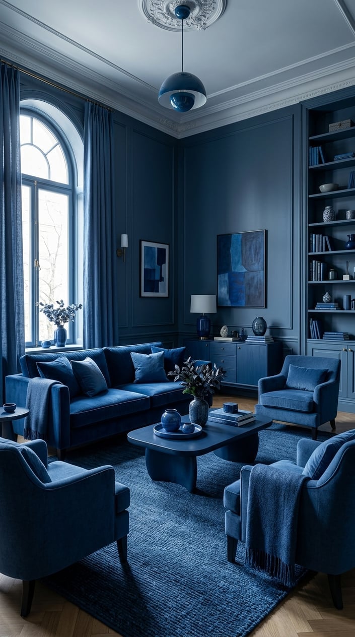
A monochromatic color scheme can look beautiful in photos, but real life asks a little more from a living room. This space was filled with gorgeous shades of blue from floor to ceiling, yet it never felt quite comfortable.
The room looked finished, but not particularly inviting.
For ideas on bringing warmth back into a blue color scheme, check out these cozy blue decor ideas and fall decor ideas for blue living rooms.
Some Questions about Blue Living Rooms:
Can a blue living room feel cozy?
Yes. Warm woods, textured fabrics, and softer accent colors help balance blue nicely.
What colors can warm up a blue space?
Beige, cream, tan, rust, caramel, and warm wood tones are all great choices.
Is navy blue too dark for a living room?
No. It works well when paired with lighter furnishings and plenty of contrast.
Why does my blue room feel cold?
Too many cool-toned colors and not enough warm materials are usually the reason.
What is the biggest mistake with a blue color scheme?
Using blue on nearly every surface without adding warmer colors or textures.
Thanks for reading,
Anli