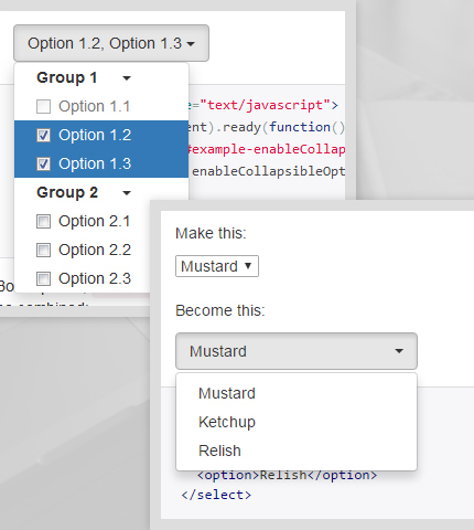
Frequently in our everyday design and development projects, when working with Bootstrap forms, we need to use various select or multiple select input fields. Usually the native look and feel of these fields is ugly, changes from browser to browser, doesn’t match our desired design style and doesn’t offer advanced features.
So, what can we do? Is there a way to overcome these “problems”? Maybe with some jQuery plugin?
With these questions in mind, I made a research on the internet and I found two free plugins that go along with Bootstrap and can help us in these cases, which you can see below along with their main features and examples of what they can do. You can choose one or another based on the type of project you’re working on and characteristics you need.
1. Bootstrap-select by Silvio Moreto
The first plugin that can help us add custom styles and additional functionalities to our Bootstrap select input fields is called “Bootstrap-select”.
It’s a jQuery plugin that uses Bootstrap’s dropdown.js library.
Bootstrap-select’s official website: https://silviomoreto.github.io/bootstrap-select/
1.1 Installation
Here I’ll explain briefly how to install and use this plugin. For more information visit the official website from the link above.
Bootstrap-select requires jQuery v1.8.0+, Bootstrap’s dropdown.js component, and Bootstrap’s CSS.
The plugin can be imported directly in your project from the CDN (links on the official site). You have to import a CSS file to style the select boxes and a Javascript file to make the entire thing work.
It can also be installed using Bower, npm or NuGet.
1.2 Basic Usage
After you have imported all the dependencies (you probably don’t need to import anything if you’re working on a Bootstrap project) and also the Bootstrap-select plugin, here is a simple code to show how it can be used, so you know what to expect:
<select class="selectpicker">
    <option>Mustard</option>
    <option>Ketchup</option>
    <option>Relish</option>
</select>
This is a very simple example, as you can see. You just create a normal select field with some options and add the “selectpicker” class. After that, it gets automatically translated into a fancy select / dropdown field by the plugin.
As we’ll see below, Bootstrap-select offers a lot of options and advanced features. The options can be added with data attributes or JavaScript:
$('.selectpicker').selectpicker({
    style: 'btn-info',
    size: 4
});
1.3 Examples
Below I’ve made a few screenshot images to show you some examples of what this plugin can do. For live previews and more advanced configurations, take a look at the examples’ page here.
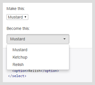
a) Standard select box
This is a simple select field with the same code we saw above.
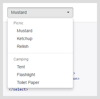
b) Select box with optgroups
This is a more advanced select field with more options, divided in two groups, each with its own label.
HTML code:
<select class="selectpicker">
    <optgroup label="Picnic">
        <option>Mustard</option>
        <option>Ketchup</option>
        <option>Relish</option>
    </optgroup>
    <optgroup label="Camping">
        <option>Tent</option>
        <option>Flashlight</option>
        <option>Toilet Paper</option>
    </optgroup>
</select>
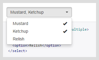
c) Multiple select field
A select input field where you can choose more than one option.
HTML code:
<select class="selectpicker" multiple>
    <option>Mustard</option>
    <option>Ketchup</option>
    <option>Relish</option>
</select>
d) Select box with live search field
You can add a live search input field to the select box with the attribute “data-live-search” set to “true”. You can also add some keywords to the option tags using the “data-tokens” attribute.
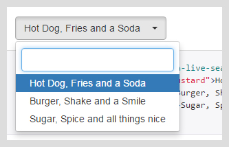
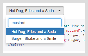
HTML code:
<select class="selectpicker" data-live-search="true">
    <option data-tokens="ketchup mustard">Hot Dog, Fries and a Soda</option>
    <option data-tokens="mustard">Burger, Shake and a Smile</option>
    <option data-tokens="frosting">Sugar, Spice and all things nice</option>
</select>
e) Styling
The plugin offers many options to style the select boxes. For example, you can set the button classes with the attribute “data-style”:
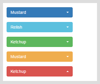
HTML code:
<select class="selectpicker" data-style="btn-primary">
    ...
</select>

<select class="selectpicker" data-style="btn-info">
    ...
</select>

<select class="selectpicker" data-style="btn-success">
    ...
</select>

<select class="selectpicker" data-style="btn-warning">
    ...
</select>

<select class="selectpicker" data-style="btn-danger">
    ...
</select>
Or you can style individual options:
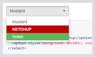
HTML code:
<select class="selectpicker">
    <option>Mustard</option>
    <option class="special">Ketchup</option>
    <option style="background: #5cb85c; color: #fff;">Relish</option>
</select>
CSS code:
.special {
    font-weight: bold !important;
    color: #fff !important;
    background: #bc0000 !important;
    text-transform: uppercase;
}
Other styling features include: setting the width of the select boxes, adding icons or subtexts to the option tags, adding custom HTML code to the option tags.
f) Other options
The Bootstrap-select plugin offers many other customizations like: setting the menu size; adding “Select All” / “Deselect All” buttons at the top of the menu; adding a divider between options; adding a header to the dropdown menu; disabling the select box, an option or an option group; etc.
You can learn how to use these features and many others from the official site.
2. Bootstrap Multiselect by David Stutz
Bootstrap Multiselect is a jQuery plugin which substitutes a normal select input field that has the “multiple” attribute present, with a Bootstrap button that has a dropdown menu containing the single options as checkboxes.
The plugin is much similar to the first one in this list.
Bootstrap Multiselect’s official website: https://github.com/davidstutz/bootstrap-multiselect
Documentation and Examples: http://davidstutz.github.io/bootstrap-multiselect/
2.1 Installation
First you have to import in your project the jQuery and Bootstrap libraries. For Bootstrap you need both the Javascript and CSS files. These libraries can also be included directly from a CDN (see their official sites).
Next you need to include the Bootstrap Multiselect plugin, the Javascript and CSS files. For example, like this:
<script type="text/javascript" src="js/bootstrap-multiselect.js"></script>
<link rel="stylesheet" href="css/bootstrap-multiselect.css" type="text/css"/>
Now you’re ready to start using the plugin!
2.2 Basic Usage
Create a normal select field in HTML that will be translated by the plugin and add the “multiselect” attribute. The plugin can also be used without the “multiselect” attribute.
Here is the HTML code (taken from the official page):
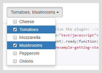
<select id="example-getting-started" multiple="multiple">
    <option value="cheese">Cheese</option>
    <option value="tomatoes">Tomatoes</option>
    <option value="mozarella">Mozzarella</option>
    <option value="mushrooms">Mushrooms</option>
    <option value="pepperoni">Pepperoni</option>
    <option value="onions">Onions</option>
</select>
Now call the plugin with jQuery:
$(document).ready(function() {
    $('#example-getting-started').multiselect();
});
You’ll have this result:
2.3 Examples
As you might expect, just like the first plugin, “Bootstrap Multiselect” comes with a lot of options that you can see all in the documentation page and choose the one you need. Below I’ve selected some of them to give you an idea.
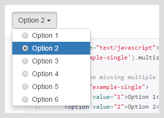
a) Multiple select box without the “multiple” attribute
If you don’t add the “multiple” attribute to the select tag, the options are displayed as radio buttons instead of checkboxes.
HTML and Javascript code:
<script type="text/javascript">
    $('#example-single').multiselect();
</script>

<select id="example-single">
    <option value="1">Option 1</option>
    <option value="2">Option 2</option>
    <option value="3">Option 3</option>
    <option value="4">Option 4</option>
    <option value="5">Option 5</option>
    <option value="6">Option 6</option>
</select>
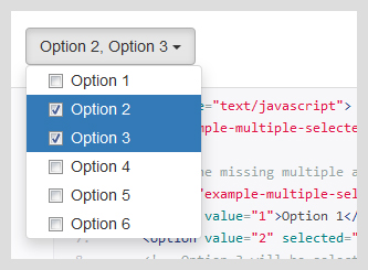
b) Preselected options
A multi-select box with the “multiple” attribute and two preselected options.
HTML and Javascript code:
    <script type="text/javascript">
        $('#example-multiple-selected').multiselect();
    </script>

    <select id="example-multiple-selected" multiple="multiple">
        <option value="1">Option 1</option>
        <option value="2" selected="selected">Option 2</option>
        <option value="3" selected="selected">Option 3</option>
        <option value="4">Option 4</option>
        <option value="5">Option 5</option>
        <option value="6">Option 6</option>
    </select>
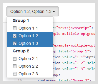
c) Multiple select with option groups
The plugin supports option groups inside the multiselect field, with the “optgroup” HTML tag. By default the group headers are not clickable (“Group 1”, “Group 2” in the image below) but can be activated with the “enableClickableOptGroups” option.
HTML and Javascript code:
    <script type="text/javascript">
        $('#example-multiple-optgroups').multiselect();
    </script>

    <select id="example-multiple-optgroups">
        <optgroup label="Group 1">
            <option value="1-1">Option 1.1</option>
            <option value="1-2" selected="selected">Option 1.2</option>
            <option value="1-3" selected="selected">Option 1.3</option>
        </optgroup>
        <optgroup label="Group 2">
            <option value="2-1">Option 2.1</option>
            <option value="2-2">Option 2.2</option>
            <option value="2-3">Option 2.3</option>
        </optgroup>
    </select>
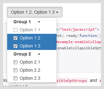
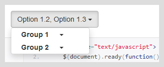
d) Multiple select with collapsible option groups
You can make the option groups collapsible by setting “enableCollapsibleOptGroups” to “true”.
Javascript code:
$(document).ready(function() {
    $('#example-enableCollapsibleOptGroups').multiselect({
        enableCollapsibleOptGroups: true
    });
});
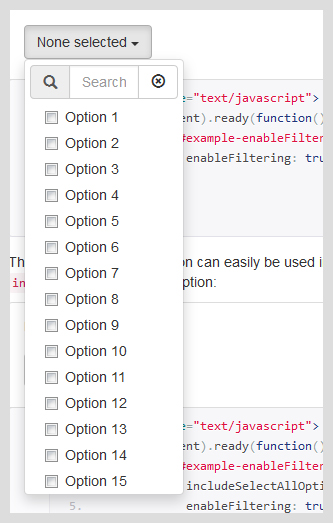
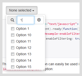
e) Enable filtering
You can add a filter input field to the multiselect using the “enableFiltering” option.
Javascript code:
$(document).ready(function() {
    $('#example-enableFiltering').multiselect({
        enableFiltering: true
    });
});
f) Other options
Of course the plugin offers many other options, styling, templates, jQuery methods and keyboard controls. You can see them all on the official site.
Conclusions
When it comes to using a select or multiselect input field in a Bootstrap project the webdesign community has us covered with these two useful jQuery plugins.
As we saw above, they come with a lot of features responding to every possible special case or issue that we often encounter in our design and development projects.
Do you have any question or suggestion about other similar plugins? Let me know in the comments.
All the best,
Anli
Stay Updated
Subscribe to the Azmind Newsletter and I’ll update you as soon as I release a new WordPress Theme, Bootstrap Template, Tutorial or other Freebie:
To learn how we use your data when you sign up to our newsletter, read our Privacy Policy here.





if use more than 3 select options in the select box the drop down is going out of display, its showing on the page top portion. I am using this in Angular 5. May i know the issue please